## Grouped Bar Chart: Performance Metrics Comparison
### Overview
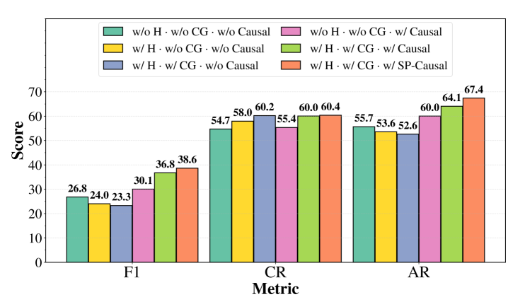
The image displays a grouped bar chart comparing the performance scores of six different model configurations across three evaluation metrics: F1, CR, and AR. The chart is designed to show the incremental impact of adding components (H, CG, Causal, SP-Causal) to a baseline model.
### Components/Axes
* **Chart Type:** Grouped Bar Chart.
* **X-Axis (Horizontal):** Labeled "Metric". It contains three categorical groups:
1. **F1**
2. **CR**
3. **AR**
* **Y-Axis (Vertical):** Labeled "Score". It is a linear scale ranging from 0 to 70, with major tick marks at intervals of 10 (0, 10, 20, 30, 40, 50, 60, 70).
* **Legend:** Positioned at the top-center of the chart area. It defines six data series, each corresponding to a specific model configuration, identified by color and a descriptive label:
1. **Teal:** `w/o H · w/o CG · w/o Causal` (Baseline)
2. **Yellow:** `w/ H · w/o CG · w/o Causal`
3. **Blue:** `w/ H · w/ CG · w/o Causal`
4. **Pink:** `w/o H · w/o CG · w/ Causal`
5. **Green:** `w/ H · w/ CG · w/ Causal`
6. **Orange:** `w/ H · w/ CG · w/ SP-Causal`
* **Data Labels:** Each bar has its exact numerical score printed directly above it.
### Detailed Analysis
The chart presents the following scores for each metric and configuration:
**1. F1 Metric Group (Leftmost cluster):**
* **Trend:** Scores generally increase from left to right within the group, with the baseline (teal) and the "w/ H" (yellow) configurations performing lower than those incorporating "Causal" or "SP-Causal" components.
* **Data Points:**
* Teal (Baseline): 26.8
* Yellow (w/ H): 24.0
* Blue (w/ H, w/ CG): 23.3
* Pink (w/ Causal): 30.1
* Green (w/ H, w/ CG, w/ Causal): 36.8
* Orange (w/ H, w/ CG, w/ SP-Causal): 38.6
**2. CR Metric Group (Center cluster):**
* **Trend:** Scores are more tightly clustered compared to F1. The addition of "CG" (blue) and "SP-Causal" (orange) yields the highest scores.
* **Data Points:**
* Teal (Baseline): 54.7
* Yellow (w/ H): 58.0
* Blue (w/ H, w/ CG): 60.2
* Pink (w/ Causal): 55.4
* Green (w/ H, w/ CG, w/ Causal): 60.0
* Orange (w/ H, w/ CG, w/ SP-Causal): 60.4
**3. AR Metric Group (Rightmost cluster):**
* **Trend:** Shows a clear, progressive increase in score from the baseline (teal) to the most complex configuration (orange). The "SP-Causal" variant (orange) achieves the highest score on the entire chart.
* **Data Points:**
* Teal (Baseline): 55.7
* Yellow (w/ H): 53.6
* Blue (w/ H, w/ CG): 52.6
* Pink (w/ Causal): 60.0
* Green (w/ H, w/ CG, w/ Causal): 64.1
* Orange (w/ H, w/ CG, w/ SP-Causal): 67.4
### Key Observations
1. **Consistent Top Performer:** The `w/ H · w/ CG · w/ SP-Causal` (orange) configuration achieves the highest score in all three metric categories (F1: 38.6, CR: 60.4, AR: 67.4).
2. **Impact of Causal Components:** Configurations that include a "Causal" or "SP-Causal" component (pink, green, orange bars) consistently outperform their non-causal counterparts (teal, yellow, blue) within the same metric group, especially in F1 and AR.
3. **Metric Sensitivity:** The F1 metric shows the greatest relative variation between configurations (scores ranging from ~23 to ~39), while the CR metric shows the least variation (scores clustered between ~55 and ~60).
4. **Non-Linear Improvement:** Adding components does not always guarantee improvement. For example, in the AR metric, adding "H" alone (yellow) or "H + CG" (blue) to the baseline actually results in a slight score decrease before the "Causal" components drive a significant increase.
### Interpretation
This chart is an ablation study, systematically evaluating the contribution of different components (H, CG, Causal, SP-Causal) to a model's performance. The data suggests:
* **Synergistic Effects:** The best performance is achieved not by any single component, but by the combination of all three: H, CG, and a causal modeling approach (especially SP-Causal). This indicates these components address complementary aspects of the problem.
* **Causal Modeling is Key:** The most significant performance jumps are associated with the introduction of causal components (pink, green, orange bars). This strongly implies that modeling causal relationships is crucial for improving performance on these specific metrics (F1, CR, AR).
* **"SP-Causal" Superiority:** The "SP-Causal" variant consistently outperforms the standard "Causal" variant when paired with H and CG (comparing green vs. orange bars). This suggests the "SP" modification provides a meaningful enhancement to the causal modeling approach for this task.
* **Task-Specific Baseline:** The baseline model (teal) performs moderately on CR and AR (~55) but poorly on F1 (~27), indicating the baseline is better suited for the tasks measured by CR and AR than for the task measured by F1. The added components, particularly causal ones, are especially effective at boosting F1 performance.
In summary, the visualization provides strong evidence that integrating hierarchical (H), coarse-grained (CG), and advanced causal (SP-Causal) modeling techniques leads to superior and more robust model performance across multiple evaluation dimensions.