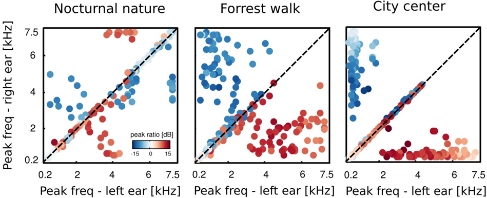
## Scatter Plots: Peak Frequency Ratio by Environment
### Overview
The image presents three scatter plots, each representing a different sound environment: "Nocturnal nature", "Forrest walk", and "City center". Each plot visualizes the relationship between peak frequency detected in the left ear versus the peak frequency detected in the right ear, with data points colored according to the "peak ratio [dB]". A dashed black line representing the equality line (left ear frequency = right ear frequency) is overlaid on each plot.
### Components/Axes
Each plot shares the following components:
* **X-axis:** "Peak freq - left ear [kHz]", ranging from approximately 0.2 to 7.5 kHz.
* **Y-axis:** "Peak freq - right ear [kHz]", ranging from approximately 0.2 to 7.5 kHz.
* **Color Scale/Legend:** Located at the bottom-center of the image, the legend represents "peak ratio [dB]", with a gradient from blue (-15 dB) to red (15 dB).
* **Title:** Each plot has a title indicating the environment: "Nocturnal nature", "Forrest walk", and "City center", positioned at the top-center.
* **Equality Line:** A dashed black line is present in each plot, running diagonally from the bottom-left to the top-right, representing where the peak frequency in the left ear equals the peak frequency in the right ear.
### Detailed Analysis or Content Details
**Plot 1: Nocturnal Nature**
* **Trend:** The data points generally cluster around the equality line, but with a noticeable spread. There's a slight tendency for points to fall *below* the line at lower frequencies (left ear > right ear).
* **Data Points:**
* Numerous blue points (peak ratio ~ -15 dB) are concentrated around (0.2 kHz, 0.2 kHz) to (2 kHz, 2 kHz).
* Points transition through lighter blues, then to neutral colors around the equality line.
* Red points (peak ratio ~ 15 dB) are scattered, primarily between (2 kHz, 3 kHz) and (6 kHz, 7 kHz).
* Approximate data points: (0.5, 0.5) - blue, (2, 1.5) - neutral, (4, 5) - neutral, (6, 6.5) - red.
**Plot 2: Forrest Walk**
* **Trend:** Similar to "Nocturnal nature", the data points are clustered around the equality line, but with a wider spread. There's a more pronounced tendency for points to fall *below* the line at lower frequencies.
* **Data Points:**
* Blue points are concentrated around (0.2 kHz, 0.2 kHz) to (3 kHz, 3 kHz).
* A larger number of points are scattered *below* the equality line compared to "Nocturnal nature".
* Red points are scattered, primarily between (3 kHz, 4 kHz) and (7 kHz, 7.5 kHz).
* Approximate data points: (0.5, 0.5) - blue, (2, 1.5) - neutral, (4, 5) - neutral, (6, 6.5) - red.
**Plot 3: City Center**
* **Trend:** The data points are more dispersed and show a stronger tendency to fall *below* the equality line, especially at lower frequencies. The spread is significantly wider than in the other two environments.
* **Data Points:**
* Blue points are concentrated around (0.2 kHz, 0.2 kHz) to (2 kHz, 2 kHz).
* A substantial number of points are scattered *below* the equality line.
* Red points are scattered, primarily between (2 kHz, 3 kHz) and (6 kHz, 6.5 kHz).
* Approximate data points: (0.5, 0.5) - blue, (2, 1.5) - neutral, (4, 5) - neutral, (6, 6.5) - red.
### Key Observations
* The "City center" environment exhibits the greatest deviation from the equality line, suggesting a larger difference in peak frequencies detected between the left and right ears.
* The "Nocturnal nature" environment shows the least deviation, indicating a more balanced frequency distribution between the ears.
* The color distribution (peak ratio) appears to be correlated with the position relative to the equality line. Points below the line tend to be blue (negative peak ratio), while points above the line tend to be red (positive peak ratio).
* The spread of data points increases from "Nocturnal nature" to "Forrest walk" to "City center", indicating greater variability in peak frequencies in more complex sound environments.
### Interpretation
These scatter plots likely represent the spatial hearing characteristics in different acoustic environments. The peak frequency ratio indicates the difference in the dominant frequencies perceived by each ear.
* **Nocturnal nature:** The close clustering around the equality line suggests a relatively symmetrical sound field, with sounds arriving at both ears with similar frequencies. This could be due to the absence of strong directional sound sources or reflections.
* **Forrest walk:** The wider spread and slight downward trend suggest that sounds are arriving at the ears with slightly different frequencies, potentially due to the complex soundscape of a forest (e.g., rustling leaves, bird calls from different directions).
* **City center:** The significant deviation from the equality line and the large spread indicate a highly asymmetrical sound field. This is likely due to the presence of numerous sound sources (traffic, construction, people) and strong reflections from buildings, creating significant interaural differences in frequency.
The plots demonstrate how the acoustic environment influences the perceived frequency distribution between the ears. The "peak ratio" metric provides a quantitative measure of this asymmetry, which could be relevant for understanding sound localization, spatial awareness, and the impact of noise pollution on auditory perception. The dashed line serves as a baseline for comparison, highlighting the degree to which the sound environment alters the symmetry of frequency perception.