## Line Graph: Cosine Similarity Across Sample Numbers
### Overview
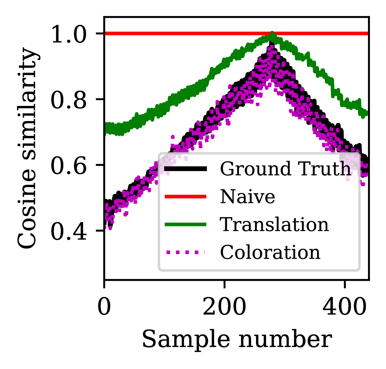
The graph compares cosine similarity values across four data series (Ground Truth, Naive, Translation, Coloration) as sample numbers increase from 0 to 400. Cosine similarity ranges from 0.0 to 1.0 on the y-axis, with sample numbers incrementing by 200 on the x-axis.
### Components/Axes
- **X-axis**: "Sample number" (0–400, increments of 200)
- **Y-axis**: "Cosine similarity" (0.0–1.0, increments of 0.2)
- **Legend**: Located in the bottom-right corner, with four entries:
- **Black solid line**: Ground Truth
- **Red solid line**: Naive
- **Green solid line**: Translation
- **Purple dotted line**: Coloration
### Detailed Analysis
1. **Ground Truth (Black)**:
- Flat line at **1.0** across all sample numbers.
- Acts as a reference for maximum similarity.
2. **Naive (Red)**:
- Starts at ~0.4 (sample 0), rises to a peak of ~0.9 at sample 200, then declines to ~0.6 by sample 400.
- Shows a clear upward trend until sample 200, followed by a sharp drop.
3. **Translation (Green)**:
- Starts at ~0.7 (sample 0), peaks at ~0.95 at sample 200, then declines to ~0.75 by sample 400.
- Maintains higher similarity than Naive and Coloration throughout.
4. **Coloration (Purple)**:
- Starts at ~0.5 (sample 0), peaks at ~0.85 at sample 200, then declines to ~0.6 by sample 400.
- Shows moderate performance, outperforming Naive but underperforming Translation.
### Key Observations
- All non-Ground Truth lines exhibit a **bell-shaped curve**, peaking at sample 200.
- **Translation** achieves the highest peak (~0.95), closely approaching Ground Truth.
- **Naive** has the lowest peak (~0.9) and steepest decline post-200.
- **Coloration** shows intermediate performance (~0.85 peak).
- Post-200 decline suggests diminishing returns or overfitting in all methods.
### Interpretation
The graph demonstrates that the **Translation** method most closely approximates the Ground Truth, particularly at the optimal sample point (200). The Naive and Coloration methods lag behind, with Naive showing the weakest performance. The consistent peak at sample 200 implies a critical threshold where similarity is maximized, potentially due to data characteristics (e.g., feature saturation, noise introduction). The decline after 200 may indicate overfitting or reduced relevance of additional samples. The Ground Truth’s flat line underscores its role as an idealized benchmark.