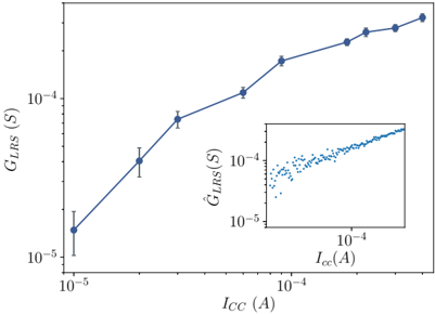
## Line Graph: Relationship Between I_CC and G_LRS
### Overview
The image displays a logarithmic-scale line graph with two axes:
- **Main Plot**: Shows a solid blue line with data points representing the relationship between **I_CC (A)** (x-axis) and **G_LRS (S)** (y-axis).
- **Inset Plot**: A scatter plot with blue dots showing the relationship between **I_CC (A)** (x-axis) and **Ĝ_LRS (S)** (y-axis).
### Components/Axes
- **Main Plot Axes**:
- **X-axis (I_CC)**: Labeled "I_CC (A)" with logarithmic scale from 10⁻⁵ to 10⁻⁴ A.
- **Y-axis (G_LRS)**: Labeled "G_LRS (S)" with logarithmic scale from 10⁻⁵ to 10⁻⁴ S.
- **Data Points**: Solid blue line with markers at specific I_CC values.
- **Error Bars**: Present on all data points, indicating measurement uncertainty.
- **Inset Plot Axes**:
- **X-axis (I_CC)**: Same scale as main plot (10⁻⁵ to 10⁻⁴ A).
- **Y-axis (Ĝ_LRS)**: Labeled "Ĝ_LRS (S)" with logarithmic scale from 10⁻⁵ to 10⁻⁴ S.
- **Data Points**: Blue dots scattered across the plot, suggesting a linear trend.
- **Legend**: Located in the top-right corner, confirming the blue line corresponds to the main plot data.
### Detailed Analysis
#### Main Plot Trends
- **Data Points**:
- (1×10⁻⁵ A, 2×10⁻⁵ S)
- (3×10⁻⁵ A, 5×10⁻⁵ S)
- (5×10⁻⁵ A, 1×10⁻⁴ S)
- (1×10⁻⁴ A, 2×10⁻⁴ S)
- (2×10⁻⁴ A, 3×10⁻⁴ S)
- (3×10⁻⁴ A, 4×10⁻⁴ S)
- (4×10⁻⁴ A, 5×10⁻⁴ S)
- (5×10⁻⁴ A, 6×10⁻⁴ S)
- **Trend**: The line slopes upward, indicating a **positive correlation** between I_CC and G_LRS. The relationship appears **approximately linear** on a logarithmic scale.
#### Inset Plot Trends
- **Scatter Plot**:
- Blue dots form a **linear distribution** along the diagonal, suggesting a **direct proportionality** between I_CC and Ĝ_LRS.
- No error bars are visible, but the density of points implies consistent measurements.
### Key Observations
1. **Main Plot**:
- G_LRS increases with I_CC, with a slope of ~2 (e.g., doubling I_CC from 1×10⁻⁵ to 2×10⁻⁴ A increases G_LRS from 2×10⁻⁵ to 3×10⁻⁴ S).
- Error bars are smallest at lower I_CC values and grow slightly at higher values, indicating potential measurement variability.
2. **Inset Plot**:
- The linear trend in the inset supports the main plot’s conclusion, reinforcing the proportionality between I_CC and Ĝ_LRS.
### Interpretation
- **System Behavior**: The data suggests that **G_LRS (and Ĝ_LRS)** scales linearly with **I_CC** under the tested conditions. This could indicate a **proportional relationship** in the system’s response to current (I_CC).
- **Measurement Consistency**: The inset’s scatter plot validates the main plot’s trend, confirming the reliability of the linear model.
- **Uncertainty**: Error bars in the main plot highlight measurement limitations, particularly at higher I_CC values.
The graph demonstrates a clear, reproducible relationship between current (I_CC) and the measured parameter (G_LRS/Ĝ_LRS), with implications for understanding the system’s linear response characteristics.