## Line Chart: Fraction of Under-counting by Age Group and Date
### Overview
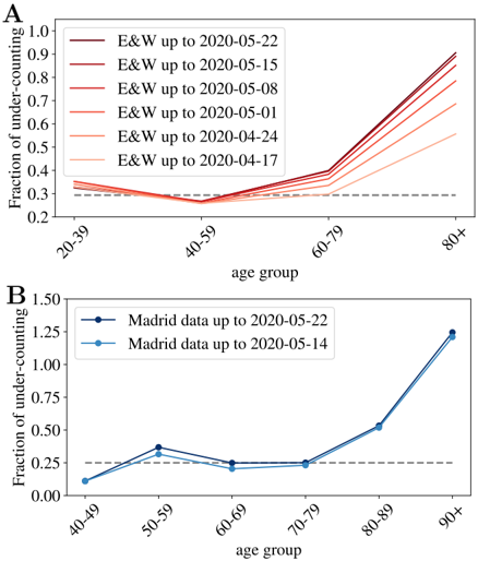
The image presents two line charts (labeled A and B) illustrating the fraction of under-counting, likely related to mortality or case reporting, across different age groups over time. Chart A focuses on "E&W" data (England & Wales), while Chart B focuses on "Madrid" data. Both charts share a similar structure, plotting the fraction of under-counting against age groups. A horizontal dashed line at approximately y=0.3 is present in both charts, potentially representing a baseline or threshold.
### Components/Axes
**Common Elements:**
* **X-axis:** "age group" with markers: 20-39, 40-59, 60-79, 80+ (Chart A) and 40-49, 50-59, 60-69, 70-79, 80-89, 90+ (Chart B).
* **Y-axis:** "Fraction of under-counting" ranging from 0.0 to 1.0 (Chart A) and 0.0 to 1.5 (Chart B).
* **Horizontal dashed line:** Approximately y=0.3 in both charts.
**Chart A (E&W Data):**
* **Legend:** Located in the top-right corner.
* "E&W up to 2020-05-22" (Dark Red)
* "E&W up to 2020-05-15" (Reddish-Orange)
* "E&W up to 2020-05-08" (Orange)
* "E&W up to 2020-05-01" (Light Orange)
* "E&W up to 2020-04-24" (Pale Orange)
* "E&W up to 2020-04-17" (Very Pale Orange)
**Chart B (Madrid Data):**
* **Legend:** Located in the top-left corner.
* "Madrid data up to 2020-05-22" (Dark Blue)
* "Madrid data up to 2020-05-14" (Light Blue)
### Detailed Analysis or Content Details
**Chart A (E&W Data):**
* **Trend:** All lines start around y=0.3 and generally increase as age group increases, with the later dates (closer to 2020-05-22) showing higher fractions of under-counting.
* **Data Points (approximate):**
* 20-39: ~0.31 for all dates.
* 40-59: ~0.28-0.32 for all dates.
* 60-79: ~0.33-0.55, increasing with later dates.
* 80+: ~0.65-0.85, increasing with later dates.
* The lines are closely clustered for the earlier dates (April 17th and April 24th), diverging more as the dates approach May 22nd.
**Chart B (Madrid Data):**
* **Trend:** The line for "Madrid data up to 2020-05-22" starts around y=0.25, dips slightly, then increases sharply for the 80-89 and 90+ age groups. The line for "Madrid data up to 2020-05-14" is generally lower, with a more gradual increase.
* **Data Points (approximate):**
* 40-49: ~0.26 (May 14), ~0.28 (May 22)
* 50-59: ~0.45 (May 14), ~0.48 (May 22)
* 60-69: ~0.32 (May 14), ~0.30 (May 22)
* 70-79: ~0.25 (May 14), ~0.28 (May 22)
* 80-89: ~0.35 (May 14), ~0.60 (May 22)
* 90+: ~0.40 (May 14), ~1.25 (May 22)
### Key Observations
* **Age-related increase:** Both datasets show a clear trend of increasing under-counting with increasing age.
* **Temporal increase:** In both regions, the fraction of under-counting generally increases over time, suggesting a worsening of reporting or data collection issues.
* **Madrid's sharper increase:** The Madrid data exhibits a much more dramatic increase in under-counting for the oldest age groups (80-89 and 90+) between May 14th and May 22nd.
* **Baseline:** The horizontal dashed line at y=0.3 may represent a baseline level of under-counting, or a threshold for concern.
### Interpretation
These charts likely represent the degree to which deaths or cases were *not* reported or accurately attributed to the cause of interest (e.g., a pandemic). The increasing fraction of under-counting with age suggests that older individuals were more likely to have their deaths or cases go unrecorded. This could be due to a variety of factors, including:
* **Difficulty in diagnosis:** Older individuals may present with atypical symptoms, making diagnosis more challenging.
* **Comorbidities:** Pre-existing health conditions may obscure the true cause of death.
* **Limited access to healthcare:** Older individuals may have limited access to healthcare, leading to under-reporting.
* **Reporting biases:** Systematic biases in reporting practices may disproportionately affect older individuals.
The temporal increase in under-counting suggests that these issues were worsening over time, potentially due to increased strain on healthcare systems or changes in reporting protocols. The stark difference between the E&W and Madrid data, particularly in the oldest age groups, could indicate differences in healthcare infrastructure, reporting practices, or the severity of the situation in each region. The horizontal dashed line provides a reference point for assessing the magnitude of under-counting, and whether it is exceeding acceptable levels. The data suggests a significant and growing problem with accurately tracking the impact of the event across all age groups, but particularly among the elderly.