## Line Charts: Fraction of Under-Counting by Age Group (England & Wales and Madrid)
### Overview
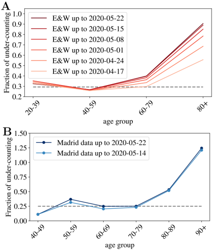
The image contains two line charts, labeled **A** and **B**, which display the "Fraction of under-counting" across different age groups for two distinct geographic regions over specific time periods in 2020. Both charts suggest that the measured under-counting fraction increases significantly with age, particularly for the oldest age brackets.
### Components/Axes
**Chart A (Top):**
* **Title/Label:** "A" (top-left corner).
* **Y-axis:** Label: "Fraction of under-counting". Scale: 0.2 to 1.0, with increments of 0.1.
* **X-axis:** Label: "age group". Categories: "20-39", "40-59", "60-79", "80+".
* **Legend:** Located in the top-left quadrant. Contains six entries, each a line with a color gradient from light to dark red, representing cumulative data for "E&W" (England & Wales) up to successive dates:
* Lightest red: "E&W up to 2020-04-17"
* "E&W up to 2020-04-24"
* "E&W up to 2020-05-01"
* "E&W up to 2020-05-08"
* "E&W up to 2020-05-15"
* Darkest red: "E&W up to 2020-05-22"
* **Other Elements:** A horizontal dashed grey line at y=0.3.
**Chart B (Bottom):**
* **Title/Label:** "B" (top-left corner).
* **Y-axis:** Label: "Fraction of under-counting". Scale: 0.00 to 1.50, with increments of 0.25.
* **X-axis:** Label: "age group". Categories: "40-49", "50-59", "60-69", "70-79", "80-89", "90+".
* **Legend:** Located in the top-left quadrant. Contains two entries:
* Dark blue line with circle markers: "Madrid data up to 2020-05-22"
* Light blue line with circle markers: "Madrid data up to 2020-05-14"
* **Other Elements:** A horizontal dashed grey line at y=0.25.
### Detailed Analysis
**Chart A: England & Wales Data**
* **Trend Verification:** All six lines follow a similar pattern. They start between ~0.30-0.35 for the 20-39 age group, show a slight dip or plateau for the 40-59 age group, then rise sharply for the 60-79 group, and rise even more steeply for the 80+ group. The lines for later dates (darker red) are consistently higher than earlier dates (lighter red) for the 60-79 and 80+ groups.
* **Data Points (Approximate):**
* **20-39:** All lines cluster between 0.30 and 0.35.
* **40-59:** All lines dip to a minimum, clustering around 0.28-0.30.
* **60-79:** Values range from ~0.38 (earliest date) to ~0.42 (latest date).
* **80+:** Values show the greatest spread and increase over time:
* 2020-04-17: ~0.55
* 2020-04-24: ~0.65
* 2020-05-01: ~0.75
* 2020-05-08: ~0.82
* 2020-05-15: ~0.88
* 2020-05-22: ~0.90
**Chart B: Madrid Data**
* **Trend Verification:** Both lines show a general upward trend with age. They start low, have a small peak at 50-59, a slight dip at 60-69, then a consistent and sharp increase from 70-79 onward. The line for the later date (dark blue) is slightly higher than the earlier date (light blue) at most points, with the difference becoming most pronounced at the 90+ age group.
* **Data Points (Approximate):**
* **40-49:** ~0.10 (both lines).
* **50-59:** ~0.35 (both lines).
* **60-69:** ~0.22 (light blue), ~0.25 (dark blue).
* **70-79:** ~0.25 (both lines).
* **80-89:** ~0.52 (both lines).
* **90+:** ~1.20 (light blue), ~1.25 (dark blue).
### Key Observations
1. **Age Correlation:** In both datasets, the fraction of under-counting is strongly positively correlated with age, with the most dramatic increases occurring after age 70.
2. **Temporal Increase:** For a given age group (especially the oldest), the under-counting fraction increases as the data collection period extends later into May 2020. This is visible in the upward shift of the lines in Chart A and the slight upward shift in Chart B.
3. **Regional Difference:** The scale of under-counting is notably higher in the Madrid data (Chart B) for the oldest group (90+), exceeding 1.0, compared to the England & Wales data (Chart A) for the 80+ group, which peaks around 0.90. The age brackets also differ between the charts.
4. **Non-Linear Pattern:** The relationship is not perfectly linear. Chart A shows a dip at 40-59, while Chart B shows a local peak at 50-59 followed by a dip at 60-69 before the final ascent.
### Interpretation
The charts likely visualize the under-ascertainment or under-reporting of a phenomenon (commonly seen in epidemiological data, such as COVID-19 cases or deaths) across different age demographics. The "fraction of under-counting" represents the proportion of true events that were not captured by official counts.
* **What the data suggests:** The data strongly suggests that surveillance or reporting systems were significantly less effective at capturing events among the elderly population compared to younger adults. This gap widened over time during the early phase of the pandemic (April-May 2020), possibly due to overwhelmed systems or changes in testing/reporting criteria.
* **How elements relate:** The increasing lines over time (darker colors) indicate that as the pandemic progressed, the discrepancy between reported and estimated true counts grew, especially for the most vulnerable age groups. The dashed reference lines (0.3 in A, 0.25 in B) may represent a baseline or expected under-counting rate.
* **Notable anomalies:** The value exceeding 1.0 for the 90+ group in Madrid is a critical anomaly. A fraction >1 implies that the *estimated true count* was more than double the *official reported count*. This points to a severe breakdown in case ascertainment for the oldest old in that region during that period. The local peaks and dips in the middle age groups (e.g., 50-59 in Madrid) could reflect specific policy decisions, such as prioritizing testing for certain symptomatic groups or workplaces.