\n
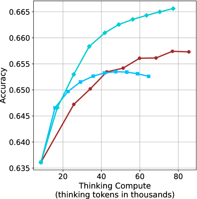
## Line Chart: Accuracy vs. Thinking Compute
### Overview
The image is a line chart plotting model accuracy against computational effort, measured in thinking tokens. It compares the performance of three distinct models or methods, represented by three colored lines with different markers. The chart demonstrates how accuracy scales with increased compute for each approach.
### Components/Axes
* **Chart Type:** Line chart with markers.
* **X-Axis:**
* **Label:** "Thinking Compute (thinking tokens in thousands)"
* **Scale:** Linear, ranging from approximately 10 to 85 (thousands of tokens).
* **Major Tick Marks:** 20, 40, 60, 80.
* **Y-Axis:**
* **Label:** "Accuracy"
* **Scale:** Linear, ranging from 0.635 to 0.665.
* **Major Tick Marks:** 0.635, 0.640, 0.645, 0.650, 0.655, 0.660, 0.665.
* **Legend:** Located in the top-right corner of the plot area. It contains three entries:
1. A cyan line with diamond markers (◆).
2. A blue line with square markers (■).
3. A red line with circle markers (●).
* **Grid:** A light gray grid is present for both major x and y ticks.
### Detailed Analysis
**Data Series 1: Cyan Line with Diamond Markers (◆)**
* **Trend:** Shows a strong, consistent, and slightly decelerating upward trend across the entire compute range. It is the top-performing series for compute values above ~20k tokens.
* **Key Data Points (Approximate):**
* At ~10k tokens: Accuracy ≈ 0.636
* At ~20k tokens: Accuracy ≈ 0.650
* At ~40k tokens: Accuracy ≈ 0.661
* At ~60k tokens: Accuracy ≈ 0.664
* At ~80k tokens: Accuracy ≈ 0.666 (highest point on the chart)
**Data Series 2: Blue Line with Square Markers (■)**
* **Trend:** Increases sharply initially, then plateaus and slightly declines after reaching a peak. It performs similarly to the cyan line at very low compute but is quickly surpassed.
* **Key Data Points (Approximate):**
* At ~10k tokens: Accuracy ≈ 0.636 (similar starting point to cyan)
* At ~20k tokens: Accuracy ≈ 0.650
* At ~30k tokens: Accuracy ≈ 0.652
* At ~40k tokens: Accuracy ≈ 0.653
* At ~50k tokens: Accuracy ≈ 0.653 (peak)
* At ~65k tokens: Accuracy ≈ 0.652 (shows a slight decrease from peak)
**Data Series 3: Red Line with Circle Markers (●)**
* **Trend:** Shows a steady, approximately linear increase, but with a shallower slope than the cyan line. It consistently performs below the cyan line but eventually surpasses the plateauing blue line.
* **Key Data Points (Approximate):**
* At ~10k tokens: Accuracy ≈ 0.636
* At ~25k tokens: Accuracy ≈ 0.647
* At ~40k tokens: Accuracy ≈ 0.653
* At ~60k tokens: Accuracy ≈ 0.656
* At ~80k tokens: Accuracy ≈ 0.657
### Key Observations
1. **Common Origin:** All three models start at nearly the same accuracy point (~0.636) at the lowest compute level (~10k tokens).
2. **Divergence:** Performance diverges significantly as compute increases. The cyan model scales the best, the red model scales moderately, and the blue model stops scaling after ~50k tokens.
3. **Crossover Point:** The red line crosses above the blue line at approximately 45k thinking tokens, indicating that for higher compute budgets, the "red" method becomes more accurate than the "blue" method.
4. **Diminishing Returns:** All curves show signs of diminishing returns (the slope decreases as compute increases), but the degree varies greatly. The cyan curve maintains a positive slope throughout, while the blue curve's slope becomes zero or slightly negative.
### Interpretation
This chart illustrates a fundamental trade-off in AI model scaling: the relationship between computational investment (thinking tokens) and performance (accuracy). The data suggests:
* **Model Architecture/Method Matters Profoundly:** The three lines likely represent different model architectures, training techniques, or inference strategies. The "cyan" method is significantly more efficient at converting additional compute into accuracy gains.
* **The "Blue" Method Hits a Ceiling:** The plateau of the blue line indicates a performance bottleneck. This could be due to a model capacity limit, a flaw in the training objective, or an inherent limitation of that specific approach that cannot be overcome simply by throwing more compute at it.
* **Strategic Compute Allocation:** For low-compute applications (<20k tokens), the choice between methods may be less critical. However, for high-compute, high-performance scenarios, selecting the "cyan" method is crucial. The "red" method offers a middle ground, providing steady but less efficient scaling.
* **Investigative Question:** The stark difference in scaling behavior invites investigation into the underlying causes. What architectural feature allows the cyan model to keep improving? Why does the blue model saturate? This chart provides empirical evidence to guide such research and development decisions.