\n
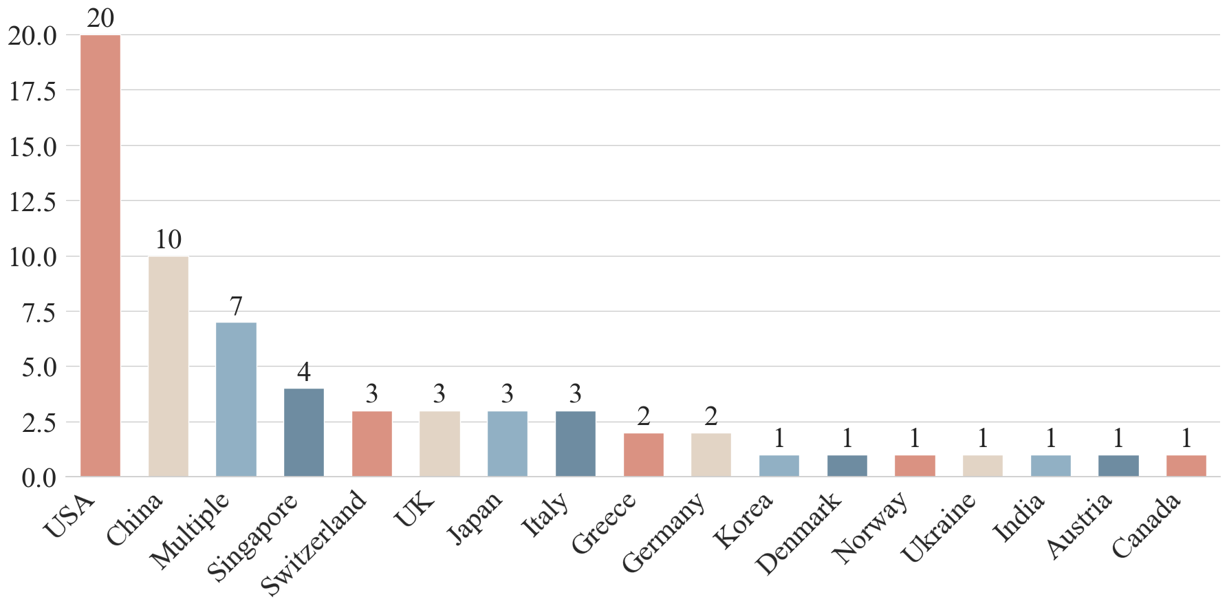
## Bar Chart: Number of Publications by Country
### Overview
This image presents a bar chart illustrating the number of publications originating from different countries. The chart uses vertical bars to represent the publication count for each country, with the countries listed along the horizontal axis. The vertical axis represents the number of publications, ranging from 0 to 20.
### Components/Axes
* **X-axis (Horizontal):** Lists the countries: USA, China, Multiple, Singapore, Switzerland, UK, Japan, Italy, Greece, Germany, Korea, Denmark, Norway, Ukraine, India, Austria, Canada.
* **Y-axis (Vertical):** Represents the number of publications, with a scale ranging from 0.0 to 20.0, incrementing by 2.5.
* **Bars:** Each bar corresponds to a country and its height indicates the number of publications. The bars are colored in shades of red and blue.
### Detailed Analysis
The chart displays the following data points:
* **USA:** Approximately 20 publications. (Dark Red)
* **China:** Approximately 10 publications. (Light Blue)
* **Multiple:** Approximately 7 publications. (Light Blue)
* **Singapore:** Approximately 4 publications. (Reddish-Brown)
* **Switzerland:** Approximately 3 publications. (Reddish-Brown)
* **UK:** Approximately 3 publications. (Light Blue)
* **Japan:** Approximately 3 publications. (Light Blue)
* **Italy:** Approximately 3 publications. (Light Blue)
* **Greece:** Approximately 3 publications. (Light Blue)
* **Germany:** Approximately 2 publications. (Reddish-Brown)
* **Korea:** Approximately 2 publications. (Reddish-Brown)
* **Denmark:** Approximately 1 publication. (Reddish-Brown)
* **Norway:** Approximately 1 publication. (Reddish-Brown)
* **Ukraine:** Approximately 1 publication. (Reddish-Brown)
* **India:** Approximately 1 publication. (Reddish-Brown)
* **Austria:** Approximately 1 publication. (Reddish-Brown)
* **Canada:** Approximately 1 publication. (Reddish-Brown)
The bars for USA and China are significantly taller than those for other countries, indicating a much higher number of publications from these two countries. The remaining countries have relatively low publication counts, mostly between 1 and 3.
### Key Observations
* The USA has the highest number of publications by a substantial margin.
* China has the second-highest number of publications.
* There is a significant drop in publication count after China, with "Multiple", "Singapore" having the next highest counts.
* A large number of countries have very few publications (1-2).
* The color scheme appears to differentiate between countries with higher (red shades) and lower (blue shades) publication counts, though this is not explicitly stated.
### Interpretation
The data suggests a clear dominance of the USA and China in terms of publication output within the context represented by this chart. The "Multiple" category could represent publications with multiple country affiliations or those where the country of origin is not clearly defined. The low publication counts from many countries may indicate limited research activity, funding, or reporting in those regions. The chart provides a snapshot of the geographical distribution of publications, potentially highlighting areas of research strength and areas where investment in research may be needed. The distinction in bar colors may be an attempt to visually categorize countries based on their publication levels, but without a legend, this is speculative. The chart does not provide information about the *type* of publications, the *fields* of research, or the *time period* covered, limiting the depth of interpretation.