## Vertical Bar Chart: Frequency by Country
### Overview
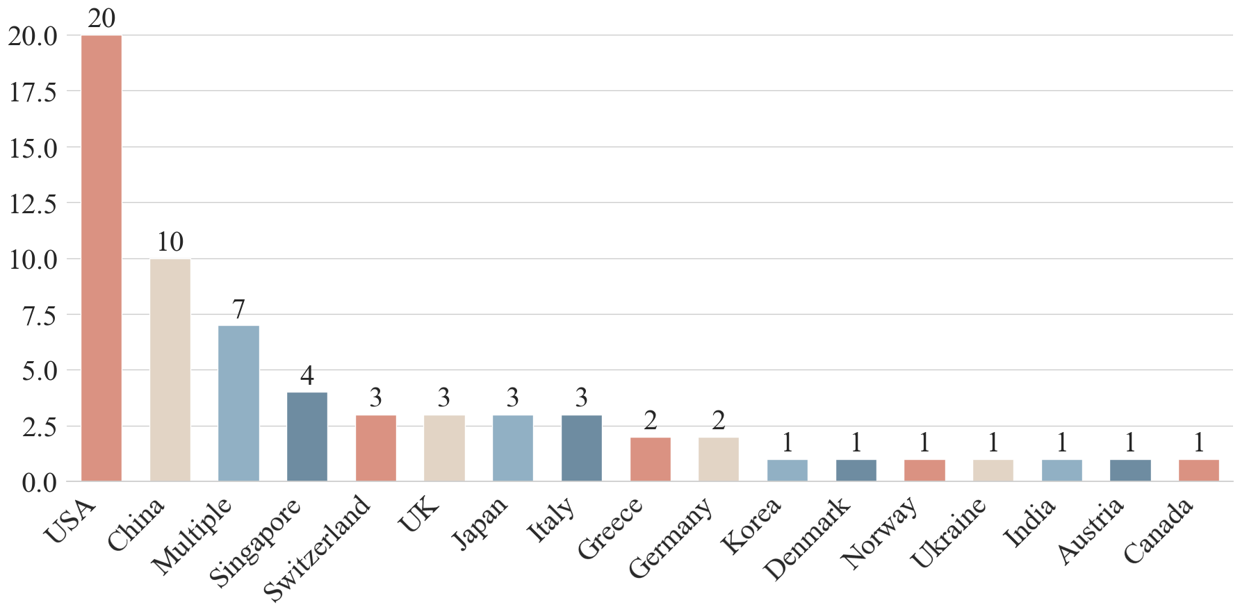
This image is a vertical bar chart displaying the frequency count (likely of publications, patents, or participants) for various countries and one category labeled "Multiple." The data is presented in descending order of count, from the highest value on the left to the lowest on the right.
### Components/Axes
* **Chart Type:** Vertical Bar Chart.
* **X-Axis (Horizontal):** Labeled with country names and one category. The labels are rotated approximately 45 degrees for readability. From left to right, the categories are: USA, China, Multiple, Singapore, Switzerland, UK, Japan, Italy, Greece, Germany, Korea, Denmark, Norway, Ukraine, India, Austria, Canada.
* **Y-Axis (Vertical):** Labeled "Count" (inferred from context, as the axis title is not explicitly shown but the numerical scale is clear). The scale runs from 0.0 to 20.0, with major gridlines at intervals of 2.5 (0.0, 2.5, 5.0, 7.5, 10.0, 12.5, 15.0, 17.5, 20.0).
* **Data Labels:** Each bar has its exact numerical count displayed directly above it.
* **Color Coding:** Bars are colored in a repeating pattern of four distinct colors (a salmon/red, a light beige, a light blue, and a dark blue-grey). The color sequence appears to be: Salmon, Beige, Light Blue, Dark Blue-Grey, and then repeats. There is no accompanying legend to explain what the colors represent.
### Detailed Analysis
The chart presents the following data points, listed in order from left (highest) to right (lowest):
1. **USA:** Count = 20. Bar color: Salmon.
2. **China:** Count = 10. Bar color: Beige.
3. **Multiple:** Count = 7. Bar color: Light Blue.
4. **Singapore:** Count = 4. Bar color: Dark Blue-Grey.
5. **Switzerland:** Count = 3. Bar color: Salmon.
6. **UK:** Count = 3. Bar color: Beige.
7. **Japan:** Count = 3. Bar color: Light Blue.
8. **Italy:** Count = 3. Bar color: Dark Blue-Grey.
9. **Greece:** Count = 2. Bar color: Salmon.
10. **Germany:** Count = 2. Bar color: Beige.
11. **Korea:** Count = 1. Bar color: Light Blue.
12. **Denmark:** Count = 1. Bar color: Dark Blue-Grey.
13. **Norway:** Count = 1. Bar color: Salmon.
14. **Ukraine:** Count = 1. Bar color: Beige.
15. **India:** Count = 1. Bar color: Light Blue.
16. **Austria:** Count = 1. Bar color: Dark Blue-Grey.
17. **Canada:** Count = 1. Bar color: Salmon.
**Trend Verification:** The visual trend is a steep decline from the first bar (USA) to the second (China), followed by a more gradual, stepwise decrease. The counts plateau at 3 for four consecutive countries (Switzerland, UK, Japan, Italy) and then again at 1 for the final seven countries (Korea through Canada).
### Key Observations
* **Dominant Leader:** The USA has a count (20) that is double that of the next highest country, China (10).
* **Significant Second:** China is the only other country with a double-digit count.
* **"Multiple" Category:** The third-highest entry is "Multiple" (count=7), suggesting a significant portion of the data involves collaborations or entities spanning more than one country.
* **Long Tail Distribution:** The data follows a classic "long tail" pattern. After the top three entries (USA, China, Multiple), the counts drop to single digits and then flatten out, with over half of the listed countries (10 out of 17) having a count of 2 or 1.
* **Color Pattern:** The four-color pattern repeats consistently across the bars but does not correlate with the count magnitude or geographic region in an obvious way based on the provided image. Its purpose is unclear without a legend.
### Interpretation
This chart likely illustrates the geographical distribution of a specific metric, such as research output, conference submissions, or project origins. The data suggests a highly concentrated field where the United States is the predominant contributor, followed by China. The presence of a "Multiple" category in third place highlights the importance of international collaboration in this domain.
The long tail of countries with counts of 1 or 2 indicates that while the activity is global, significant contributions (as measured by this count) are emerging from a wide range of nations, albeit at a much lower volume than the top leaders. The lack of a legend for the color coding is a notable omission; without it, the colors serve only to visually differentiate adjacent bars but do not convey additional categorical information (e.g., continent, economic bloc, or language group). To fully interpret the chart, one would need to know what the "Count" represents and the meaning behind the color scheme.