\n
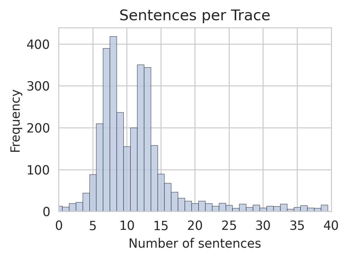
## Histogram: Sentences per Trace
### Overview
The image presents a histogram visualizing the distribution of the number of sentences per trace. The x-axis represents the number of sentences, and the y-axis represents the frequency (count) of traces with that number of sentences. The distribution appears to be approximately normal, skewed slightly to the right.
### Components/Axes
* **Title:** "Sentences per Trace" - positioned at the top-center of the chart.
* **X-axis Label:** "Number of sentences" - positioned at the bottom-center of the chart. The scale ranges from 0 to 40, with tick marks at intervals of 5.
* **Y-axis Label:** "Frequency" - positioned at the left-center of the chart. The scale ranges from 0 to 400, with tick marks at intervals of 100.
* **Bars:** Represent the frequency of traces for each number of sentences. The bars are light gray.
* **Gridlines:** Horizontal and vertical gridlines are present to aid in reading values.
### Detailed Analysis
The histogram shows the following approximate data points:
* **0-5 sentences:** Frequency is approximately 50-100.
* **5-10 sentences:** Frequency increases rapidly, peaking at around 400 at approximately 7-8 sentences.
* **10-15 sentences:** Frequency decreases from 400 to approximately 200-300.
* **15-20 sentences:** Frequency continues to decrease to around 50-100.
* **20-25 sentences:** Frequency drops to approximately 30-60.
* **25-30 sentences:** Frequency is around 20-40.
* **30-35 sentences:** Frequency is around 10-20.
* **35-40 sentences:** Frequency is around 5-10.
The peak of the distribution is around 7-8 sentences, indicating that most traces contain between 5 and 10 sentences. The distribution is not perfectly symmetrical; it has a longer tail extending towards higher sentence counts.
### Key Observations
* The most frequent number of sentences per trace is between 7 and 8.
* The distribution is unimodal (single peak).
* There is a positive skew, meaning there are more traces with a higher number of sentences than with a lower number.
* The frequency decreases as the number of sentences increases.
### Interpretation
The data suggests that the typical trace contains a relatively small number of sentences, with a concentration around 7-8 sentences. The right skew indicates that while most traces are concise, some traces contain a significantly larger number of sentences. This could be due to variations in the complexity or detail of the information contained within each trace. The histogram provides a useful overview of the sentence length distribution, which could be relevant for tasks such as text summarization, information retrieval, or quality control. The data could be used to establish thresholds for identifying unusually long or short traces, or to optimize algorithms for processing textual data.