## Bar Chart: Sentences per Trace
### Overview
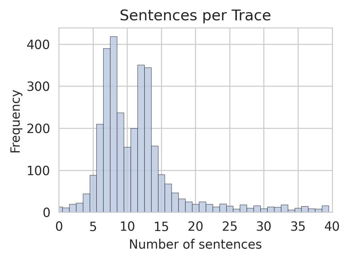
The chart displays the distribution of sentence counts per trace, with frequency on the y-axis and number of sentences on the x-axis. The data forms a roughly normal distribution, peaking at 8 sentences per trace, with frequencies declining symmetrically on either side. Outliers exist beyond 20 sentences but are significantly less frequent.
### Components/Axes
- **Title**: "Sentences per Trace" (centered at the top).
- **X-axis**: "Number of sentences" (horizontal), scaled from 0 to 40 in increments of 5.
- **Y-axis**: "Frequency" (vertical), scaled from 0 to 400 in increments of 100.
- **Bars**: Blue, with no legend present. The tallest bar corresponds to 8 sentences (~420 frequency), exceeding the y-axis maximum of 400.
### Detailed Analysis
- **Peak Frequency**: At 8 sentences, frequency reaches approximately 420 (visually exceeding the y-axis cap of 400).
- **Symmetrical Decline**: Frequencies decrease as sentence counts move away from 8. For example:
- 5 sentences: ~200 frequency.
- 10 sentences: ~250 frequency.
- 15 sentences: ~150 frequency.
- **Long-Tail Behavior**: Frequencies drop sharply beyond 15 sentences. At 20 sentences, frequency is ~50; at 30 sentences, ~10.
- **Outliers**: Bars beyond 30 sentences (e.g., 35, 40) have frequencies of ~10–20, indicating rare occurrences.
### Key Observations
1. **Dominant Sentence Count**: 8 sentences per trace is the most common, with the highest frequency.
2. **Normal Distribution**: The data follows a bell curve, with frequencies tapering off equally in both directions from the peak.
3. **Long-Tail Anomalies**: Traces with >20 sentences are rare but present, suggesting potential outliers or specialized cases.
### Interpretation
The data suggests that traces in the dataset typically contain 8 sentences, with a predictable decline in frequency for shorter or longer traces. The peak at 8 may reflect an optimal or standard sentence count for the analyzed context (e.g., user queries, document segments). The long-tail outliers (e.g., 35–40 sentences) could indicate edge cases, such as verbose inputs or complex documents. The absence of a legend implies a single data series, simplifying interpretation but limiting comparative analysis. The y-axis cap at 400 underrepresents the true peak frequency (~420), highlighting potential data scaling or visualization constraints.