\n
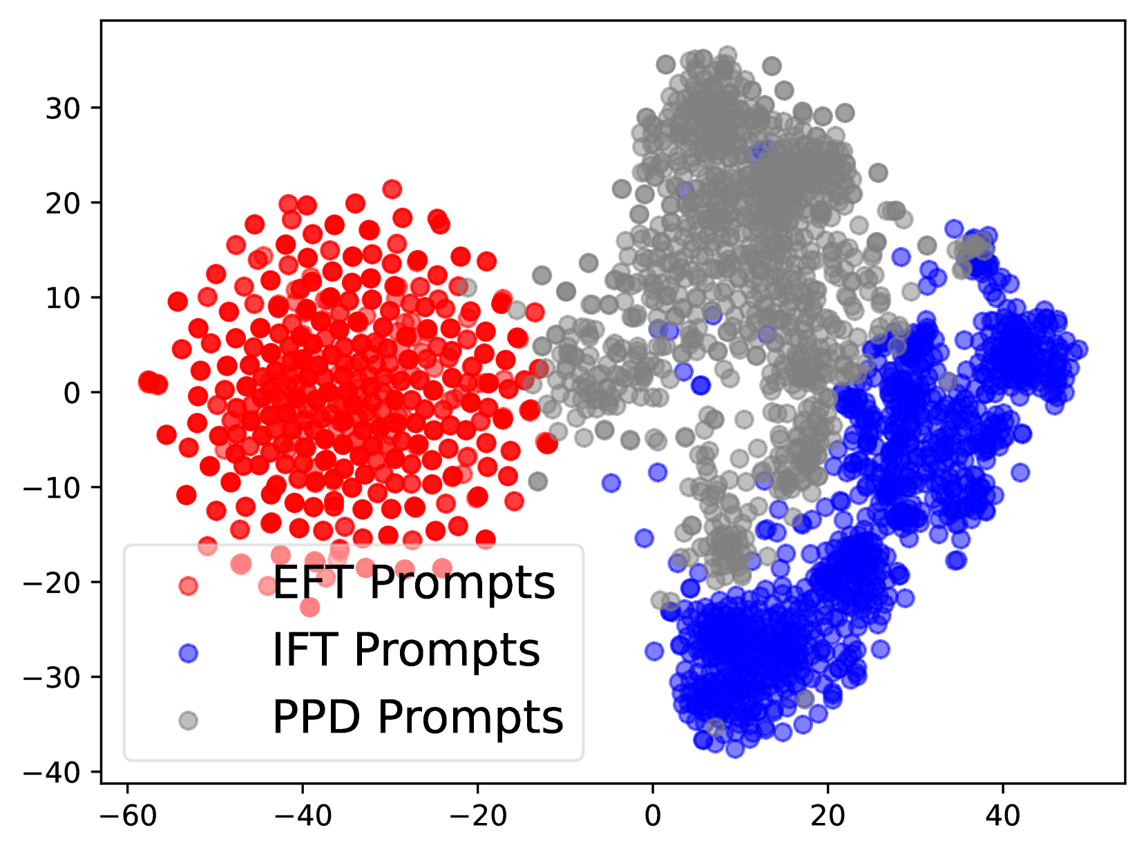
## Scatter Plot: Prompt Performance Comparison
### Overview
This image presents a scatter plot comparing the performance of three types of prompts: EFT Prompts, IFT Prompts, and PPD Prompts. The plot visualizes the distribution of data points across two dimensions, likely representing some form of score or measurement. The data points are color-coded to distinguish between the different prompt types.
### Components/Axes
* **X-axis:** Ranges from approximately -60 to 40. No explicit label is provided, but it likely represents a performance metric.
* **Y-axis:** Ranges from approximately -40 to 30. No explicit label is provided, but it likely represents a performance metric.
* **Legend:** Located in the bottom-left corner.
* **EFT Prompts:** Represented by red circles.
* **IFT Prompts:** Represented by blue circles.
* **PPD Prompts:** Represented by grey circles.
### Detailed Analysis
The plot shows three distinct clusters of data points, corresponding to the three prompt types.
* **EFT Prompts (Red):** These points are concentrated in the left side of the plot, with X-values ranging from approximately -55 to -15 and Y-values ranging from approximately -15 to 15. The distribution appears relatively uniform within this range.
* **IFT Prompts (Blue):** These points are concentrated on the right side of the plot, with X-values ranging from approximately 10 to 40 and Y-values ranging from approximately -35 to 10. The distribution is more vertically spread than the EFT prompts.
* **PPD Prompts (Grey):** These points are spread across the center and right side of the plot, with X-values ranging from approximately -20 to 35 and Y-values ranging from approximately -30 to 30. This distribution is the most dispersed of the three.
Let's extract some approximate data points:
* **EFT Prompts:**
* Approximately (-40, 5)
* Approximately (-20, -10)
* Approximately (-50, 0)
* **IFT Prompts:**
* Approximately (25, -20)
* Approximately (35, 5)
* Approximately (15, -30)
* **PPD Prompts:**
* Approximately (-10, 20)
* Approximately (20, 10)
* Approximately (0, -25)
### Key Observations
* The three prompt types exhibit distinct performance characteristics.
* EFT prompts consistently perform lower on the X-axis (the primary performance metric) compared to IFT and PPD prompts.
* PPD prompts have the widest distribution, indicating greater variability in performance.
* There is some overlap between the IFT and PPD prompt distributions, particularly in the right-center region of the plot.
### Interpretation
The scatter plot suggests that IFT prompts generally outperform EFT prompts on the measured performance metric. PPD prompts show a wider range of performance, potentially indicating sensitivity to specific input conditions or variations in prompt implementation. The distinct clustering of the prompt types suggests that the underlying mechanisms driving their performance are different. The lack of axis labels makes it difficult to provide a more specific interpretation, but the data clearly demonstrates a performance difference between the three prompt types. Further investigation would be needed to understand the factors contributing to the observed performance variations and to determine the optimal prompt type for a given application. The wide spread of PPD prompts could indicate that this prompt type is more sensitive to the specific input it receives, or that there is more variance in the way it is implemented.