## Heatmap: AUROC Performance Comparison
### Overview
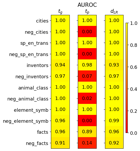
The image is a heatmap displaying AUROC (Area Under the Receiver Operating Characteristic curve) scores for different categories across three models or conditions, labeled as *t<sub>g</sub>*, *t<sub>p</sub>*, and *d<sub>LR</sub>*. The heatmap uses a color gradient from red (0.0) to yellow (1.0) to represent the AUROC values. The categories are listed on the left side of the heatmap.
### Components/Axes
* **Title:** AUROC
* **Columns:**
* *t<sub>g</sub>*
* *t<sub>p</sub>*
* *d<sub>LR</sub>*
* **Rows (Categories):**
* cities
* neg\_cities
* sp\_en\_trans
* neg\_sp\_en\_trans
* inventors
* neg\_inventors
* animal\_class
* neg\_animal\_class
* element\_symb
* neg\_element\_symb
* facts
* neg\_facts
* **Color Scale (Legend):** Located on the right side of the heatmap, ranging from 0.0 (red) to 1.0 (yellow). The scale is linear with increments of 0.2.
### Detailed Analysis or ### Content Details
Here's a breakdown of the AUROC values for each category and model:
* **cities:**
* *t<sub>g</sub>*: 1.00 (yellow)
* *t<sub>p</sub>*: 1.00 (yellow)
* *d<sub>LR</sub>*: 1.00 (yellow)
* **neg\_cities:**
* *t<sub>g</sub>*: 1.00 (yellow)
* *t<sub>p</sub>*: 0.00 (red)
* *d<sub>LR</sub>*: 1.00 (yellow)
* **sp\_en\_trans:**
* *t<sub>g</sub>*: 1.00 (yellow)
* *t<sub>p</sub>*: 1.00 (yellow)
* *d<sub>LR</sub>*: 1.00 (yellow)
* **neg\_sp\_en\_trans:**
* *t<sub>g</sub>*: 1.00 (yellow)
* *t<sub>p</sub>*: 0.00 (red)
* *d<sub>LR</sub>*: 1.00 (yellow)
* **inventors:**
* *t<sub>g</sub>*: 0.94 (yellow)
* *t<sub>p</sub>*: 0.98 (yellow)
* *d<sub>LR</sub>*: 0.93 (yellow)
* **neg\_inventors:**
* *t<sub>g</sub>*: 0.97 (yellow)
* *t<sub>p</sub>*: 0.07 (red)
* *d<sub>LR</sub>*: 0.97 (yellow)
* **animal\_class:**
* *t<sub>g</sub>*: 1.00 (yellow)
* *t<sub>p</sub>*: 1.00 (yellow)
* *d<sub>LR</sub>*: 1.00 (yellow)
* **neg\_animal\_class:**
* *t<sub>g</sub>*: 1.00 (yellow)
* *t<sub>p</sub>*: 0.02 (red)
* *d<sub>LR</sub>*: 1.00 (yellow)
* **element\_symb:**
* *t<sub>g</sub>*: 1.00 (yellow)
* *t<sub>p</sub>*: 1.00 (yellow)
* *d<sub>LR</sub>*: 1.00 (yellow)
* **neg\_element\_symb:**
* *t<sub>g</sub>*: 0.96 (yellow)
* *t<sub>p</sub>*: 0.00 (red)
* *d<sub>LR</sub>*: 0.99 (yellow)
* **facts:**
* *t<sub>g</sub>*: 0.96 (yellow)
* *t<sub>p</sub>*: 0.89 (yellow)
* *d<sub>LR</sub>*: 0.96 (yellow)
* **neg\_facts:**
* *t<sub>g</sub>*: 0.91 (yellow)
* *t<sub>p</sub>*: 0.14 (red)
* *d<sub>LR</sub>*: 0.92 (yellow)
### Key Observations
* The *t<sub>p</sub>* column shows significantly lower AUROC scores for the "neg\_" categories (neg\_cities, neg\_sp\_en\_trans, neg\_inventors, neg\_animal\_class, neg\_element\_symb, neg\_facts) compared to *t<sub>g</sub>* and *d<sub>LR</sub>*.
* The *t<sub>g</sub>* and *d<sub>LR</sub>* columns generally show high AUROC scores (close to 1.00) across all categories.
* The categories "cities", "sp\_en\_trans", "animal\_class", and "element\_symb" have perfect AUROC scores (1.00) for all three models except *t<sub>p</sub>* for "neg\_" categories.
### Interpretation
The heatmap suggests that the *t<sub>p</sub>* model struggles with the "neg\_" categories, indicating a potential issue in handling negative examples or a bias towards positive examples in those specific categories. The *t<sub>g</sub>* and *d<sub>LR</sub>* models perform consistently well across all categories, suggesting they are more robust or better suited for these tasks. The high AUROC scores for "cities", "sp\_en\_trans", "animal\_class", and "element\_symb" across *t<sub>g</sub>* and *d<sub>LR</sub>* indicate strong performance in these categories. The difference in performance between the models highlights the importance of model selection and the impact of data characteristics on model performance.