## Heatmap Chart: AUROC Performance Comparison
### Overview
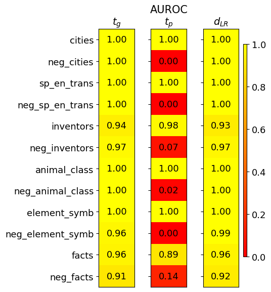
The image displays a heatmap chart titled "AUROC" (Area Under the Receiver Operating Characteristic Curve), comparing the performance of three different methods or models across various datasets or tasks. The chart uses a color gradient from red (low AUROC, ~0.0) to yellow (high AUROC, 1.0) to visualize numerical scores.
### Components/Axes
* **Title:** "AUROC" (centered at the top).
* **Columns (Methods/Models):** Three vertical columns, labeled from left to right:
1. `t_g`
2. `t_p`
3. `d_{LR}`
* **Rows (Datasets/Tasks):** Twelve horizontal rows, labeled from top to bottom:
1. `cities`
2. `neg_cities`
3. `sp_en_trans`
4. `neg_sp_en_trans`
5. `inventors`
6. `neg_inventors`
7. `animal_class`
8. `neg_animal_class`
9. `element_symb`
10. `neg_element_symb`
11. `facts`
12. `neg_facts`
* **Color Scale/Legend:** A vertical color bar is positioned on the far right of the chart. It maps colors to AUROC values, ranging from **0.0 (red)** at the bottom to **1.0 (yellow)** at the top, with intermediate markers at 0.2, 0.4, 0.6, and 0.8.
* **Data Cells:** Each cell in the grid contains a numerical AUROC value (to two decimal places) and is colored according to the scale.
### Detailed Analysis
The following table reconstructs the data from the heatmap. Values are transcribed directly from the image.
| Dataset/Task | `t_g` | `t_p` | `d_{LR}` |
|-------------------|-------|-------|----------|
| cities | 1.00 | 1.00 | 1.00 |
| neg_cities | 1.00 | 0.00 | 1.00 |
| sp_en_trans | 1.00 | 1.00 | 1.00 |
| neg_sp_en_trans | 1.00 | 0.00 | 1.00 |
| inventors | 0.94 | 0.98 | 0.93 |
| neg_inventors | 0.97 | 0.07 | 0.97 |
| animal_class | 1.00 | 1.00 | 1.00 |
| neg_animal_class | 1.00 | 0.02 | 1.00 |
| element_symb | 1.00 | 1.00 | 1.00 |
| neg_element_symb | 0.96 | 0.00 | 0.99 |
| facts | 0.96 | 0.89 | 0.96 |
| neg_facts | 0.91 | 0.14 | 0.92 |
**Trend Verification by Column:**
* **`t_g` (Left Column):** The visual trend is overwhelmingly high performance (yellow). The line of values slopes very slightly downward from perfect 1.00 scores at the top to a low of 0.91 for `neg_facts` at the bottom. All values are ≥ 0.91.
* **`t_p` (Middle Column):** The visual trend is highly variable, showing a stark contrast between positive and negative datasets. It displays a "checkerboard" pattern: bright yellow (1.00) for most positive datasets (`cities`, `sp_en_trans`, `animal_class`, `element_symb`) and deep red (0.00-0.14) for their corresponding negative counterparts (`neg_cities`, `neg_sp_en_trans`, `neg_animal_class`, `neg_element_symb`). The `inventors`/`neg_inventors` and `facts`/`neg_facts` pairs show a less extreme but still significant drop.
* **`d_{LR}` (Right Column):** The visual trend is very similar to `t_g`—consistently high performance (yellow) across all rows, with a slight dip for `neg_facts` (0.92). All values are ≥ 0.92.
### Key Observations
1. **Perfect Scores:** The datasets `cities`, `sp_en_trans`, `animal_class`, and `element_symb` achieve a perfect AUROC of 1.00 across all three methods (`t_g`, `t_p`, `d_{LR}`).
2. **Catastrophic Failure on Negative Sets for `t_p`:** The `t_p` method shows near-total failure (AUROC ≈ 0.00) on the negative versions of the perfect-scoring datasets: `neg_cities`, `neg_sp_en_trans`, `neg_animal_class`, and `neg_element_symb`.
3. **Robustness of `t_g` and `d_{LR}`:** Both the `t_g` and `d_{LR}` methods maintain high performance (AUROC > 0.90) on *all* datasets, including the negative ones. Their performance is remarkably stable and similar to each other.
4. **Most Challenging Dataset:** The `neg_facts` dataset appears to be the most challenging overall, yielding the lowest scores for `t_g` (0.91) and `d_{LR}` (0.92), and a very low score for `t_p` (0.14).
5. **Intermediate Performance:** The `inventors` and `facts` datasets (and their negatives) show high but not perfect performance for `t_g` and `d_{LR}`, and a significant but not complete performance collapse for `t_p` on the negative versions.
### Interpretation
This heatmap likely evaluates the robustness or generalization capability of three different models or techniques (`t_g`, `t_p`, `d_{LR}`) on binary classification tasks. The "positive" datasets (e.g., `cities`) and their "negative" counterparts (e.g., `neg_cities`) are probably designed to test specific failure modes, such as performance on out-of-distribution data, adversarial examples, or counterfactual instances.
The data suggests a critical finding: **The `t_p` method is highly brittle.** It performs perfectly on standard tasks but fails completely when presented with the "negative" or challenging variant of those same tasks. This indicates it may have overfitted to spurious correlations or specific patterns in the primary data that are absent or inverted in the negative sets.
In contrast, **`t_g` and `d_{LR}` demonstrate strong robustness.** Their consistently high scores across both positive and negative datasets imply they have learned more fundamental, generalizable features of the tasks, making them reliable even under distribution shift or adversarial conditions. The near-identical performance of `t_g` and `d_{LR}` might suggest they are related methods or share a common robust design principle.
The investigation points to `t_g` or `d_{LR}` as the preferable methods for real-world applications where data may be noisy, shifted, or intentionally deceptive, while `t_p` carries a high risk of silent failure on specific, predictable data types.