\n
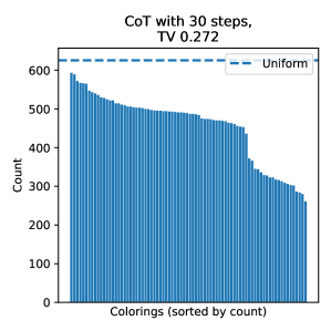
## Bar Chart: Colorings (sorted by count)
### Overview
The image presents a bar chart visualizing the distribution of "Colorings" sorted by their count. The chart displays the frequency of each coloring, with the x-axis representing the colorings and the y-axis representing the count. A horizontal dashed line indicates a uniform distribution for comparison. The chart is titled "CoT with 30 steps, TV 0.272".
### Components/Axes
* **Title:** "CoT with 30 steps, TV 0.272" (top-center)
* **X-axis Label:** "Colorings (sorted by count)" (bottom-center)
* **Y-axis Label:** "Count" (left-center)
* **Legend:** Located in the top-right corner, with a single entry: "Uniform" (blue dashed line).
* **Data Series:** A series of blue bars representing the count of each coloring.
* **Uniform Line:** A horizontal blue dashed line representing a uniform distribution.
### Detailed Analysis
The chart consists of approximately 40-50 bars. The bars are sorted in descending order of count.
* **Initial Bars:** The first few bars (leftmost) have a count of approximately 600.
* **Decreasing Trend:** The counts generally decrease as you move from left to right.
* **Plateau:** After an initial steep decline, the rate of decrease slows down, and the bars appear to plateau around a count of 400-500 for a period.
* **Final Bars:** The last few bars (rightmost) have counts around 300.
* **Uniform Line Value:** The horizontal dashed line representing the uniform distribution is positioned at a count of approximately 620.
Here's a rough approximation of the counts for the first few and last few bars:
* Bar 1: ~600
* Bar 5: ~560
* Bar 10: ~520
* Bar 20: ~440
* Bar 30: ~380
* Bar 40: ~320
* Bar 45 (approximate last bar): ~300
### Key Observations
* The distribution of colorings is not uniform. The counts are higher for certain colorings and lower for others.
* The distribution is right-skewed, meaning there are a few colorings with very high counts and many colorings with low counts.
* The "Uniform" line provides a baseline for comparison, and the observed distribution deviates significantly from it.
* The initial steep decline suggests that a relatively small number of colorings account for a large proportion of the total count.
### Interpretation
The chart demonstrates the distribution of colorings obtained after 30 steps of a "CoT" (Chain of Thought) process, with a TV (Total Variation) value of 0.272. The fact that the distribution is not uniform suggests that the CoT process is not generating colorings randomly. Instead, it is favoring certain colorings over others. The TV value likely quantifies the degree of non-uniformity.
The deviation from the uniform distribution indicates that the CoT process is introducing some bias or structure into the generation of colorings. This could be due to the specific parameters of the CoT process or the nature of the problem being solved. The right-skewed distribution suggests that a few dominant colorings are emerging, while many others remain relatively rare. This could indicate that the CoT process is converging towards a particular solution or set of solutions.
The chart provides insights into the behavior of the CoT process and its ability to explore the space of possible colorings. The non-uniform distribution suggests that the CoT process is not simply generating random solutions but is actively searching for promising ones.