\n
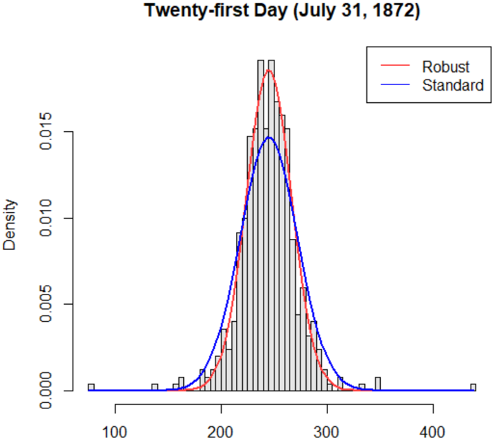
## Chart: Distribution Comparison - Robust vs. Standard (July 31, 1872)
### Overview
The image presents a comparative histogram showing the distribution of a dataset on July 31, 1872, using two different methods: "Robust" and "Standard". The chart displays density on the y-axis against values ranging from approximately 100 to 400 on the x-axis. Both distributions are visually similar, with a central peak around 250, but exhibit slight differences in their tails.
### Components/Axes
* **Title:** "Twenty-first Day (July 31, 1872)" - positioned at the top-center of the image.
* **X-axis:** Labeled implicitly by the range of values displayed (approximately 100 to 400). No explicit label is present.
* **Y-axis:** Labeled "Density" - positioned on the left side of the chart. The scale ranges from approximately 0.00 to 0.015.
* **Legend:** Located in the top-right corner.
* "Robust" - represented by a red line.
* "Standard" - represented by a blue line.
* **Data Representation:** Histograms with overlaid density curves. The histograms are composed of vertical bars of varying heights.
### Detailed Analysis
The chart shows two distributions.
**Robust (Red Line):**
The density curve for the Robust method initially rises from approximately x=150, reaches a peak density of approximately 0.013 at around x=250, and then declines, approaching zero around x=350. The histogram shows a concentration of data points around the peak, with fewer points at the extremes.
**Standard (Blue Line):**
The density curve for the Standard method also rises from approximately x=150, peaks at a density of approximately 0.012 at around x=250, and then declines, approaching zero around x=350. The histogram mirrors the Robust histogram in shape, with a similar concentration of data around the peak.
**Approximate Data Points (Extracted from visual estimation):**
| X-Value | Robust Density (approx.) | Standard Density (approx.) |
|---|---|---|
| 150 | 0.001 | 0.001 |
| 200 | 0.005 | 0.004 |
| 250 | 0.013 | 0.012 |
| 300 | 0.006 | 0.005 |
| 350 | 0.001 | 0.001 |
The Robust distribution appears to have slightly heavier tails than the Standard distribution, meaning it has a greater proportion of values further from the mean.
### Key Observations
* Both distributions are approximately symmetrical and unimodal (single peak).
* The peak of both distributions is located around x=250.
* The Robust distribution has a slightly wider spread and heavier tails compared to the Standard distribution.
* The difference between the two distributions is most noticeable in the tails.
### Interpretation
The chart compares two methods ("Robust" and "Standard") for estimating the distribution of a dataset. The fact that both methods produce similar distributions suggests that they are both reasonable approaches for this data. However, the slight differences in the tails indicate that the Robust method may be less sensitive to outliers or extreme values than the Standard method. This could be beneficial if the dataset contains errors or unusual observations. The title "Twenty-first Day (July 31, 1872)" suggests this data is part of a time series, and the comparison is being made on a specific date. Without further context, it's difficult to determine the nature of the data being analyzed, but the chart provides valuable insights into the distribution and potential differences between the two estimation methods. The data suggests a central tendency around 250, with a relatively narrow spread, indicating a consistent dataset.