## Histogram with Density Curves: Twenty-first Day (July 31, 1872)
### Overview
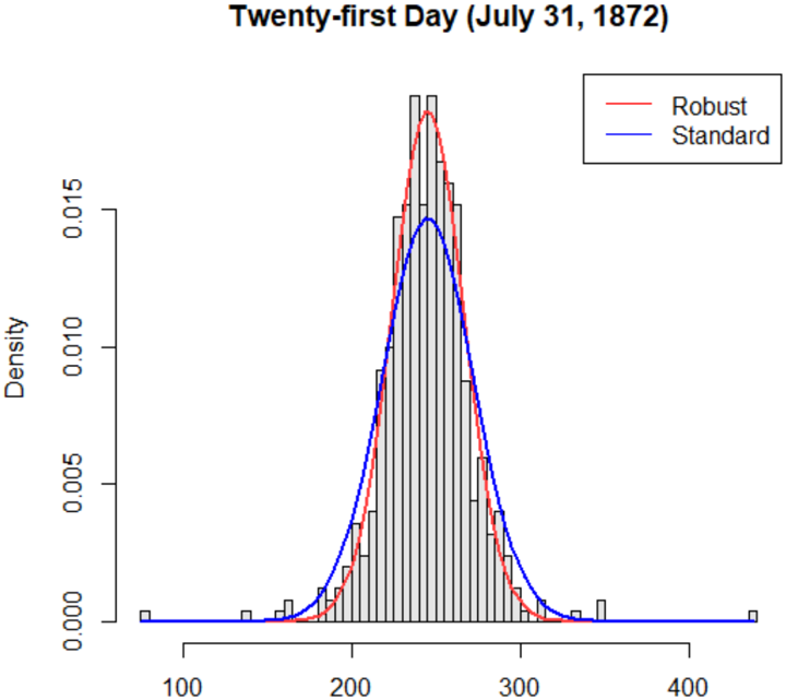
The image is a histogram overlaid with two density curves: a red "Robust" curve and a blue "Standard" curve. The x-axis is labeled "Density" with values ranging from 100 to 400, while the y-axis is also labeled "Density" with values from 0.000 to 0.015. The legend is positioned in the top-right corner, associating red with "Robust" and blue with "Standard". The histogram bars are gray, and the curves are smooth, suggesting a comparison of distributions.
### Components/Axes
- **X-axis**: Labeled "Density", with values from 100 to 400.
- **Y-axis**: Labeled "Density", with values from 0.000 to 0.015.
- **Legend**: Top-right corner, with red for "Robust" and blue for "Standard".
- **Histogram Bars**: Gray, with varying heights across the x-axis range.
### Detailed Analysis
- **Red Curve (Robust)**:
- Peaks sharply around **250** on the x-axis.
- The curve is narrower, with a maximum density of approximately **0.012**.
- The curve declines symmetrically on both sides of the peak.
- **Blue Curve (Standard)**:
- Peaks slightly lower (around **275**) with a maximum density of approximately **0.010**.
- The curve is broader, with a more gradual decline.
- **Histogram Bars**:
- The bars are tallest between **200–300** on the x-axis, aligning with the peaks of both curves.
- The bars are evenly spaced, with heights decreasing toward the edges of the x-axis range.
### Key Observations
1. The **Robust** curve has a higher peak and narrower spread compared to the **Standard** curve.
2. The **Standard** curve is broader, indicating greater variability in the data.
3. Both curves align with the histogram’s tallest bars, suggesting the data is concentrated around the 200–300 range.
4. The x-axis label "Density" is ambiguous, as it typically refers to the y-axis in standard histograms. This may indicate a mislabeling or unconventional axis configuration.
### Interpretation
The chart compares two distributions: "Robust" and "Standard". The **Robust** distribution is more concentrated, suggesting lower variability or a more precise measurement, while the **Standard** distribution is broader, indicating higher variability. The date "July 31, 1872" may contextualize the data, potentially relating to historical records (e.g., economic, social, or scientific metrics). The overlapping of the curves with the histogram bars implies that both models approximate the same underlying data, but with differing assumptions about distribution shape. The ambiguity in axis labeling ("Density" for both axes) could lead to misinterpretation, as the x-axis likely represents a variable (e.g., "Value" or "Measurement") rather than density itself.
### Spatial Grounding
- **Legend**: Top-right corner, clearly associating red with "Robust" and blue with "Standard".
- **Curves**: Overlaid on the histogram, with the red curve positioned slightly to the left of the blue curve.
- **Histogram Bars**: Gray, with heights concentrated between 200–300 on the x-axis.
### Trend Verification
- **Robust Curve**: Slopes upward to a peak at ~250, then declines symmetrically.
- **Standard Curve**: Slopes upward to a peak at ~275, then declines more gradually.
- **Histogram Bars**: Tallest between 200–300, with decreasing heights toward the edges.
### Content Details
- **X-axis Values**: 100–400 (labeled "Density").
- **Y-axis Values**: 0.000–0.015 (labeled "Density").
- **Peak Densities**:
- Robust: ~0.012 at x ≈ 250.
- Standard: ~0.010 at x ≈ 275.
- **Histogram Bar Heights**: Vary between 0.000 and 0.015, with the tallest bars near the curve peaks.
### Notable Anomalies
- The x-axis label "Density" conflicts with standard histogram conventions, where the x-axis typically represents the variable being measured. This may indicate a mislabeling or unconventional axis configuration.
- The red curve (Robust) is narrower and higher than the blue curve (Standard), suggesting a trade-off between precision and spread in the two models.
### Conclusion
The chart illustrates a comparison between two statistical models ("Robust" and "Standard") applied to data from July 31, 1872. The **Robust** model exhibits a more concentrated distribution, while the **Standard** model shows greater variability. The overlapping of the curves with the histogram bars suggests both models approximate the same data, but with differing assumptions about distribution shape. The ambiguity in axis labeling ("Density" for both axes) warrants clarification to avoid misinterpretation. The historical context of the date may provide additional insights into the data’s significance.