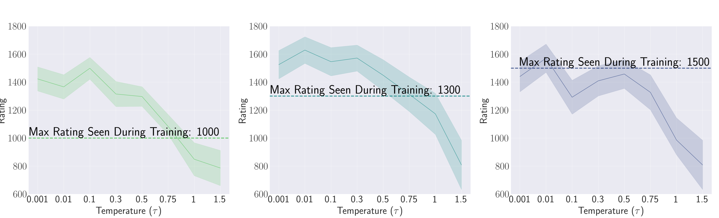
# Technical Data Extraction: Rating vs. Temperature ($\tau$) Analysis
This document provides a comprehensive extraction of data from three line charts illustrating the relationship between "Rating" and "Temperature ($\tau$)" across different training thresholds.
## 1. General Layout and Shared Axes
The image consists of three side-by-side line charts. Each chart shares the same axis scales and labels.
* **Y-Axis (Vertical):**
* **Label:** Rating
* **Range:** 600 to 1800
* **Major Tick Marks:** 600, 800, 1000, 1200, 1400, 1600, 1800
* **X-Axis (Horizontal):**
* **Label:** Temperature ($\tau$)
* **Scale:** Non-linear/Categorical sampling
* **Values:** 0.001, 0.01, 0.1, 0.3, 0.5, 0.75, 1, 1.5
* **Visual Elements:** Each chart contains a solid central line representing the mean/median, a shaded area representing a confidence interval or variance, and a horizontal dashed line representing a training baseline.
---
## 2. Component Analysis
### Chart 1 (Left): Green Series
* **Baseline:** A horizontal dashed green line is set at **1000**.
* **Text Annotation:** "Max Rating Seen During Training: 1000" (positioned above the dashed line).
* **Trend Description:** The rating starts high at low temperatures, peaks slightly at $\tau=0.1$, and then undergoes a significant downward slope as temperature increases beyond 0.5.
| Temperature ($\tau$) | Approximate Rating |
| :--- | :--- |
| 0.001 | 1420 |
| 0.01 | 1380 |
| 0.1 | 1500 (Peak) |
| 0.3 | 1320 |
| 0.5 | 1300 |
| 0.75 | 1050 |
| 1 | 850 |
| 1.5 | 800 |
### Chart 2 (Center): Teal Series
* **Baseline:** A horizontal dashed teal line is set at **1300**.
* **Text Annotation:** "Max Rating Seen During Training: 1300" (positioned above the dashed line).
* **Trend Description:** The rating remains relatively stable and well above the training baseline for low temperatures ($\tau \le 0.3$), followed by a steady decline. It crosses below the training baseline between $\tau=0.75$ and $\tau=1$.
| Temperature ($\tau$) | Approximate Rating |
| :--- | :--- |
| 0.001 | 1520 |
| 0.01 | 1620 (Peak) |
| 0.1 | 1550 |
| 0.3 | 1580 |
| 0.5 | 1450 |
| 0.75 | 1320 |
| 1 | 1180 |
| 1.5 | 820 |
### Chart 3 (Right): Dark Blue Series
* **Baseline:** A horizontal dashed dark blue line is set at **1500**.
* **Text Annotation:** "Max Rating Seen During Training: 1500" (positioned above the dashed line).
* **Trend Description:** This series shows more volatility at low temperatures. It peaks early at $\tau=0.01$, drops sharply at $\tau=0.1$, recovers slightly, and then enters a steep decline after $\tau=0.5$. It stays mostly below the training baseline for all values $\tau \ge 0.1$.
| Temperature ($\tau$) | Approximate Rating |
| :--- | :--- |
| 0.001 | 1450 |
| 0.01 | 1580 (Peak) |
| 0.1 | 1300 |
| 0.3 | 1420 |
| 0.5 | 1450 |
| 0.75 | 1320 |
| 1 | 1000 |
| 1.5 | 820 |
---
## 3. Summary of Key Findings
1. **Inverse Relationship:** In all three scenarios, there is a clear inverse relationship between Temperature ($\tau$) and Rating for values of $\tau > 0.5$. Higher temperatures consistently lead to lower ratings.
2. **Generalization vs. Training:**
* In the **1000 baseline** chart, the model maintains a rating above its training maximum for most of the temperature range until $\tau \approx 0.8$.
* In the **1300 baseline** chart, the model exceeds its training maximum only at lower temperatures ($\tau < 0.75$).
* In the **1500 baseline** chart, the model struggles to exceed the training maximum, only doing so briefly around $\tau=0.01$.
3. **Convergence:** Regardless of the starting "Max Rating Seen During Training," all three models converge toward a similar low rating (between 600 and 900) as the temperature reaches 1.5.