# Technical Document Extraction: Temperature-Rating Analysis
## Chart Structure Overview
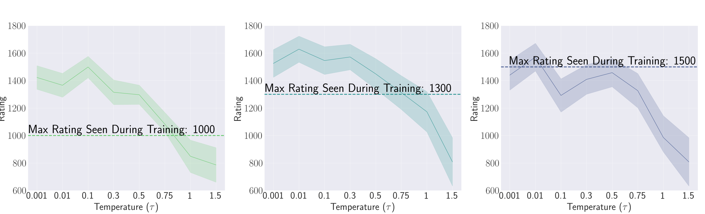
Three line plots are presented, each depicting the relationship between **Temperature (τ)** and **Rating**. All charts share identical axis labels and scales but differ in line color, trend, and annotated maximum ratings.
---
### Chart 1: Green Line (Max Rating: 1000)
**Legend**: Right-aligned, green line labeled *"Max Rating Seen During Training: 1000"*
**Trend**: Gradual downward slope from left to right.
**Key Data Points**:
- τ = 0.001 → Rating = 1400
- τ = 0.01 → Rating = 1350
- τ = 0.1 → Rating = 1500 (peak)
- τ = 0.3 → Rating = 1300
- τ = 0.5 → Rating = 1250
- τ = 1 → Rating = 1000
- τ = 1.5 → Rating = 800
**Annotation**: *"Max Rating Seen During Training: 1000"* (dashed green line at y=1000).
---
### Chart 2: Teal Line (Max Rating: 1300)
**Legend**: Right-aligned, teal line labeled *"Max Rating Seen During Training: 1300"*
**Trend**: Steeper decline compared to Chart 1.
**Key Data Points**:
- τ = 0.001 → Rating = 1500
- τ = 0.01 → Rating = 1600 (peak)
- τ = 0.1 → Rating = 1550
- τ = 0.3 → Rating = 1500
- τ = 0.5 → Rating = 1400
- τ = 1 → Rating = 1200
- τ = 1.5 → Rating = 900
**Annotation**: *"Max Rating Seen During Training: 1300"* (dashed teal line at y=1300).
---
### Chart 3: Blue Line (Max Rating: 1500)
**Legend**: Right-aligned, blue line labeled *"Max Rating Seen During Training: 1500"*
**Trend**: Moderate decline with fluctuations.
**Key Data Points**:
- τ = 0.001 → Rating = 1400
- τ = 0.01 → Rating = 1600 (peak)
- τ = 0.1 → Rating = 1450
- τ = 0.3 → Rating = 1500
- τ = 0.5 → Rating = 1400
- τ = 1 → Rating = 1200
- τ = 1.5 → Rating = 1000
**Annotation**: *"Max Rating Seen During Training: 1500"* (dashed blue line at y=1500).
---
### Common Elements Across All Charts
1. **Axes**:
- **X-axis**: Temperature (τ) ranging from 0.001 to 1.5 (logarithmic scale).
- **Y-axis**: Rating ranging from 600 to 1800.
2. **Shading**: Semi-transparent bands around each line indicate confidence intervals or variability.
3. **Annotations**: Dashed horizontal lines at the maximum rating values for each chart.
---
### Observations
- **Inverse Relationship**: All charts show a general decline in rating as temperature increases.
- **Peak Ratings**:
- Chart 1: 1500 at τ = 0.1.
- Chart 2: 1600 at τ = 0.01.
- Chart 3: 1600 at τ = 0.01.
- **Divergence**: Chart 2 exhibits the steepest decline, while Chart 3 shows the most stable trend.
---
### Legend Spatial Grounding
- All legends are positioned on the **right side** of their respective charts.
- Color consistency confirmed:
- Green → Chart 1 (1000).
- Teal → Chart 2 (1300).
- Blue → Chart 3 (1500).
---
### Conclusion
The charts illustrate how maximum ratings during training correlate with temperature thresholds. Higher initial ratings (e.g., 1600) correlate with sharper declines, suggesting sensitivity to temperature variations.