\n
## Diagram: Annealing Landscape
### Overview
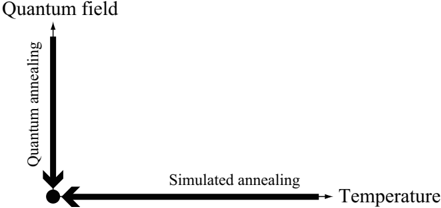
The image is a 2D diagram illustrating the relationship between temperature and annealing methods – Quantum Annealing and Simulated Annealing. It depicts a conceptual space where these methods operate, with temperature on the horizontal axis and the degree of annealing on the vertical axis. A single data point is shown in the bottom-left corner.
### Components/Axes
* **X-axis:** Labeled "Temperature", with an arrow indicating increasing temperature to the right.
* **Y-axis:** Labeled "Quantum annealing" at the top and "Quantum field" at the bottom, with an arrow indicating increasing annealing to the top.
* **Annotation:** "Simulated annealing" is written along the positive x-axis.
* **Data Point:** A filled black circle is located at the origin (approximately (0,0)).
### Detailed Analysis
The diagram shows a coordinate system with two axes representing temperature and annealing. The x-axis, labeled "Temperature", extends horizontally to the right, indicating increasing temperature. The y-axis, labeled "Quantum annealing" at the top and "Quantum field" at the bottom, extends vertically upwards, indicating increasing annealing. The annotation "Simulated annealing" is placed along the positive x-axis.
A single black circle is positioned at the origin of the coordinate system. This point represents a state of low temperature and low annealing. There are no other data points or curves present in the diagram.
### Key Observations
The diagram is highly conceptual and lacks quantitative data. The single data point suggests a starting point or a specific condition within the annealing landscape. The placement of "Simulated annealing" along the x-axis implies that it operates at varying temperatures. The diagram does not show any relationship between the two annealing methods.
### Interpretation
The diagram illustrates a conceptual space for understanding annealing processes. The x-axis represents the temperature parameter, while the y-axis represents the degree of annealing. The diagram suggests that simulated annealing operates across a range of temperatures, while the single point indicates a specific state for quantum annealing. The diagram is a simplified representation and does not provide detailed information about the behavior of these methods. It appears to be a qualitative illustration of the parameter space rather than a quantitative analysis of annealing performance. The absence of curves or additional data points limits the ability to draw more specific conclusions. The diagram is likely intended to provide a high-level overview of the relationship between temperature and annealing methods, rather than a precise depiction of their behavior.