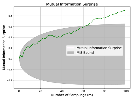
## Line Chart with Confidence Interval: Mutual Information Surprise
### Overview
The image displays a line chart titled "Mutual Information Surprise," plotting a metric against the number of samplings. The chart includes a primary data series (a green line) and a shaded gray region representing a bound or confidence interval. The overall trend shows the metric increasing with the number of samplings, while the uncertainty (bound) also expands.
### Components/Axes
* **Chart Title:** "Mutual Information Surprise" (centered at the top).
* **X-Axis:**
* **Label:** "Number of Samplings (m)"
* **Scale:** Linear, ranging from 0 to 100.
* **Major Tick Marks:** 0, 20, 40, 60, 80, 100.
* **Y-Axis:**
* **Label:** "Mutual Information Surprise"
* **Scale:** Linear, ranging from approximately -0.2 to 0.45.
* **Major Tick Marks:** -0.2, -0.1, 0.0, 0.1, 0.2, 0.3, 0.4.
* **Legend:** Located in the top-left quadrant of the plot area.
* **Green Line Symbol:** Labeled "Mutual Information Surprise".
* **Gray Rectangle Symbol:** Labeled "MIS Bound".
* **Grid:** A light gray grid is present, aligning with the major tick marks on both axes.
### Detailed Analysis
**1. Primary Data Series (Green Line - "Mutual Information Surprise"):**
* **Trend Verification:** The line exhibits a clear, generally upward trend from left to right, with noticeable local fluctuations (ups and downs) along its path.
* **Data Point Extraction (Approximate):**
* At m=0: y ≈ 0.0
* At m=10: y ≈ 0.1
* At m=20: y ≈ 0.2
* At m=30: y ≈ 0.22 (local peak before a small dip)
* At m=40: y ≈ 0.25
* At m=50: y ≈ 0.28
* At m=60: y ≈ 0.3
* At m=70: y ≈ 0.38
* At m=80: y ≈ 0.4
* At m=90: y ≈ 0.42
* At m=100: y ≈ 0.45 (final point, highest value)
**2. Shaded Region (Gray Area - "MIS Bound"):**
* **Description:** This region represents a bound or interval around the primary metric. It is narrow at low sampling numbers and expands significantly as the number of samplings increases.
* **Spatial Grounding & Bounds:**
* **Lower Bound:** Starts near y=0 at m=0. It decreases, reaching approximately y=-0.2 by m=100.
* **Upper Bound:** Starts near y=0 at m=0. It increases, reaching approximately y=0.33 by m=100.
* The green data line remains within this gray bound for the entire plotted range.
### Key Observations
1. **Positive Correlation:** There is a strong positive correlation between the "Number of Samplings (m)" and the "Mutual Information Surprise" value.
2. **Increasing Uncertainty:** The "MIS Bound" widens dramatically as `m` increases, indicating that the potential range or uncertainty of the surprise metric grows with more data/samples.
3. **Non-Monotonic Growth:** While the overall trend is upward, the green line is not smooth; it contains several small-scale fluctuations, suggesting variability in the metric's calculation at different sampling points.
4. **Bound Asymmetry:** The expansion of the MIS Bound is asymmetric. The lower bound decreases more sharply (to -0.2) than the upper bound increases (to ~0.33) relative to the central trend line.
### Interpretation
This chart likely visualizes a concept from information theory or statistics, possibly related to active learning, Bayesian optimization, or anomaly detection. "Mutual Information Surprise" could quantify how informative or unexpected a new data point is given a model or prior knowledge.
* **What the data suggests:** The upward trend indicates that as more samples are collected (increasing `m`), the cumulative or average "surprise" or information gain increases. This is intuitive—more data should lead to more information.
* **Relationship between elements:** The green line shows the estimated or measured value of the surprise metric. The gray "MIS Bound" likely represents a theoretical confidence interval, a posterior variance, or a bound on the possible values of this metric. Its expansion signifies that with more observations, the *potential* for extreme surprise values (both high and low) also increases, even if the measured value trends upward.
* **Notable implications:** The fact that the measured value (green line) trends toward the upper part of the expanding bound suggests the process is generating information at a rate that consistently challenges expectations. The asymmetry of the bound might indicate a skewed underlying distribution or a one-sided constraint on the metric. This visualization is crucial for understanding not just the expected information gain, but also the risk or variability associated with it as an experiment progresses.