## Bar Chart: Hallucination and Association Percentages by Category
### Overview
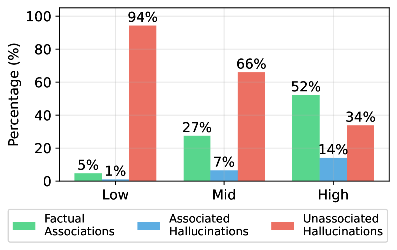
The image is a grouped bar chart displaying the percentage distribution of three types of outputs—Factual Associations, Associated Hallucinations, and Unassociated Hallucinations—across three categories labeled "Low," "Mid," and "High." The chart visually compares how the prevalence of these output types changes across the categories.
### Components/Axes
* **Chart Type:** Grouped bar chart.
* **X-Axis (Horizontal):** Represents categorical groups. The labels, from left to right, are **"Low"**, **"Mid"**, and **"High"**.
* **Y-Axis (Vertical):** Represents a percentage scale. The axis title is **"Percentage (%)"**. The scale runs from 0 to 100, with major tick marks and labels at intervals of 20 (0, 20, 40, 60, 80, 100).
* **Legend:** Positioned at the bottom center of the chart. It defines three data series by color:
* **Green square:** "Factual Associations"
* **Blue square:** "Associated Hallucinations"
* **Red square:** "Unassociated Hallucinations"
* **Data Labels:** Each bar has a numerical percentage value displayed directly above it.
### Detailed Analysis
The data is grouped by the three x-axis categories. Each group contains three bars corresponding to the legend.
**1. Category: Low**
* **Factual Associations (Green Bar):** 5%
* **Associated Hallucinations (Blue Bar):** 1%
* **Unassociated Hallucinations (Red Bar):** 94%
* **Trend within Group:** The "Unassociated Hallucinations" bar is overwhelmingly dominant, nearly reaching the top of the chart. The other two categories are minimal.
**2. Category: Mid**
* **Factual Associations (Green Bar):** 27%
* **Associated Hallucinations (Blue Bar):** 7%
* **Unassociated Hallucinations (Red Bar):** 66%
* **Trend within Group:** "Unassociated Hallucinations" remains the largest category but has decreased significantly from the "Low" group. "Factual Associations" shows a notable increase.
**3. Category: High**
* **Factual Associations (Green Bar):** 52%
* **Associated Hallucinations (Blue Bar):** 14%
* **Unassociated Hallucinations (Red Bar):** 34%
* **Trend within Group:** "Factual Associations" is now the largest category. "Unassociated Hallucinations" has dropped to its lowest point. "Associated Hallucinations" has increased but remains the smallest category.
### Key Observations
* **Inverse Relationship:** There is a clear inverse relationship between the "Unassociated Hallucinations" (red) and "Factual Associations" (green) series. As one increases across the Low→Mid→High categories, the other decreases.
* **Dominant Shift:** The dominant output type shifts completely from "Unassociated Hallucinations" in the "Low" category to "Factual Associations" in the "High" category.
* **Associated Hallucinations Trend:** The "Associated Hallucinations" (blue) series shows a steady, monotonic increase from 1% to 14% across the categories, but it remains the minority output in all cases.
* **Summation Check:** For each category, the three percentages sum to 100% (Low: 5+1+94=100; Mid: 27+7+66=100; High: 52+14+34=100), confirming the data represents a complete distribution.
### Interpretation
The chart demonstrates a strong correlation between the categorical label (Low, Mid, High) and the quality or type of output generated by a system, likely an AI model. The "Low" category is characterized by a very high rate of "Unassociated Hallucinations" (94%), suggesting outputs that are not grounded in or related to the source material. As we move to "Mid" and then "High," the system's outputs become progressively more grounded, with "Factual Associations" rising to become the majority (52%) in the "High" category.
This suggests that the "Low," "Mid," and "High" labels may represent a measure of input quality, model confidence, or training data relevance. The data implies that under "High" conditions, the system is far more reliable, producing factual associations more often than unassociated hallucinations. The steady rise in "Associated Hallucinations" (plausible but incorrect associations) is a notable secondary trend, indicating that even as overall accuracy improves, a specific type of error becomes slightly more common. The chart effectively visualizes a trade-off or transition between error types and factual accuracy across different operational contexts.