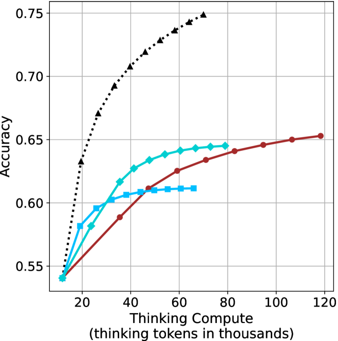
## Line Chart: Accuracy vs. Thinking Compute
### Overview
The image is a line chart plotting model accuracy against computational effort, measured in "thinking tokens." It displays four distinct data series, each representing a different model or method, showing how their performance scales with increased compute. The chart demonstrates a clear positive correlation between thinking compute and accuracy for all series, though the rate of improvement varies significantly.
### Components/Axes
* **X-Axis (Horizontal):**
* **Label:** "Thinking Compute (thinking tokens in thousands)"
* **Scale:** Linear scale from 0 to 120, with major tick marks at 20, 40, 60, 80, 100, and 120.
* **Y-Axis (Vertical):**
* **Label:** "Accuracy"
* **Scale:** Linear scale from 0.55 to 0.75, with major tick marks at 0.55, 0.60, 0.65, 0.70, and 0.75.
* **Data Series (Legend inferred from visual markers):**
1. **Black Dotted Line with Upward-Pointing Triangles:** Positioned as the top-most line.
2. **Red Solid Line with Circles:** Positioned as the second-highest line at higher compute values.
3. **Cyan Solid Line with Diamonds:** Positioned in the middle range.
4. **Cyan Solid Line with Squares:** Positioned as the lowest line after the initial points.
### Detailed Analysis
**Trend Verification & Data Point Extraction (Approximate Values):**
* **Series 1: Black Dotted Line (Triangles)**
* **Trend:** Shows the steepest initial increase in accuracy, rising sharply from low compute and continuing to climb steadily, though the slope decreases slightly at higher values. It consistently achieves the highest accuracy.
* **Data Points:**
* At ~10k tokens: Accuracy ≈ 0.54
* At ~20k tokens: Accuracy ≈ 0.63
* At ~30k tokens: Accuracy ≈ 0.67
* At ~40k tokens: Accuracy ≈ 0.70
* At ~50k tokens: Accuracy ≈ 0.72
* At ~60k tokens: Accuracy ≈ 0.73
* At ~70k tokens: Accuracy ≈ 0.74
* At ~80k tokens: Accuracy ≈ 0.75 (final point)
* **Series 2: Red Solid Line (Circles)**
* **Trend:** Shows a steady, near-linear increase in accuracy across the entire compute range. It starts lower than the cyan lines but surpasses them as compute increases.
* **Data Points:**
* At ~10k tokens: Accuracy ≈ 0.54
* At ~40k tokens: Accuracy ≈ 0.59
* At ~60k tokens: Accuracy ≈ 0.625
* At ~80k tokens: Accuracy ≈ 0.64
* At ~100k tokens: Accuracy ≈ 0.65
* At ~120k tokens: Accuracy ≈ 0.655 (final point)
* **Series 3: Cyan Solid Line (Diamonds)**
* **Trend:** Increases rapidly at first, then begins to plateau around 60k-80k tokens. It is overtaken by the red line at approximately 50k tokens.
* **Data Points:**
* At ~10k tokens: Accuracy ≈ 0.54
* At ~20k tokens: Accuracy ≈ 0.58
* At ~30k tokens: Accuracy ≈ 0.60
* At ~40k tokens: Accuracy ≈ 0.625
* At ~50k tokens: Accuracy ≈ 0.635
* At ~60k tokens: Accuracy ≈ 0.64
* At ~70k tokens: Accuracy ≈ 0.645
* At ~80k tokens: Accuracy ≈ 0.645 (final point)
* **Series 4: Cyan Solid Line (Squares)**
* **Trend:** Increases initially but plateaus very early, showing minimal gains after approximately 40k tokens. It has the lowest final accuracy.
* **Data Points:**
* At ~10k tokens: Accuracy ≈ 0.54
* At ~20k tokens: Accuracy ≈ 0.58
* At ~30k tokens: Accuracy ≈ 0.60
* At ~40k tokens: Accuracy ≈ 0.605
* At ~50k tokens: Accuracy ≈ 0.61
* At ~60k tokens: Accuracy ≈ 0.61
* At ~70k tokens: Accuracy ≈ 0.61 (final point)
### Key Observations
1. **Universal Scaling Law:** All four methods show improved accuracy with increased thinking compute, confirming a fundamental relationship between computational resources and model performance on this task.
2. **Divergent Scaling Efficiency:** The methods scale with dramatically different efficiency. The black-dotted method is highly efficient, achieving high accuracy with relatively low compute. The red method scales steadily but requires more compute to reach the same accuracy as the black method. The two cyan methods show early saturation.
3. **Crossover Point:** The red line (circles) crosses above both cyan lines between 40k and 50k tokens, indicating that its scaling advantage becomes dominant at medium-to-high compute budgets.
4. **Performance Ceiling:** The cyan-square method hits a clear performance ceiling around 0.61 accuracy, suggesting a fundamental limitation in that approach regardless of additional compute.
### Interpretation
This chart likely compares different reasoning or "thinking" strategies for an AI model. The data suggests that the method represented by the **black dotted line** is superior in terms of **compute efficiency**—it extracts the most accuracy per thinking token, especially in the low-to-medium compute regime (10k-60k tokens). This could represent a more optimized or advanced reasoning algorithm.
The **red line** represents a method with **consistent, reliable scaling**. While less efficient initially, it continues to improve predictably and overtakes the other methods at higher compute budgets, making it potentially suitable for scenarios where maximum accuracy is the goal and compute is less constrained.
The two **cyan lines** appear to be less sophisticated methods that benefit from initial compute but quickly **saturate**, hitting a performance wall. The difference between the diamond and square markers might indicate a minor variation in an otherwise similar approach, with the diamond variant having a slightly higher ceiling.
The overarching message is that **how** a model "thinks" (the algorithm or strategy) is critically important. Simply throwing more compute at a problem yields diminishing returns if the underlying method is inefficient. The chart makes a strong case for investing in better reasoning architectures (like the black-dotted one) over brute-force scaling of less efficient methods.