\n
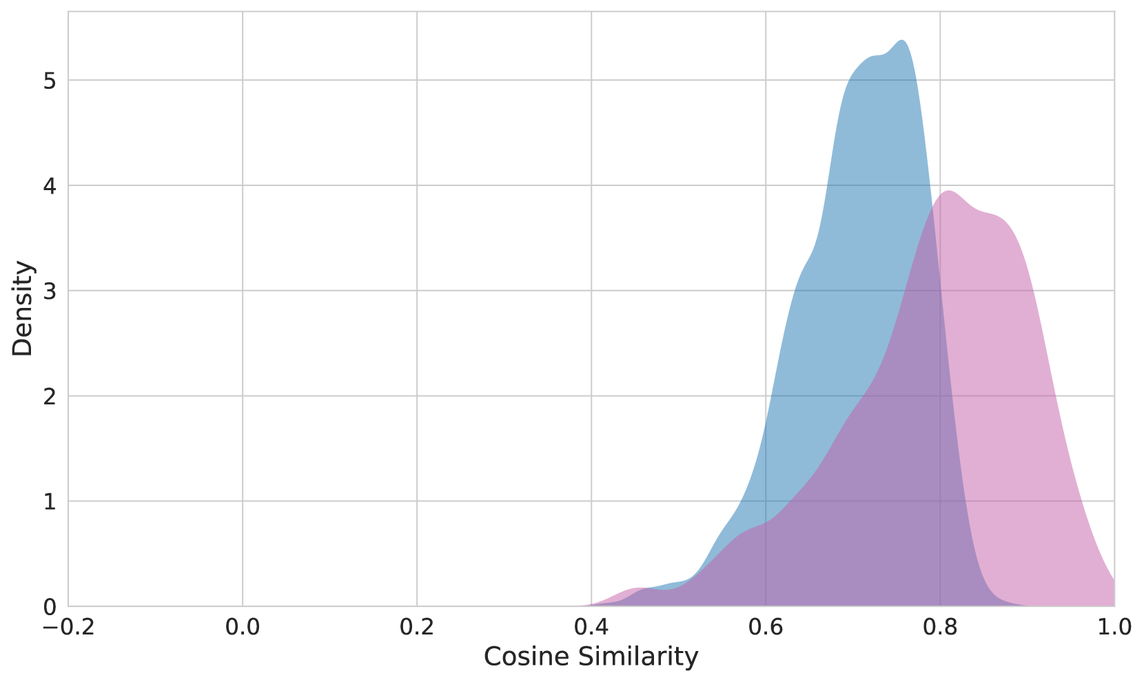
## Density Plot: Cosine Similarity Distribution
### Overview
The image presents a density plot illustrating the distribution of cosine similarity scores. Two overlapping density curves are displayed, representing two different datasets or conditions. The x-axis represents the cosine similarity, ranging from -0.2 to 1.0, while the y-axis represents the density, ranging from 0 to 5.
### Components/Axes
* **X-axis Label:** "Cosine Similarity"
* **Y-axis Label:** "Density"
* **X-axis Range:** Approximately -0.2 to 1.0
* **Y-axis Range:** Approximately 0 to 5
* **Curve 1 Color:** Light Blue
* **Curve 2 Color:** Light Purple
### Detailed Analysis
The plot shows two overlapping density curves.
* **Light Blue Curve:** This curve exhibits a unimodal distribution, peaking at approximately 0.78 on the Cosine Similarity axis, with a density of approximately 5.1. The curve starts to rise noticeably around 0.65, reaches its peak at 0.78, and then gradually declines, approaching a density of approximately 1.0 at 0.95.
* **Light Purple Curve:** This curve also displays a unimodal distribution, peaking at approximately 0.82 on the Cosine Similarity axis, with a density of approximately 4.0. The curve begins to increase around 0.6, reaches its peak at 0.82, and then decreases, reaching a density of approximately 1.0 at 0.95.
Both curves show a significant concentration of similarity scores between 0.65 and 0.95. The purple curve is slightly shifted towards higher cosine similarity values compared to the blue curve.
### Key Observations
* Both distributions are positively skewed, with a longer tail extending towards higher cosine similarity values.
* The peak of the purple curve is slightly to the right of the blue curve, indicating a generally higher cosine similarity for the dataset represented by the purple curve.
* There is substantial overlap between the two distributions, suggesting a considerable degree of similarity between the two datasets.
* The density is relatively low for cosine similarity values below 0.6 for both curves.
### Interpretation
The density plot suggests that the two datasets being compared exhibit a high degree of similarity, as indicated by the overlapping distributions of cosine similarity scores. However, the slight shift in the purple curve towards higher values suggests that, on average, the dataset represented by the purple curve has a higher similarity to a reference point or another dataset compared to the dataset represented by the blue curve.
The concentration of similarity scores between 0.65 and 0.95 indicates that the majority of the data points in both datasets are relatively similar. The positive skewness suggests that there are some outliers with very high similarity scores, potentially representing highly similar data points or instances.
This type of plot is commonly used in natural language processing (NLP) to visualize the similarity between text documents or embeddings. In this context, cosine similarity measures the angle between two vectors representing the documents, with values closer to 1 indicating higher similarity. The plot could also be used in other domains where similarity measures are employed, such as image recognition or recommendation systems.