## Density Plot
### Overview
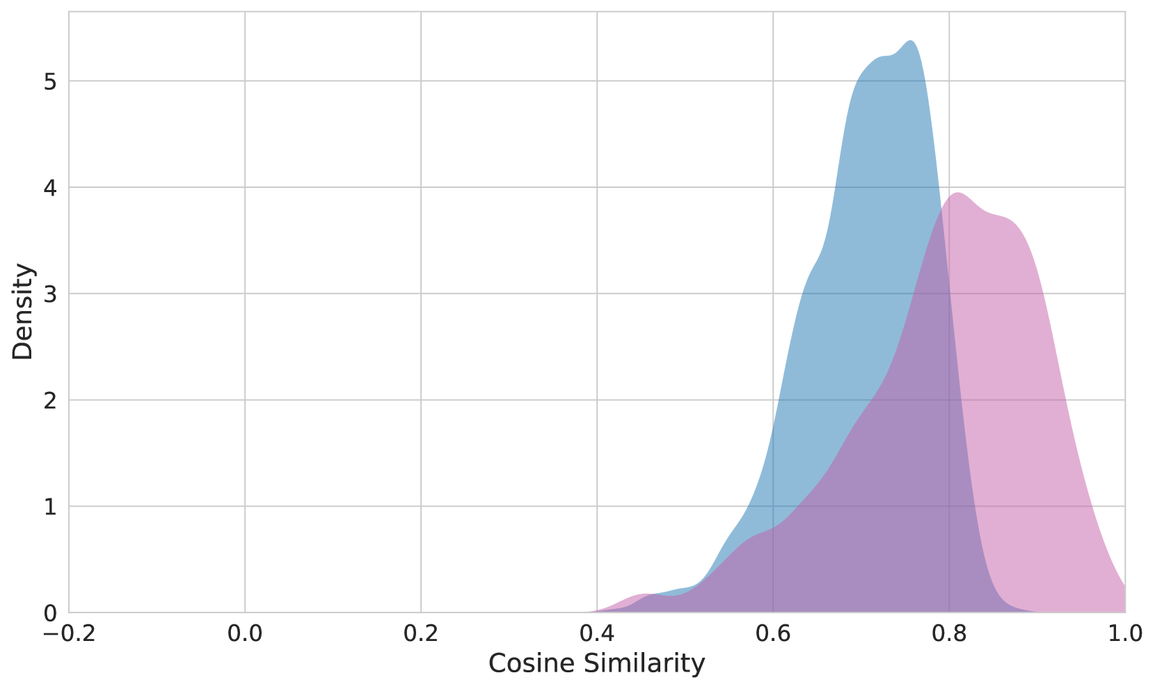
The image displays a density plot of cosine similarity values. The plot shows the distribution of cosine similarity scores, which range from -1 to 1. The x-axis represents the cosine similarity values, while the y-axis represents the density of these values.
### Components/Axes
- **X-axis**: Labeled "Cosine Similarity" and ranges from -0.2 to 1.0.
- **Y-axis**: Labeled "Density" and ranges from 0 to 5.
- **Legend**: There is no legend visible in the image.
### Detailed Analysis or ### Content Details
The density plot shows a peak around the cosine similarity value of 0.6, indicating that this is the most common cosine similarity value in the dataset. The density decreases as the cosine similarity values move away from 0.6, with the density being highest around 0.6 and decreasing towards -0.2 and 1.0.
### Key Observations
- The peak of the density plot is around the cosine similarity value of 0.6.
- The density is highest around 0.6 and decreases towards -0.2 and 1.0.
- There are no other significant peaks or troughs in the density plot.
### Interpretation
The density plot suggests that the cosine similarity values in the dataset are concentrated around 0.6. This could indicate that the dataset is relatively homogeneous, with most data points being similar to each other. However, the presence of a peak around 0.6 also suggests that there are some data points that are significantly different from the majority. The lack of other significant peaks or troughs indicates that the cosine similarity values are relatively evenly distributed around 0.6.