\n
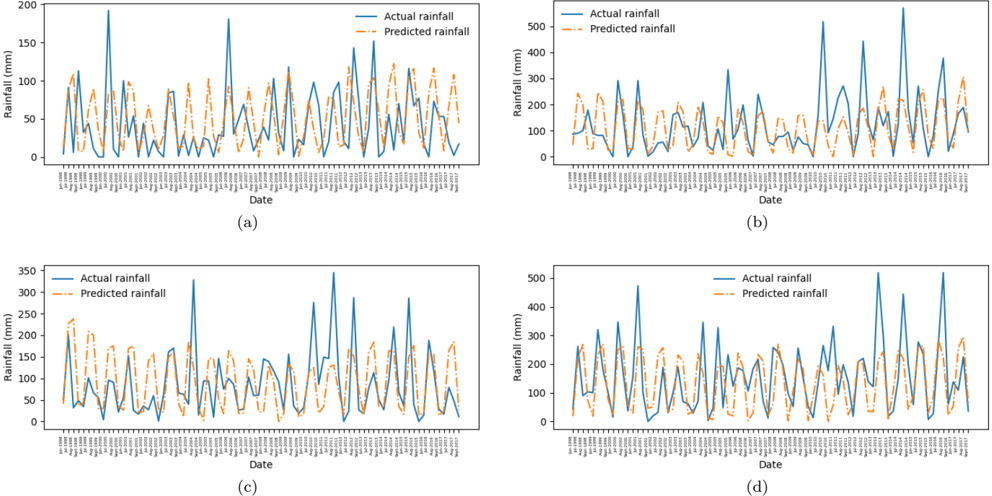
## Time-Series Line Charts: Actual vs. Predicted Rainfall
### Overview
The image is a composite figure containing four distinct line charts, labeled (a), (b), (c), and (d). Each chart plots daily rainfall data over a period of approximately one year, comparing "Actual rainfall" (solid blue line) with "Predicted rainfall" (dashed orange line). The charts are arranged in a 2x2 grid.
### Components/Axes
* **Chart Layout:** Four separate charts in a grid: (a) top-left, (b) top-right, (c) bottom-left, (d) bottom-right.
* **Common Elements per Chart:**
* **X-Axis:** Labeled "Date". The axis displays a dense series of date markers. The visible labels indicate a range from approximately "1-Jan" to "27-Dec". The exact year is not specified. The dates appear to be daily intervals.
* **Y-Axis:** Labeled "Rainfall (mm)". The scale and range differ for each chart.
* **Legend:** Positioned in the top-left corner of each chart's plot area. It contains two entries:
* A solid blue line labeled "Actual rainfall".
* A dashed orange line labeled "Predicted rainfall".
* **Chart-Specific Y-Axis Ranges:**
* **Chart (a):** 0 to 200 mm, with major ticks at 0, 50, 100, 150, 200.
* **Chart (b):** 0 to 500 mm, with major ticks at 0, 100, 200, 300, 400, 500.
* **Chart (c):** 0 to 350 mm, with major ticks at 0, 50, 100, 150, 200, 250, 300, 350.
* **Chart (d):** 0 to 500 mm, with major ticks at 0, 100, 200, 300, 400, 500.
### Detailed Analysis
**Chart (a):**
* **Trend Verification:** The "Actual rainfall" (blue) line shows high volatility with several sharp, isolated peaks. The "Predicted rainfall" (orange) line follows the general pattern of ups and downs but with significantly lower amplitude, rarely matching the magnitude of the actual peaks.
* **Key Data Points (Approximate):**
* Highest actual peak: ~190 mm (occurs around late February/early March).
* Other notable actual peaks: ~180 mm (around May), ~150 mm (multiple instances).
* Predicted values generally stay below 120 mm, with most peaks between 50-100 mm.
**Chart (b):**
* **Trend Verification:** Similar high volatility in actual rainfall. The predicted line again tracks the timing of events but underestimates the largest peaks.
* **Key Data Points (Approximate):**
* Highest actual peak: ~520 mm (occurs around late September/early October).
* Other notable actual peaks: ~450 mm (around November), ~300 mm (multiple instances).
* Predicted values mostly range between 0-300 mm, with the highest predicted peak around 300 mm.
**Chart (c):**
* **Trend Verification:** The actual rainfall shows a mix of moderate and high peaks. The predicted line appears to have a slightly better amplitude match compared to (a) but still underestimates the most extreme events.
* **Key Data Points (Approximate):**
* Highest actual peak: ~340 mm (occurs around late July/early August).
* Other notable actual peaks: ~280 mm (around September), ~200 mm (multiple instances).
* Predicted values generally stay below 200 mm, with most peaks in the 100-180 mm range.
**Chart (d):**
* **Trend Verification:** This chart shows the most frequent high-magnitude actual rainfall events. The predicted line follows the complex pattern but consistently under-predicts the largest events.
* **Key Data Points (Approximate):**
* Highest actual peak: ~510 mm (occurs around late October/early November).
* Other notable actual peaks: ~480 mm (around March), ~450 mm (around September), ~350 mm (multiple instances).
* Predicted values mostly range between 0-300 mm, with the highest predicted peak near 300 mm.
### Key Observations
1. **Consistent Under-Prediction of Extremes:** In all four charts, the predictive model (orange dashed line) successfully captures the *timing* of rainfall events but systematically underestimates the *magnitude* of the most extreme rainfall peaks. The largest actual events are almost always significantly higher than their corresponding predictions.
2. **Variable Performance:** The degree of under-prediction varies. Charts (b) and (d), which have the highest actual rainfall scales (up to 500 mm), show the most dramatic discrepancies between actual and predicted peaks.
3. **Pattern Correlation:** Despite the amplitude mismatch, the predicted line shows a strong temporal correlation with the actual data, rising and falling in sync with the observed rainfall events. This suggests the model is good at identifying when it will rain but less accurate at predicting how much will fall during intense events.
4. **Data Density:** The x-axis is densely packed with daily date labels, making individual date identification difficult without zooming. The overall period spans a full year.
### Interpretation
The data demonstrates the performance of a rainfall prediction model over four different scenarios or locations (implied by the separate charts a-d). The core finding is a model that is **temporally accurate but magnitude-biased**.
* **What the data suggests:** The model has learned the seasonal or meteorological patterns that lead to rainfall events. However, it appears to be conservative or constrained, possibly due to training data that lacks sufficient examples of extreme events, or a model architecture that smooths predictions. The consistent under-prediction of peaks is a critical limitation for applications like flood forecasting, where accurately predicting the maximum rainfall is essential.
* **Relationship between elements:** The tight coupling of the orange and blue lines in time, contrasted with their separation in magnitude, visually isolates the model's specific weakness. The charts (b) and (d) with higher rainfall totals expose this weakness more severely than charts (a) and (c).
* **Notable Anomalies:** The most significant anomalies are the extreme rainfall events themselves (e.g., the ~520 mm event in chart b). The model's failure to predict these outliers suggests it may not be capturing the non-linear dynamics or rare conditions that lead to such extreme precipitation. The charts collectively argue for model improvement focused on extreme value prediction.