## Time Series Charts: Actual vs. Predicted Rainfall
### Overview
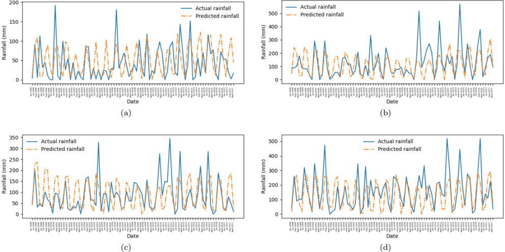
The image contains four time series charts, labeled (a), (b), (c), and (d), each displaying "Actual rainfall" and "Predicted rainfall" over time. The x-axis represents the date, and the y-axis represents rainfall in millimeters (mm). The charts show variations in rainfall patterns over a period of approximately 20 years.
### Components/Axes
* **Y-axis (Rainfall (mm))**:
* Chart (a): Scale from 0 to 200 mm, with markers at 0, 50, 100, 150, and 200.
* Chart (b): Scale from 0 to 500 mm, with markers at 0, 100, 200, 300, 400, and 500.
* Chart (c): Scale from 0 to 350 mm, with markers at 0, 50, 100, 150, 200, 250, 300, and 350.
* Chart (d): Scale from 0 to 500 mm, with markers at 0, 100, 200, 300, 400, and 500.
* **X-axis (Date)**: The x-axis represents time, with tick marks for each month, spanning from approximately January 1998 to September 2017.
* **Legend**: Located at the top of each chart.
* "Actual rainfall": Represented by a solid blue line.
* "Predicted rainfall": Represented by a dashed orange line.
* **Chart Labels**: Located at the bottom center of each chart: (a), (b), (c), and (d).
### Detailed Analysis
**Chart (a)**:
* **Actual Rainfall (Blue)**: The actual rainfall fluctuates, with several peaks. A notable peak occurs around 1998, reaching approximately 180 mm. The rainfall generally varies between 0 and 100 mm, with occasional spikes.
* **Predicted Rainfall (Orange)**: The predicted rainfall generally follows the trend of the actual rainfall but often underestimates the peak values. It also shows fluctuations, with values generally between 0 and 75 mm.
**Chart (b)**:
* **Actual Rainfall (Blue)**: The actual rainfall shows significant peaks, with one around 2002 reaching approximately 480 mm. The rainfall varies significantly, with values ranging from near 0 to almost 500 mm.
* **Predicted Rainfall (Orange)**: The predicted rainfall follows the general trend of the actual rainfall but tends to underestimate the higher peaks. It fluctuates between approximately 0 and 250 mm.
**Chart (c)**:
* **Actual Rainfall (Blue)**: The actual rainfall shows fluctuations, with peaks around 2000 and 2011, reaching approximately 320 mm and 280 mm, respectively. The rainfall varies between 0 and 320 mm.
* **Predicted Rainfall (Orange)**: The predicted rainfall follows the trend of the actual rainfall but often underestimates the peak values. It fluctuates between approximately 0 and 200 mm.
**Chart (d)**:
* **Actual Rainfall (Blue)**: The actual rainfall shows fluctuations, with peaks around 2002 and 2016, reaching approximately 480 mm and 450 mm, respectively. The rainfall varies between 0 and 500 mm.
* **Predicted Rainfall (Orange)**: The predicted rainfall follows the general trend of the actual rainfall but tends to underestimate the higher peaks. It fluctuates between approximately 0 and 300 mm.
### Key Observations
* The actual rainfall data exhibits significant variability across all four charts.
* The predicted rainfall generally follows the trend of the actual rainfall but often underestimates the peak values.
* The time period covered in each chart is approximately from January 1998 to September 2017.
* The y-axis scales differ across the charts, indicating potentially different regions or data sets.
### Interpretation
The charts compare actual rainfall data with predicted rainfall, likely from a predictive model. The consistent underestimation of peak rainfall values by the model suggests that the model may need refinement to better capture extreme weather events. The variations in rainfall patterns across the charts could be due to geographical differences or different data sources. The data suggests that while the model captures the general trend of rainfall, it struggles to accurately predict the magnitude of peak rainfall events. This could have implications for water resource management, flood prediction, and other related applications.