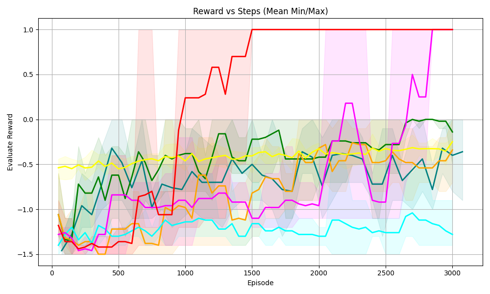
## [Line Graph]: Reward vs Steps (Mean Min/Max)
### Overview
This is a line graph titled *"Reward vs Steps (Mean Min/Max)"*, plotting **Evaluate Reward** (y-axis) against **Episode** (x-axis). Multiple colored lines (with translucent shaded regions) represent different data series, likely showing mean reward over episodes with shaded areas indicating min/max (or confidence intervals) around the mean.
### Components/Axes
- **Title**: *"Reward vs Steps (Mean Min/Max)"* (indicates the plot compares reward to training episodes, with mean, min, and max values).
- **X-axis**: Labeled *"Episode"*, ranging from 0 to 3000 (ticks at 0, 500, 1000, 1500, 2000, 2500, 3000).
- **Y-axis**: Labeled *"Evaluate Reward"*, ranging from -1.5 to 1.0 (ticks at -1.5, -1.0, -0.5, 0.0, 0.5, 1.0).
- **Lines/Shaded Regions**: Multiple colored lines (red, green, yellow, orange, cyan, magenta, dark blue) with corresponding translucent shaded areas (e.g., light red, light green) representing min/max ranges around each line’s mean.
### Detailed Analysis (Line-by-Line Trends)
We analyze each line by color (approximate, as no explicit legend is visible, but trends are clear):
1. **Red Line**
- **Trend**: Starts at ~-1.5 (Episode 0), rises sharply around Episode 1000, reaches ~1.0 by Episode 1500, and remains flat at 1.0 until Episode 3000.
- **Shaded Region**: Light red, covering a wide range early (Episode 0–1000) and narrowing as the line stabilizes.
2. **Magenta Line**
- **Trend**: Fluctuates between -1.5 and 0.5, then surges sharply around Episode 2500, reaching ~1.0 by Episode 3000.
- **Shaded Region**: Light magenta, wide (high variability) during fluctuations, narrowing as it stabilizes.
3. **Green Line**
- **Trend**: Fluctuates between -1.0 and 0.0, with a slight upward trend (Episode 3000: ~-0.1).
- **Shaded Region**: Light green, moderate width (consistent variability).
4. **Yellow Line**
- **Trend**: Stable around -0.5, with minor fluctuations.
- **Shaded Region**: Light yellow, narrow (low variability).
5. **Orange Line**
- **Trend**: Fluctuates between -1.5 and -0.5, with a slight upward trend (Episode 3000: ~-0.4).
- **Shaded Region**: Light orange, moderate width.
6. **Cyan Line**
- **Trend**: Fluctuates between -1.5 and -1.0, with a slight upward trend (Episode 3000: ~-1.2).
- **Shaded Region**: Light cyan, moderate width.
7. **Dark Blue Line**
- **Trend**: Fluctuates between -1.5 and -0.5, with a slight upward trend (Episode 3000: ~-0.4).
- **Shaded Region**: Light blue, moderate width.
### Key Observations
- **High-Performing Lines**: Red and magenta lines reach the maximum reward (1.0) and stabilize, indicating successful learning (e.g., effective reinforcement learning agents).
- **Low-Performing Lines**: Green, yellow, orange, cyan, and dark blue lines remain in the lower reward range (-1.5 to 0.0), with limited improvement.
- **Variability**: Shaded regions are wider for lines with more fluctuation (e.g., magenta, red early on) and narrower for stable lines (e.g., yellow).
### Interpretation
This graph likely compares the performance of different reinforcement learning agents (or algorithms) over training episodes. The **red** and **magenta** agents achieve high rewards (1.0), suggesting they learn effectively. Other agents (green, yellow, orange, cyan, dark blue) either learn slowly or get stuck in low-reward states. The shaded regions show reward variability: wider regions mean more inconsistent performance. The x-axis (Episode) represents training steps, and the y-axis (Evaluate Reward) measures performance. The key takeaway is that some agents (red, magenta) outperform others, reaching the maximum reward, while others struggle to improve.
(Note: No explicit legend is visible, so line colors are inferred from trends. Shaded regions represent min/max (or confidence intervals) around each line’s mean reward.)