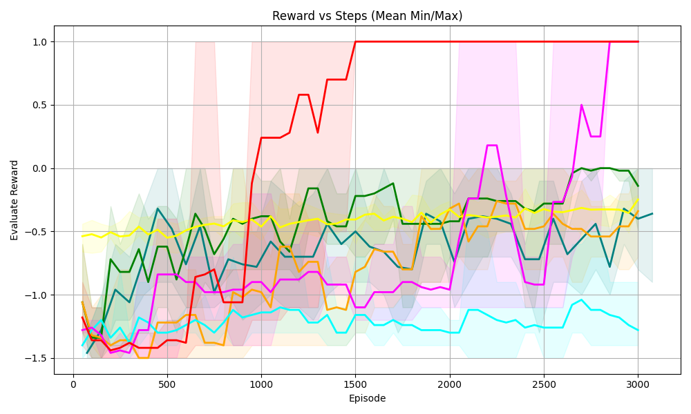
## Line Chart: Reward vs Steps (Mean Min/Max)
### Overview
The image is a line chart displaying the "Evaluate Reward" on the y-axis versus "Episode" on the x-axis. There are multiple lines, each representing a different series, along with shaded regions indicating the min/max range for each series. The chart visualizes the performance of different strategies or algorithms over a number of episodes.
### Components/Axes
* **Title:** Reward vs Steps (Mean Min/Max)
* **X-axis:**
* Label: Episode
* Scale: 0 to 3000, with major ticks at 0, 500, 1000, 1500, 2000, 2500, and 3000.
* **Y-axis:**
* Label: Evaluate Reward
* Scale: -1.5 to 1.0, with major ticks at -1.5, -1.0, -0.5, 0.0, 0.5, and 1.0.
* **Data Series:** There are six distinct data series, each represented by a different color line and a corresponding shaded region indicating the min/max range. The colors are red, green, yellow, teal, orange, and magenta.
### Detailed Analysis
Here's a breakdown of each data series:
* **Red Line:**
* Trend: Starts around -1.5, fluctuates slightly until around episode 800, then rapidly increases to around 0.7 by episode 1200, and then plateaus at 1.0 from episode 1500 onwards.
* Approximate Values:
* Episode 0: -1.5
* Episode 800: -1.4
* Episode 1200: 0.7
* Episode 1500-3000: 1.0
* **Green Line:**
* Trend: Starts around -1.2, fluctuates between -1.2 and -0.2, and ends around 0.0.
* Approximate Values:
* Episode 0: -1.2
* Episode 1500: -0.2
* Episode 3000: 0.0
* **Yellow Line:**
* Trend: Relatively stable, fluctuating around -0.5.
* Approximate Values:
* Episode 0-3000: -0.5
* **Teal Line:**
* Trend: Starts around -1.3, fluctuates, and generally decreases to around -1.2.
* Approximate Values:
* Episode 0: -1.3
* Episode 3000: -1.2
* **Orange Line:**
* Trend: Starts around -1.0, fluctuates, and ends around -0.4.
* Approximate Values:
* Episode 0: -1.0
* Episode 3000: -0.4
* **Magenta Line:**
* Trend: Starts around -1.4, fluctuates, increases around episode 2500, and ends around 1.0.
* Approximate Values:
* Episode 0: -1.4
* Episode 2500: 0.5
* Episode 3000: 1.0
### Key Observations
* The red line shows the most significant improvement in reward over the episodes, reaching a plateau at the maximum reward value.
* The yellow line shows the most stable performance, with minimal fluctuation in reward.
* The teal line shows a slight decrease in reward over the episodes.
* The shaded regions indicate the variability in reward for each series, with some series showing more consistent performance than others.
### Interpretation
The chart compares the performance of different strategies or algorithms (represented by the different colored lines) in terms of "Evaluate Reward" over a series of "Episodes". The red line represents the most successful strategy, as it quickly learns and achieves the highest reward. The yellow line represents a strategy that is consistently mediocre. The other lines represent strategies with varying degrees of success and stability. The shaded regions provide insight into the consistency of each strategy's performance, with narrower regions indicating more consistent results. The data suggests that the red strategy is the most effective for this particular task or environment. The magenta strategy also shows promise, eventually reaching the same reward level as the red strategy, but with more fluctuation.