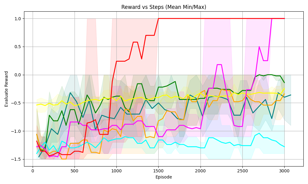
## Line Chart: Reward vs Steps (Mean Min/Max)
### Overview
The chart visualizes the relationship between "Episode" (x-axis) and "Evaluation Reward" (y-axis) across six distinct data series, represented by colored lines with shaded regions indicating variability (min/max bounds). The x-axis spans 0 to 3000 episodes, while the y-axis ranges from -1.5 to 1.0. Each line exhibits unique trends, with some showing sharp transitions and others remaining stable.
### Components/Axes
- **Title**: "Reward vs Steps (Mean Min/Max)"
- **X-axis**: "Episode" (0 to 3000, increments of 500)
- **Y-axis**: "Evaluation Reward" (-1.5 to 1.0, increments of 0.5)
- **Legend**: Six colored lines (red, pink, green, yellow, blue, orange) with shaded regions.
- **Shaded Regions**: Transparent bands around each line, representing min/max bounds.
### Detailed Analysis
1. **Red Line**
- **Trend**: Starts at ~-1.2 (Episode 0), spikes sharply to 1.0 by Episode 800, then stabilizes near 1.0.
- **Key Points**:
- Episode 0: -1.2
- Episode 800: 1.0
- Episode 3000: 1.0
2. **Pink Line**
- **Trend**: Begins at ~-1.3, rises sharply to 0.5 by Episode 2200, then jumps to 1.0.
- **Key Points**:
- Episode 0: -1.3
- Episode 2200: 0.5
- Episode 3000: 1.0
3. **Green Line**
- **Trend**: Starts at ~-1.0, fluctuates between -0.5 and -0.2, ending near -0.1.
- **Key Points**:
- Episode 0: -1.0
- Episode 1500: -0.3
- Episode 3000: -0.1
4. **Yellow Line**
- **Trend**: Flat trajectory around -0.5 throughout all episodes.
- **Key Points**:
- Episode 0: -0.5
- Episode 1500: -0.5
- Episode 3000: -0.5
5. **Blue Line**
- **Trend**: Consistently the lowest, dipping below -1.2 and stabilizing near -0.8.
- **Key Points**:
- Episode 0: -1.5
- Episode 1500: -1.2
- Episode 3000: -0.8
6. **Orange Line**
- **Trend**: Volatile, starting at ~-1.3, rising to -0.4 by Episode 3000.
- **Key Points**:
- Episode 0: -1.3
- Episode 2500: -0.6
- Episode 3000: -0.4
### Key Observations
- **Red and Pink Lines**: Exhibit rapid improvement, achieving maximum reward (1.0) by ~800 and 2200 episodes, respectively.
- **Blue Line**: Persistently underperforms, remaining below -1.2 for most episodes.
- **Green and Yellow Lines**: Show moderate stability, with green trending upward slightly.
- **Orange Line**: High variability but ends with a modest improvement.
- **Shaded Regions**: Indicate significant variability in early episodes for red and pink lines, which narrow as performance stabilizes.
### Interpretation
The chart suggests a comparison of strategies or agents over time, where:
- **Red and Pink Lines** represent highly effective approaches, achieving optimal rewards quickly.
- **Blue Line** indicates a suboptimal strategy, failing to improve meaningfully.
- **Green and Yellow Lines** reflect average performance, with green showing gradual improvement.
- **Orange Line** demonstrates inconsistent results but ends with a notable uptick.
The shaded regions highlight the uncertainty or variability in early performance, which diminishes as episodes progress for successful strategies. This could imply adaptive learning or stabilization in later episodes. The stark contrast between red/pink and blue lines underscores the importance of strategy selection in achieving desired outcomes.