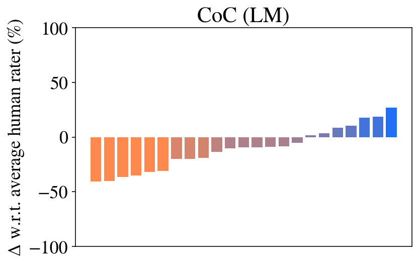
## Bar Chart: CoC (LM)
### Overview
The chart visualizes the difference in average human rater scores (Δ w.r.t. average human rater) across 19 categories, represented as percentages. The y-axis ranges from -100% to 100%, while the x-axis is labeled with categories 1 to 15. The bars are color-coded: orange for negative values, brown for near-zero values, and blue for positive values.
### Components/Axes
- **Y-axis**: "Δ w.r.t. average human rater (%)" (range: -100% to 100%).
- **X-axis**: Categories labeled 1 to 15 (though bars extend to 19, suggesting a potential inconsistency).
- **Legend**: Not explicitly visible, but colors are inferred as:
- **Orange**: Negative values (e.g., -40% to -10%).
- **Brown**: Near-zero values (e.g., -5% to 0%).
- **Blue**: Positive values (e.g., 5% to 30%).
### Detailed Analysis
- **Categories 1–10 (Orange)**:
- Bars decrease in magnitude from approximately -40% (category 1) to -10% (category 10).
- Example: Category 1 ≈ -40%, Category 5 ≈ -30%, Category 10 ≈ -10%.
- **Categories 11–15 (Brown)**:
- Bars increase slightly from -5% (category 11) to 0% (category 15).
- Example: Category 11 ≈ -5%, Category 13 ≈ -2%, Category 15 ≈ 0%.
- **Categories 16–19 (Blue)**:
- Bars increase from 5% (category 16) to 30% (category 19).
- Example: Category 16 ≈ 5%, Category 18 ≈ 20%, Category 19 ≈ 30%.
### Key Observations
1. **Negative Trend (Categories 1–10)**: The first 10 categories show a consistent decline in human rater scores, with the largest drop in the earliest categories.
2. **Neutral Transition (Categories 11–15)**: A gradual shift toward neutrality, with values approaching zero.
3. **Positive Trend (Categories 16–19)**: A sharp increase in positive scores, with the highest value (30%) in the final category.
4. **X-axis Inconsistency**: The x-axis labels only go up to 15, but bars extend to 19, suggesting a possible labeling error or misalignment.
### Interpretation
The data suggests a progression from negative to positive human rater scores across categories. The initial 10 categories (1–10) exhibit significant negative deviations, possibly indicating poor performance or dissatisfaction. Categories 11–15 show a stabilization near zero, while the final 4 categories (16–19) demonstrate a strong positive trend, potentially reflecting improvements or favorable outcomes.
The x-axis labeling discrepancy (categories 1–15 vs. bars up to 19) raises questions about data alignment or visualization errors. If the x-axis is intended to represent 19 categories, the labels should be corrected to 1–19. The color-coded trends align with the legend, confirming the visual representation of positive, neutral, and negative values.
This chart highlights a clear shift in human rater perceptions, with the latter categories showing marked improvement. Further investigation into the cause of the x-axis inconsistency is recommended to ensure data accuracy.