\n
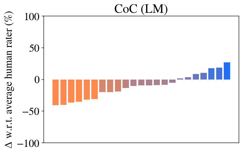
## Bar Chart: CoC (LM) - Delta w.r.t. Average Human Rater
### Overview
The image presents a bar chart titled "CoC (LM)", displaying the delta (Δ) with respect to an average human rater, expressed as a percentage. The chart appears to compare a model's performance (likely a Language Model, indicated by "LM") against human ratings. The x-axis is not explicitly labeled, implying it represents some sequential ordering or category.
### Components/Axes
* **Title:** CoC (LM)
* **Y-axis Label:** Δ w.r.t. average human rater (%) - indicating the percentage difference from the average human rater score. The scale ranges from -100% to 100%.
* **X-axis:** Unlabeled, representing categories or steps in a process.
* **Bars:** The chart consists of a series of vertical bars, colored in shades of orange, purple, and blue. The color transitions seem to indicate a change in performance.
### Detailed Analysis
The chart shows a progression of values. Initially, the bars are orange and hover around a delta of approximately +10% to -10%. As the chart progresses, the bars transition through shades of purple, remaining relatively close to 0% delta. Finally, the bars turn blue and show a positive trend, increasing from approximately 0% to +30%.
Here's a breakdown of approximate values, reading from left to right:
1. +10% (Orange)
2. +5% (Orange)
3. 0% (Orange)
4. -5% (Orange)
5. -10% (Orange)
6. -15% (Purple)
7. -10% (Purple)
8. -5% (Purple)
9. 0% (Purple)
10. +5% (Purple)
11. +10% (Purple)
12. +15% (Blue)
13. +20% (Blue)
14. +25% (Blue)
15. +30% (Blue)
### Key Observations
* The chart demonstrates an initial period of performance that is slightly above or below the average human rater.
* There's a period of stability around 0% delta, indicating the model's performance is aligned with the average human rater.
* The most notable trend is the positive shift towards the end of the chart, where the model's performance consistently exceeds the average human rater.
* The color change from orange to purple to blue appears to correlate with the performance trend.
### Interpretation
The data suggests that the Language Model (LM) initially exhibits performance comparable to, but slightly varying from, human raters. After a period of stability, the model's performance improves significantly, consistently surpassing the average human rater. This could indicate that the model learns and adapts over time, or that the evaluation criteria become more favorable to the model's strengths. The transition in bar colors likely represents different stages or configurations of the model, or different types of input data. The increasing positive delta at the end of the chart is a key finding, suggesting the model is becoming increasingly effective. The unlabeled x-axis is a limitation, as it prevents a more specific understanding of what the categories or steps represent. Without knowing what the x-axis represents, it's difficult to determine the cause of the performance improvement.