## Diagram: Data Distribution and SFT (Supervised Fine-Tuning) Usage
### Overview
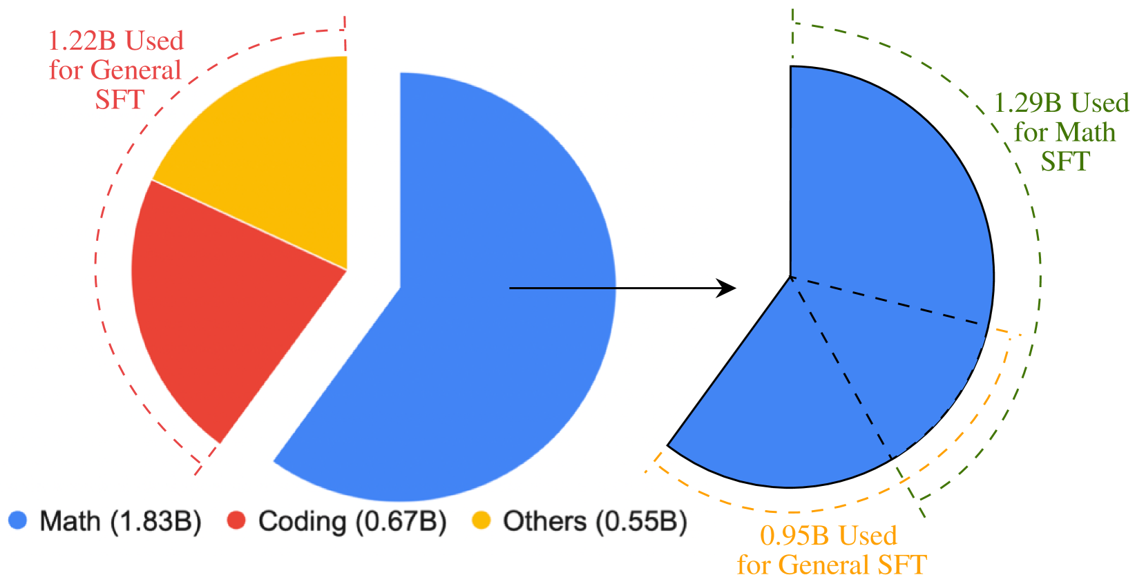
This image displays two pie charts illustrating the composition of a dataset and the subsequent usage of a specific subset for Supervised Fine-Tuning (SFT). The left chart represents the total dataset distribution across three categories (Math, Coding, Others). An arrow indicates that the "Math" category from the left chart is being expanded or analyzed in the right chart, which breaks down the usage of that specific data into "Math SFT" and "General SFT" components.
### Components/Axes
* **Legend (Bottom):**
* **Blue:** Math (1.83B)
* **Red:** Coding (0.67B)
* **Yellow:** Others (0.55B)
* **Left Chart:** A pie chart divided into three colored segments corresponding to the legend.
* **Right Chart:** A single-color (blue) pie chart representing the "Math" category, subdivided by dashed lines.
* **Annotations:**
* **Left Chart (Red dashed arc):** "1.22B Used for General SFT" (covers the Red and Yellow segments).
* **Right Chart (Green dashed arc):** "1.29B Used for Math SFT" (covers the top segment).
* **Right Chart (Orange dashed arc):** "0.95B Used for General SFT" (covers the bottom segment).
### Detailed Analysis
#### Left Chart (Total Dataset Distribution)
* **Visual Trend:** The chart is dominated by the Blue segment, which represents the largest portion of the data. The Red and Yellow segments are smaller and roughly equal in size.
* **Data Points:**
* **Math (Blue):** 1.83B (Largest segment, occupying approximately 60% of the chart).
* **Coding (Red):** 0.67B.
* **Others (Yellow):** 0.55B.
* **Annotation:** A red dashed arc spans the Red and Yellow segments, labeled "1.22B Used for General SFT." This confirms that the sum of Coding (0.67B) and Others (0.55B) equals 1.22B.
#### Right Chart (Math Data Usage Breakdown)
* **Visual Trend:** This chart is entirely blue, indicating it is a breakdown of the "Math" category from the left chart. It is divided into three distinct segments by dashed lines.
* **Data Points:**
* **Math SFT (Green dashed arc):** 1.29B. This arc covers the top-right segment of the pie.
* **General SFT (Orange dashed arc):** 0.95B. This arc covers the bottom-left segment of the pie.
* **Unlabeled Segment:** There is a middle segment between the Math SFT and General SFT sections that does not have an associated numerical label or arc.
### Key Observations
* **Data Discrepancy:** The total value of the "Math" category in the left chart is 1.83B. However, the sum of the labeled segments in the right chart (1.29B + 0.95B = 2.24B) exceeds the total Math category value. This suggests either an overlap in data usage (data being used for both Math SFT and General SFT) or that the right chart represents a different or expanded dataset.
* **Categorical Flow:** The diagram clearly distinguishes between "General SFT" usage (which pulls from Coding, Others, and a portion of Math) and "Math SFT" usage (which is specific to the Math category).
### Interpretation
This diagram visualizes the data pipeline for a Supervised Fine-Tuning (SFT) process.
1. **Source Composition:** The dataset is primarily composed of Math data (1.83B), followed by Coding (0.67B) and Others (0.55B).
2. **Usage Strategy:** The "General SFT" training process utilizes the entirety of the Coding and Others categories (1.22B) and a portion of the Math category (0.95B).
3. **Specialization:** The "Math SFT" training process utilizes a specific portion of the Math data (1.29B).
4. **Inference:** The discrepancy between the total Math data (1.83B) and the sum of its usage (1.29B + 0.95B = 2.24B) strongly implies that the Math data is being reused or multi-purposed across different training tasks, or that the "Math SFT" and "General SFT" categories are not mutually exclusive in their data consumption.