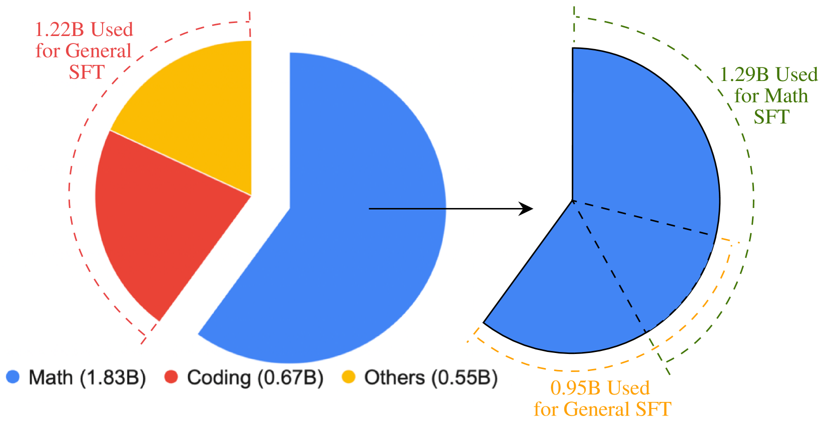
## Pie Chart: Distribution of SFT Usage
### Overview
The pie chart illustrates the distribution of Software Feature Testing (SFT) usage across different categories. The chart is divided into three segments, each representing a different category of SFT usage.
### Components/Axes
- **Math (1.83B)**: Represented by a blue segment, this category accounts for the largest portion of SFT usage.
- **Coding (0.67B)**: Represented by a red segment, this category is the second largest.
- **Others (0.55B)**: Represented by a yellow segment, this category is the smallest.
### Detailed Analysis or ### Content Details
The chart shows that the majority of SFT usage is concentrated in the "Math" category, with 1.83 billion units. The "Coding" category follows with 0.67 billion units, and the "Others" category has the least with 0.55 billion units.
### Key Observations
- The "Math" category has the highest usage, indicating that it is the most critical or frequently used SFT category.
- The "Coding" category has a moderate usage, suggesting that it is an important but not dominant SFT category.
- The "Others" category has the lowest usage, which could indicate that it is either less critical or less frequently used.
### Interpretation
The data suggests that the majority of SFT usage is concentrated in the "Math" category, which could indicate that mathematical testing is the most critical or frequently used SFT category. The "Coding" category has a moderate usage, suggesting that it is an important but not dominant SFT category. The "Others" category has the lowest usage, which could indicate that it is either less critical or less frequently used. This distribution could be due to the complexity and importance of mathematical testing in software development.