## Pie Charts: Resource Allocation Breakdown
### Overview
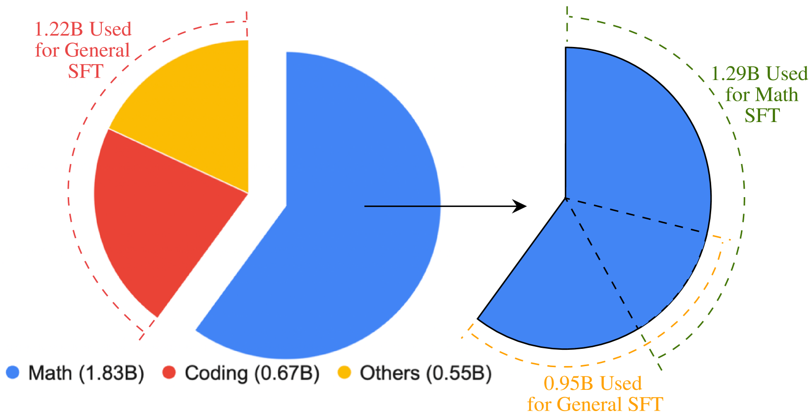
The image contains two pie charts connected by an arrow, illustrating the distribution of resource usage across different categories. The left chart shows the total usage split into "Math," "Coding," and "Others," while the right chart details the allocation of "Math SFT" and "General SFT" usage. The charts use color-coded segments with numerical labels in billions (B).
### Components/Axes
- **Left Pie Chart**:
- **Legend**: Located at the bottom, with color labels:
- **Blue**: Math (1.83B)
- **Red**: Coding (0.67B)
- **Yellow**: Others (0.55B)
- **Segments**:
- **Math (Blue)**: Largest segment, occupying ~60% of the chart.
- **Coding (Red)**: Second-largest segment, ~22%.
- **Others (Yellow)**: Smallest segment, ~18%.
- **Text Labels**: Numerical values (1.83B, 0.67B, 0.55B) are placed near each segment.
- **Right Pie Chart**:
- **Legend**: Located on the right side, with color labels:
- **Blue**: 1.29B Used for Math SFT
- **Orange**: 0.95B Used for General SFT
- **Segments**:
- **Math SFT (Blue)**: Larger segment, ~58% of the chart.
- **General SFT (Orange)**: Smaller segment, ~42%.
- **Text Labels**: Numerical values (1.29B, 0.95B) are placed near each segment.
- **Arrow**: A black arrow points from the left chart to the right chart, suggesting a transformation or relationship between the two datasets.
### Detailed Analysis
- **Left Chart**:
- **Total Usage**: 1.83B (Math) + 0.67B (Coding) + 0.55B (Others) = **3.05B**.
- **Dominance**: Math accounts for the majority (60%), followed by Coding (22%) and Others (18%).
- **Right Chart**:
- **Total Usage**: 1.29B (Math SFT) + 0.95B (General SFT) = **2.24B**.
- **Split**: Math SFT dominates (58%), while General SFT accounts for 42%.
### Key Observations
1. **Math Dominance**: Math is the largest category in both charts, indicating its critical role in resource allocation.
2. **Discrepancy in Totals**: The left chart totals 3.05B, while the right chart totals 2.24B. This suggests the right chart may represent a subset or a different categorization of the left chart's data.
3. **Color Consistency**: The blue segment in both charts corresponds to "Math" and "Math SFT," confirming alignment in labeling.
### Interpretation
The charts likely illustrate how resources are allocated across different applications. The left chart shows the overall distribution of usage, while the right chart breaks down the usage into specific SFT (Specialized Fine-Tuning) categories. The arrow implies a flow or transformation, possibly indicating that the total usage (left) is being reallocated into Math SFT and General SFT (right). However, the numerical mismatch (3.05B vs. 2.24B) raises questions about whether the right chart represents a subset, a different metric, or an error in the data. The emphasis on Math in both charts highlights its priority in resource distribution.