## Pie Chart: Q3 Categorization of Prominent Patterns
### Overview
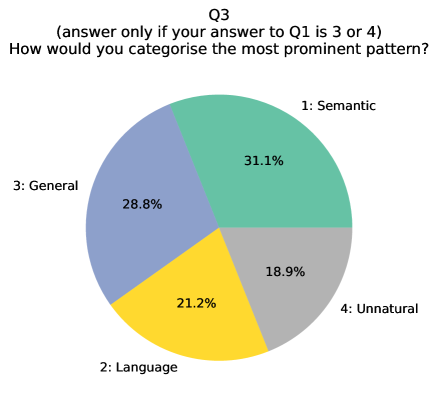
The image is a pie chart titled "Q3" with a conditional instruction: "(answer only if your answer to Q1 is 3 or 4)". It categorizes responses to the question "How would you categorise the most prominent pattern?" into four segments with approximate percentages.
### Components/Axes
- **Title**: "Q3" (top center).
- **Legend**: Located on the left side, with four color-coded categories:
- **1: Semantic** (green, 31.1%).
- **2: Language** (yellow, 21.2%).
- **3: General** (blue, 28.8%).
- **4: Unnatural** (gray, 18.9%).
- **Segments**: Four labeled wedges representing percentages of total responses.
- **Conditional Note**: Text below the title states: "(answer only if your answer to Q1 is 3 or 4)".
### Detailed Analysis
- **Segment Values**:
- **Semantic (1)**: 31.1% (largest segment, green).
- **General (3)**: 28.8% (second-largest, blue).
- **Language (2)**: 21.2% (yellow).
- **Unnatural (4)**: 18.9% (smallest, gray).
- **Color Consistency**: Legend colors match segment colors exactly (e.g., green for Semantic, blue for General).
- **Textual Elements**:
- Labels for each segment are placed adjacent to their respective wedges.
- Percentages are rounded to one decimal place (e.g., 31.1%, 28.8%).
### Key Observations
1. **Dominant Category**: "Semantic" (31.1%) is the most prominent pattern.
2. **Secondary Categories**: "General" (28.8%) and "Language" (21.2%) follow, with "Unnatural" (18.9%) being the least frequent.
3. **Conditional Context**: The chart’s relevance depends on prior responses to Q1 (only valid if Q1 was 3 or 4).
### Interpretation
- The data suggests that "Semantic" patterns are the most frequently identified, potentially indicating a focus on meaning or context in the dataset.
- The conditional instruction implies this analysis is part of a multi-step process, where Q1’s response (3 or 4) gates access to this categorization.
- The close proximity of "General" (28.8%) and "Semantic" (31.1%) highlights a potential overlap or ambiguity in how respondents distinguished these categories.
- "Unnatural" being the smallest segment (18.9%) may reflect rarity or specificity in the patterns observed.
- The chart lacks temporal or comparative data, so trends over time or between groups cannot be inferred.
*Note: Percentages are approximate and sum to 100% (31.1 + 28.8 + 21.2 + 18.9 = 100.0).*