## Chart: Model Size Scaling
### Overview
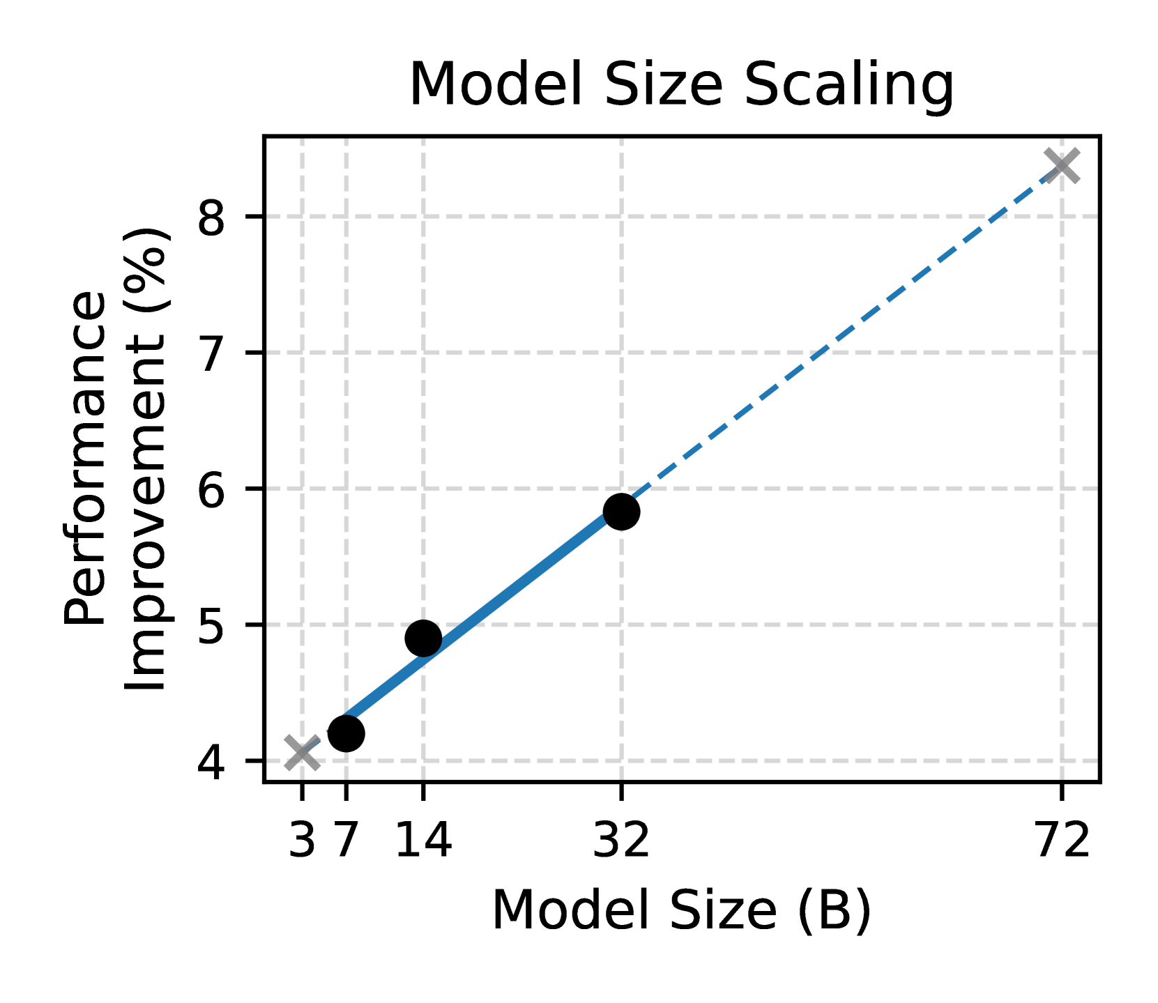
The image is a scatter plot showing the relationship between model size (in billions of parameters) and performance improvement (in percentage). The plot includes a solid blue line connecting the first three data points and a dashed blue line extending to the last data point.
### Components/Axes
* **Title:** Model Size Scaling
* **X-axis:** Model Size (B)
* Values: 3, 7, 14, 32, 72
* **Y-axis:** Performance Improvement (%)
* Values: 4, 5, 6, 7, 8
* **Data Points:**
* First data point is marked with a gray "X"
* The next three data points are marked with black circles
* The last data point is marked with a gray "X"
### Detailed Analysis
* **Data Series:** The data series represents the performance improvement as the model size increases.
* **Trend:** The performance improvement generally increases with model size.
* **Data Points:**
* Model Size 3B: Performance Improvement ~4.2% (marked with a gray "X")
* Model Size 7B: Performance Improvement ~4.9% (marked with a black circle)
* Model Size 14B: Performance Improvement ~5.0% (marked with a black circle)
* Model Size 32B: Performance Improvement ~5.8% (marked with a black circle)
* Model Size 72B: Performance Improvement ~8.4% (marked with a gray "X")
### Key Observations
* The initial increase in model size (from 3B to 32B) shows a relatively linear increase in performance improvement, represented by the solid blue line.
* The increase in model size from 32B to 72B shows a continued increase in performance improvement, but the line is dashed, suggesting a possible change in the relationship or a different scaling behavior.
### Interpretation
The chart suggests that increasing model size generally leads to improved performance. However, the change from a solid to a dashed line indicates that the relationship between model size and performance improvement may not be constant. The dashed line could represent diminishing returns or a different scaling regime as the model size increases significantly. The data points at 3B and 72B are marked with an "X" instead of a circle, which could indicate that these points are based on different data or assumptions compared to the other points.