\n
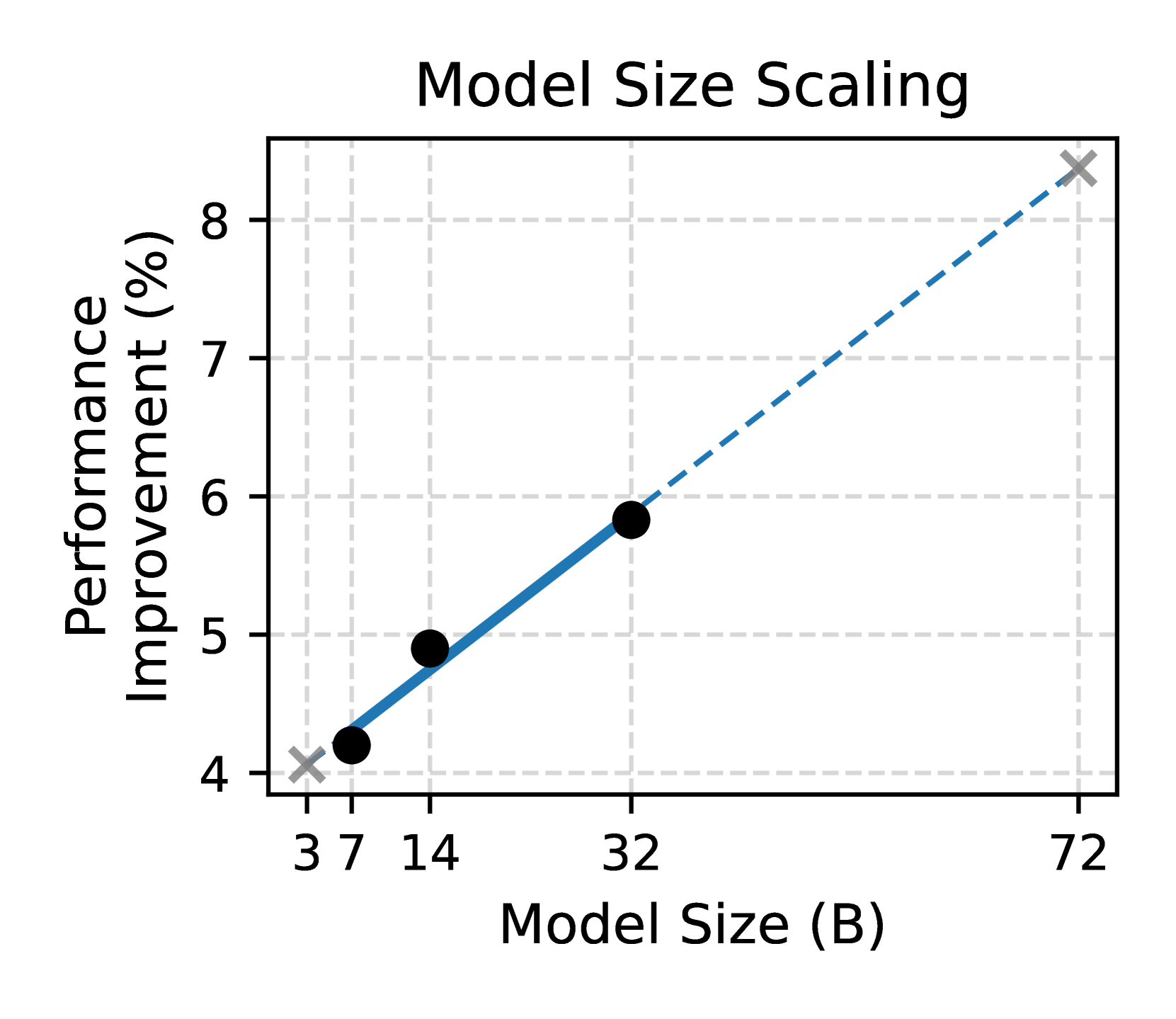
## Chart: Model Size Scaling
### Overview
The image presents a scatter plot illustrating the relationship between Model Size and Performance Improvement. The chart shows a clear positive correlation, suggesting that increasing model size leads to increased performance. A dashed line represents a linear trend fitted to the data points.
### Components/Axes
* **Title:** "Model Size Scaling" - positioned at the top-center of the chart.
* **X-axis:** "Model Size (B)" - representing model size in billions of parameters. The axis is marked with values: 3, 7, 14, 32, and 72.
* **Y-axis:** "Performance Improvement (%)" - representing the percentage of performance improvement. The axis is marked with values: 4, 5, 6, 7, and 8.
* **Data Points:** Four data points are plotted as black circles with white centers.
* **Trend Line:** A dashed blue line represents the trend of the data.
* **Legend:** No explicit legend is present, but the data points and trend line are visually distinct.
### Detailed Analysis
The chart displays a positive correlation between Model Size and Performance Improvement. Let's analyze the data points:
* **Point 1:** Located at approximately (3, 4.1).
* **Point 2:** Located at approximately (7, 4.3).
* **Point 3:** Located at approximately (14, 4.9).
* **Point 4:** Located at approximately (32, 5.8).
* **Point 5:** Located at approximately (72, 8.4).
The dashed blue trend line starts at approximately (0, 4.1) and ends at approximately (72, 8.4). The line slopes upward, indicating a positive correlation.
### Key Observations
* The performance improvement appears to increase at a decreasing rate as the model size increases.
* The data points generally follow the trend line, with some minor deviations.
* The largest performance improvement is observed with the largest model size (72B).
### Interpretation
The data suggests that scaling model size is an effective strategy for improving performance. However, the rate of improvement may diminish as the model size continues to grow. This could be due to factors such as diminishing returns or the increasing difficulty of training larger models. The trend line provides a simplified representation of the relationship, and the actual performance improvement may vary depending on other factors not considered in this chart. The chart implies that there is a benefit to increasing model size, but it doesn't specify the optimal size or the cost-benefit trade-offs involved. The data points are relatively sparse, so it's difficult to draw definitive conclusions about the exact nature of the relationship. Further investigation with more data points and a wider range of model sizes would be beneficial.