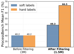
## Bar Chart: ProcessBench Mean F1 (%) Before and After Filtering
### Overview
The image is a bar chart comparing the ProcessBench Mean F1 score for "soft labels" and "hard labels" before and after filtering. The x-axis represents the filtering stage (Before Filtering and After Filtering), and the y-axis represents the ProcessBench Mean F1 score in percentage.
### Components/Axes
* **Y-axis:** ProcessBench Mean F1 (%), ranging from 30 to 70 with increments of 5.
* **X-axis:** Two categories: "Before Filtering (3M)" and "After Filtering (1.5M)". The numbers in parentheses indicate the dataset size.
* **Legend:** Located in the top-left corner.
* Blue: "soft labels"
* Orange: "hard labels"
### Detailed Analysis
* **Before Filtering (3M):**
* "soft labels" (blue bar): 40.2%
* "hard labels" (orange bar): 40.2%
* **After Filtering (1.5M):**
* "soft labels" (blue bar): 49.3%
* "hard labels" (orange bar): 66.5%
### Key Observations
* Before filtering, both "soft labels" and "hard labels" have the same ProcessBench Mean F1 score of 40.2%.
* After filtering, the ProcessBench Mean F1 score increases for both "soft labels" and "hard labels".
* The increase is more significant for "hard labels," which reach 66.5% after filtering, compared to 49.3% for "soft labels".
### Interpretation
The chart demonstrates the impact of filtering on the ProcessBench Mean F1 score for both "soft labels" and "hard labels." The filtering process, which reduces the dataset size from 3M to 1.5M, improves the performance of both labeling methods. However, "hard labels" benefit more from the filtering, suggesting that they are more sensitive to noise or irrelevant data in the original dataset. The data suggests that filtering improves the quality of the dataset, leading to better performance in terms of the ProcessBench Mean F1 score, especially for "hard labels."