## Grouped Bar Chart: ProcessBench Mean F1 (%) Before and After Filtering
### Overview
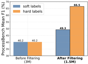
The image is a grouped bar chart comparing the performance (measured by Mean F1 score in percentage) of two labeling methods—"soft labels" and "hard labels"—on a benchmark called "ProcessBench." The comparison is made at two stages: before a filtering process and after a filtering process. The chart clearly demonstrates the impact of filtering on model performance for both label types.
### Components/Axes
* **Chart Type:** Grouped Bar Chart.
* **Y-Axis:**
* **Label:** "ProcessBench Mean F1 (%)"
* **Scale:** Linear scale ranging from 30 to 70, with major tick marks every 5 units (30, 35, 40, 45, 50, 55, 60, 65, 70).
* **X-Axis:**
* **Categories:** Two primary categories representing stages of data processing.
1. **Left Group:** "Before Filtering (3M)" – The "3M" likely denotes the dataset size (e.g., 3 million samples).
2. **Right Group:** "After Filtering (1.5M)" – The "1.5M" denotes the reduced dataset size after filtering.
* **Legend:**
* **Position:** Top-left corner of the chart area.
* **Items:**
* A blue rectangle labeled "soft labels".
* An orange rectangle labeled "hard labels".
* **Data Series & Values:** Each x-axis category contains two bars, one for each label type. The exact Mean F1 (%) value is annotated on top of each bar.
* **Before Filtering (3M):**
* **Soft labels (Blue bar):** 40.2
* **Hard labels (Orange bar):** 40.2
* **After Filtering (1.5M):**
* **Soft labels (Blue bar):** 49.3
* **Hard labels (Orange bar):** 66.5
### Detailed Analysis
1. **Baseline Performance (Before Filtering):** Both "soft labels" and "hard labels" achieve an identical Mean F1 score of 40.2% on the original, unfiltered dataset of 3 million samples. This establishes a common performance baseline.
2. **Impact of Filtering:** After applying a filtering process that reduces the dataset to 1.5 million samples, the performance of both methods improves.
* The **soft labels** score increases from 40.2% to 49.3%, a gain of approximately 9.1 percentage points.
* The **hard labels** score increases dramatically from 40.2% to 66.5%, a gain of approximately 26.3 percentage points.
3. **Comparative Trend:** While both lines (represented by the tops of the bars) slope upward from left to right, the slope for the "hard labels" series is significantly steeper. The performance gap between the two methods, which was zero before filtering, widens to 17.2 percentage points (66.5 - 49.3) after filtering.
### Key Observations
* **Identical Starting Point:** The most striking initial observation is that both label types performed identically on the larger, noisier dataset.
* **Differential Improvement:** Filtering benefits both methods, but the magnitude of improvement is not uniform. "Hard labels" benefit disproportionately more from the data filtering process.
* **Final Performance Disparity:** After filtering, "hard labels" achieve a substantially higher Mean F1 score (66.5%) compared to "soft labels" (49.3%), indicating a clear performance advantage in the refined dataset context.
### Interpretation
The data suggests that the filtering process is highly effective at improving model performance on the ProcessBench task, as measured by the F1 score. The key insight lies in the differential impact on the two labeling strategies.
The fact that both methods started equally but diverged sharply after filtering implies that the original 3M dataset contained a significant amount of noise or low-quality samples. This noise appears to have been equally detrimental to both "soft" and "hard" label learning initially.
However, the filtering process (which removed half the data) seems to have selectively removed samples that were particularly harmful to the models trained with "hard labels." This could mean:
1. **Hard labels are more sensitive to noise:** Models using hard, definitive labels may be more easily confused by ambiguous or incorrect examples in the training data. Filtering removes these confusing examples, allowing the hard-label model to learn more precise decision boundaries.
2. **Soft labels are more robust:** Models using soft, probabilistic labels might inherently handle noisy data better, as they don't commit fully to any single label. Therefore, while they still benefit from cleaner data, the relative gain is smaller because they were less impaired by the noise to begin with.
In essence, the chart demonstrates that **data quality (achieved via filtering) is a critical factor for performance, and its importance is amplified when using "hard" supervision signals.** For tasks where obtaining clean data is feasible, using hard labels with a rigorous filtering pipeline may yield superior results. If data is inherently noisy and cannot be cleaned, soft labels might offer more stable, though potentially lower-peak, performance.