\n
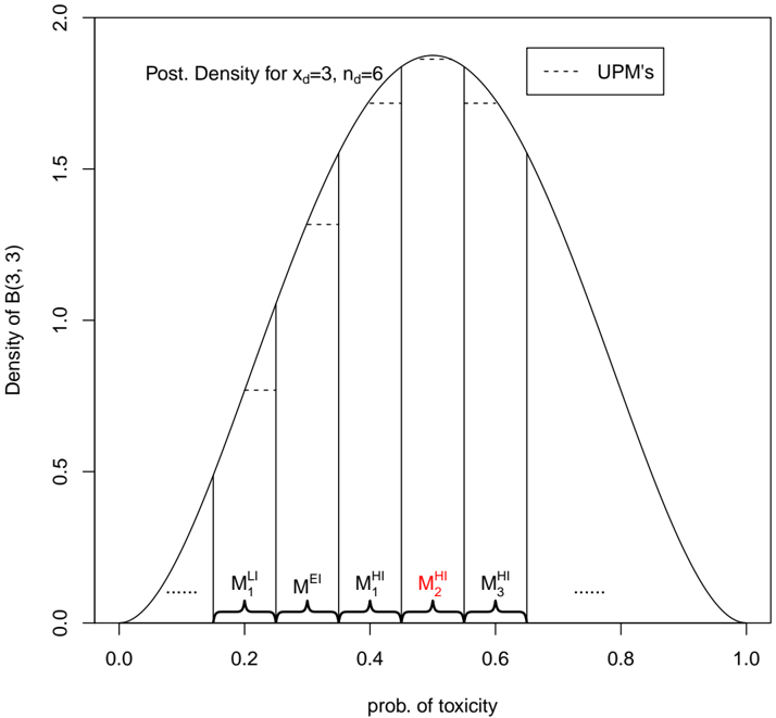
## Chart: Posterior Density Plot
### Overview
The image presents a posterior density plot, visualizing the distribution of a parameter B(3,3) given data with x<sub>d</sub>=3 and n<sub>d</sub>=6. The plot shows the probability density of the parameter against the probability of toxicity. Vertical dashed lines, labeled as UPM's, mark specific points on the x-axis.
### Components/Axes
* **X-axis:** "prob. of toxicity" ranging from 0.0 to 1.0.
* **Y-axis:** "Density of B(3, 3)" ranging from 0.0 to 2.0.
* **Title:** "Post. Density for x<sub>d</sub>=3, n<sub>d</sub>=6"
* **Curve:** A solid black line representing the posterior density.
* **Dashed Lines:** Several vertical dashed lines labeled "UPM's" with annotations: M<sub>1</sub><sup>LI</sup>, M<sub>1</sub><sup>EI</sup>, M<sub>1</sub><sup>HI</sup>, M<sub>2</sub><sup>HI</sup>, M<sub>3</sub><sup>HI</sup>. These are positioned along the x-axis.
### Detailed Analysis
The posterior density curve is approximately bell-shaped, peaking around a probability of toxicity of approximately 0.55. The curve is symmetric around the peak.
* **M<sub>1</sub><sup>LI</sup>:** Located at approximately 0.18 on the x-axis.
* **M<sub>1</sub><sup>EI</sup>:** Located at approximately 0.35 on the x-axis.
* **M<sub>1</sub><sup>HI</sup>:** Located at approximately 0.45 on the x-axis.
* **M<sub>2</sub><sup>HI</sup>:** Located at approximately 0.55 on the x-axis.
* **M<sub>3</sub><sup>HI</sup>:** Located at approximately 0.65 on the x-axis.
The dashed lines (UPM's) are spaced somewhat unevenly across the range of probabilities. The density at each of these points is not explicitly indicated, but can be estimated from the curve.
### Key Observations
The peak of the density suggests that a probability of toxicity around 0.55 is the most likely value given the observed data (x<sub>d</sub>=3, n<sub>d</sub>=6). The UPM's represent specific points of interest within this distribution, potentially representing different thresholds or classifications related to toxicity. The distribution is unimodal and relatively smooth.
### Interpretation
This plot illustrates a Bayesian posterior distribution. The parameters x<sub>d</sub>=3 and n<sub>d</sub>=6 likely represent the number of toxic events observed (3) and the total number of samples tested (6). The posterior density represents our updated belief about the probability of toxicity after observing this data. The UPM's likely represent different management or policy thresholds related to toxicity levels. The fact that the distribution is centered around 0.55 suggests that, based on the observed data, there's a relatively high probability of toxicity. The spread of the distribution indicates the uncertainty in our estimate of the true probability of toxicity. The UPM's provide specific points for decision-making, allowing for different actions to be taken based on the estimated probability of toxicity. The labels LI, EI, and HI likely stand for Low, Equal, and High, indicating different levels of exposure or impact.