\n
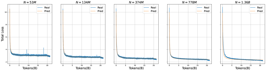
## Line Chart: Total Loss vs. Tokens for Different Model Sizes
### Overview
The image presents five line charts, each depicting the relationship between "Total Loss" and "Tokens (B)" for a different model size, denoted by "N" in millions (M). Each chart compares the "Real" loss (blue line) with the "Pred" (predicted) loss (orange dashed line). The charts are arranged horizontally, showing how the loss curves change with increasing model size.
### Components/Axes
* **X-axis:** "Tokens (B)" - Represents the number of tokens in billions. Scale ranges from 0 to approximately 20.
* **Y-axis:** "Total Loss" - Represents the total loss value. Scale ranges from approximately 1 to 11.
* **Legend:** Located in the top-left corner of each chart.
* "Real" - Represented by a solid blue line.
* "Pred" - Represented by an orange dashed line.
* **Title:** Each chart is labeled with "N = [value]M", indicating the model size in millions of parameters. The values are 53M, 134M, 374M, 778M, and 1.36B.
### Detailed Analysis or Content Details
**Chart 1: N = 53M**
* **Real (Blue Line):** The line starts at approximately 4.5, rapidly decreases to around 2.5 by 2 Tokens, then fluctuates between 1.8 and 2.5 for the remainder of the chart.
* **Pred (Orange Dashed Line):** Starts at approximately 4.5, decreases to around 2.5 by 2 Tokens, then increases to around 3.5 by 4 Tokens, and then decreases to around 2.5 by 20 Tokens.
**Chart 2: N = 134M**
* **Real (Blue Line):** Starts at approximately 4.5, decreases to around 2.5 by 2 Tokens, then fluctuates between 1.8 and 2.5 for the remainder of the chart.
* **Pred (Orange Dashed Line):** Starts at approximately 4.5, decreases to around 2.5 by 2 Tokens, then increases to around 3.5 by 4 Tokens, and then decreases to around 2.5 by 20 Tokens.
**Chart 3: N = 374M**
* **Real (Blue Line):** Starts at approximately 4.5, decreases to around 2.5 by 2 Tokens, then fluctuates between 1.8 and 2.5 for the remainder of the chart.
* **Pred (Orange Dashed Line):** Starts at approximately 4.5, decreases to around 2.5 by 2 Tokens, then increases to around 3.5 by 4 Tokens, and then decreases to around 2.5 by 20 Tokens.
**Chart 4: N = 778M**
* **Real (Blue Line):** Starts at approximately 4.5, decreases to around 2.5 by 2 Tokens, then fluctuates between 1.8 and 2.5 for the remainder of the chart.
* **Pred (Orange Dashed Line):** Starts at approximately 4.5, decreases to around 2.5 by 2 Tokens, then increases to around 3.5 by 4 Tokens, and then decreases to around 2.5 by 20 Tokens.
**Chart 5: N = 1.36B**
* **Real (Blue Line):** Starts at approximately 4.5, decreases to around 2.5 by 2 Tokens, then fluctuates between 1.8 and 2.5 for the remainder of the chart.
* **Pred (Orange Dashed Line):** Starts at approximately 4.5, decreases to around 2.5 by 2 Tokens, then increases to around 3.5 by 4 Tokens, and then decreases to around 2.5 by 20 Tokens.
### Key Observations
* The "Real" loss curves are very similar across all model sizes, exhibiting a rapid initial decrease followed by fluctuations.
* The "Pred" loss curves also show a similar pattern, with an initial decrease followed by an increase and then a decrease.
* As the model size increases, the initial decrease in loss appears slightly more pronounced, but the overall fluctuation pattern remains consistent.
* The predicted loss consistently overestimates the real loss in the initial stages (between 2 and 4 Tokens).
### Interpretation
The charts demonstrate the training dynamics of a model as the number of tokens processed increases, for different model sizes. The "Total Loss" represents how well the model is learning to predict the next token in a sequence. The comparison between "Real" and "Pred" loss suggests an evaluation of the model's predictive capability.
The consistent pattern across different model sizes indicates that the fundamental learning process is similar regardless of model capacity. The initial rapid decrease in loss represents the model quickly learning basic patterns in the data. The subsequent fluctuations suggest the model is encountering more complex or nuanced patterns that require further adjustment.
The fact that the predicted loss initially overestimates the real loss could indicate that the prediction method is conservative or that the model is initially underconfident in its predictions. The convergence of the predicted loss towards the real loss as training progresses suggests that the prediction method is becoming more accurate over time.
The charts provide insights into the training process and can be used to assess the effectiveness of the model and the prediction method. The lack of significant divergence in the curves across model sizes suggests that increasing model size may not necessarily lead to drastically different learning dynamics, at least within the range of sizes tested.