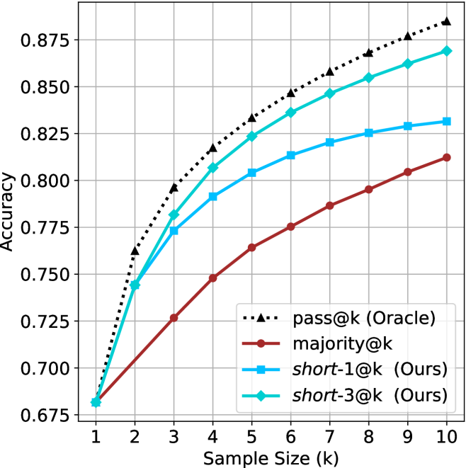
## Line Chart: Accuracy vs. Sample Size for Different Sampling Methods
### Overview
The image is a line chart comparing the performance of four different methods or metrics as a function of sample size (`k`). The chart plots "Accuracy" on the y-axis against "Sample Size (k)" on the x-axis. All four lines show an increasing trend, indicating that accuracy improves with a larger sample size. The chart includes a legend to identify each line.
### Components/Axes
* **X-Axis (Horizontal):**
* **Label:** `Sample Size (k)`
* **Scale:** Linear, with major tick marks and labels at integer values from 1 to 10.
* **Y-Axis (Vertical):**
* **Label:** `Accuracy`
* **Scale:** Linear, with major tick marks and labels at intervals of 0.025, ranging from 0.675 to 0.875.
* **Legend:** Located in the bottom-right quadrant of the chart area. It contains four entries, each with a distinct line style, marker, and color.
1. `pass@k (Oracle)`: Black, dotted line with upward-pointing triangle markers.
2. `majority@k`: Dark red/brown, solid line with circle markers.
3. `short-1@k (Ours)`: Light blue, solid line with square markers.
4. `short-3@k (Ours)`: Cyan/teal, solid line with diamond markers.
* **Grid:** A light gray grid is present, aligned with the major ticks on both axes.
### Detailed Analysis
**Data Series and Approximate Values:**
The following table lists the approximate accuracy values for each method at each sample size `k`, derived from visual inspection of the chart. Values are approximate (`~`).
| k | pass@k (Oracle) | majority@k | short-1@k (Ours) | short-3@k (Ours) |
| :--- | :--- | :--- | :--- | :--- |
| 1 | ~0.680 | ~0.680 | ~0.680 | ~0.680 |
| 2 | ~0.760 | ~0.720 | ~0.745 | ~0.745 |
| 3 | ~0.795 | ~0.725 | ~0.775 | ~0.780 |
| 4 | ~0.815 | ~0.750 | ~0.790 | ~0.805 |
| 5 | ~0.830 | ~0.765 | ~0.805 | ~0.825 |
| 6 | ~0.845 | ~0.775 | ~0.815 | ~0.835 |
| 7 | ~0.855 | ~0.785 | ~0.820 | ~0.845 |
| 8 | ~0.865 | ~0.795 | ~0.825 | ~0.855 |
| 9 | ~0.875 | ~0.805 | ~0.830 | ~0.865 |
| 10 | ~0.885 | ~0.810 | ~0.830 | ~0.870 |
**Trend Verification:**
* **pass@k (Oracle):** This black dotted line with triangle markers has the steepest initial slope and maintains the highest position throughout. It shows a strong, consistent upward trend, suggesting an upper-bound or ideal performance.
* **majority@k:** This dark red line with circle markers has the shallowest slope and remains the lowest-performing method for all `k > 1`. It shows a steady but slower rate of improvement.
* **short-1@k (Ours):** This light blue line with square markers starts at the same point as others at `k=1`. It rises quickly initially but its slope decreases more noticeably after `k=5`, appearing to plateau slightly towards `k=10`.
* **short-3@k (Ours):** This cyan line with diamond markers closely follows the `short-1@k` line for `k=1` and `k=2`, then begins to diverge upward. It maintains a position between `short-1@k` and the `pass@k (Oracle)` line, showing a strong and sustained upward trend.
### Key Observations
1. **Universal Improvement:** All four methods show improved accuracy as the sample size `k` increases from 1 to 10.
2. **Performance Hierarchy:** A clear and consistent performance hierarchy is established for `k >= 2`: `pass@k (Oracle)` > `short-3@k (Ours)` > `short-1@k (Ours)` > `majority@k`.
3. **Convergence at k=1:** All four lines originate from approximately the same accuracy point (~0.680) at `k=1`.
4. **Divergence with k:** The performance gap between the methods widens as `k` increases. The gap between the best (`pass@k`) and worst (`majority@k`) is largest at `k=10`.
5. **Proposed Methods' Efficacy:** The two methods labeled "(Ours)" both significantly outperform the `majority@k` baseline. `short-3@k` demonstrates a clear advantage over `short-1@k` for `k >= 3`.
### Interpretation
This chart likely comes from a research paper in machine learning or statistics, evaluating methods for improving prediction or generation accuracy by using multiple samples (`k`). The key takeaways are:
* **The "Oracle" is an Upper Bound:** The `pass@k (Oracle)` line represents an idealized, best-possible scenario (perhaps where the correct answer is always selected from the `k` samples). It serves as a benchmark for the maximum achievable accuracy.
* **"Ours" Methods are Effective:** The proposed methods (`short-1@k` and `short-3@k`) provide a substantial improvement over the simple `majority@k` voting baseline. This suggests the authors' technique for selecting or aggregating from multiple samples is successful.
* **More Samples Help, but with Diminishing Returns:** While accuracy increases with `k` for all methods, the rate of improvement slows down, especially for `short-1@k`. This indicates a trade-off between computational cost (more samples) and performance gain.
* **`short-3` Outperforms `short-1`:** The `short-3@k` method's superior performance over `short-1@k` suggests that the specific design choice it represents (perhaps considering a different subset or using a different aggregation strategy) is more effective. The gap between them and the Oracle line shows there is still room for improvement in the selection/aggregation algorithms.
In summary, the data demonstrates that the authors' proposed sampling strategies are effective, with `short-3@k` being particularly promising, as they approach the theoretical upper bound of performance more closely than the baseline method as more samples are used.