## Horizontal Stacked Bar Chart: Average Count by Condition Strength
### Overview
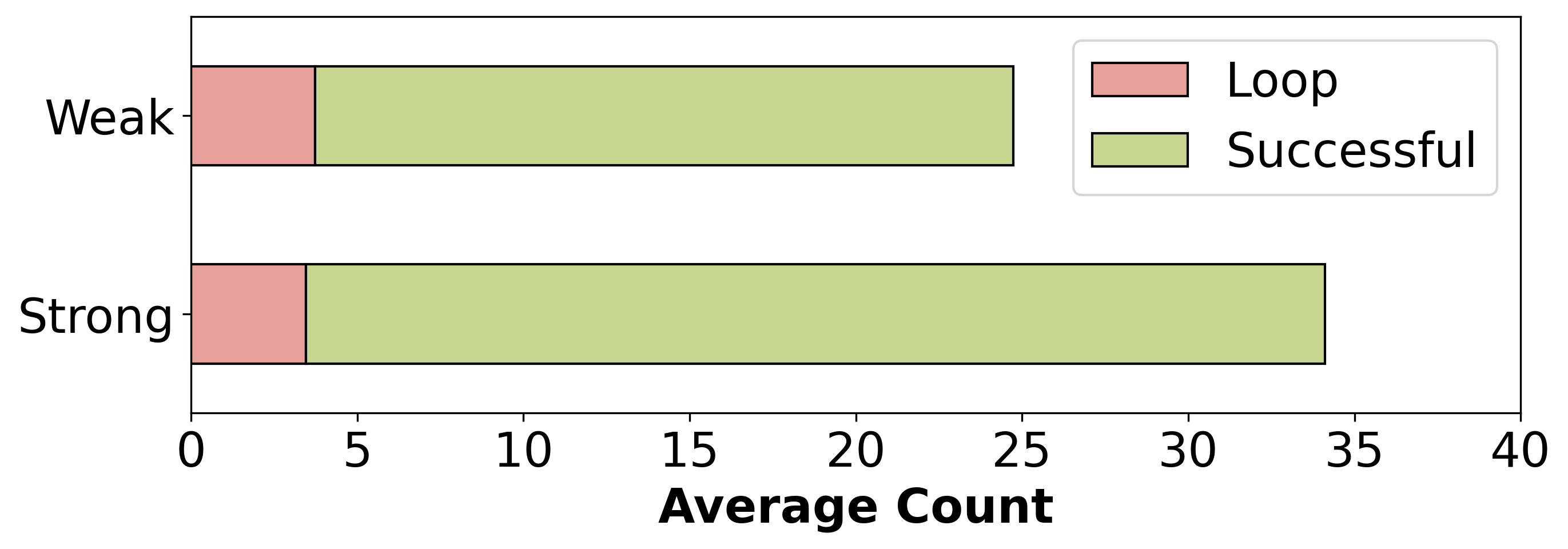
The image displays a horizontal stacked bar chart comparing two categories, "Weak" and "Strong," on the y-axis. Each bar is divided into two segments representing "Loop" and "Successful" outcomes, with the total length representing the "Average Count" on the x-axis.
### Components/Axes
* **Y-axis (Vertical):** Categorical labels. From top to bottom: "Weak" and "Strong".
* **X-axis (Horizontal):** Numerical scale labeled "Average Count". The scale runs from 0 to 40, with major tick marks at intervals of 5 (0, 5, 10, 15, 20, 25, 30, 35, 40).
* **Legend:** Positioned in the top-right corner of the chart area. It contains two entries:
* A pink/salmon-colored rectangle labeled "Loop".
* A light green/khaki-colored rectangle labeled "Successful".
* **Data Series:** Two horizontal stacked bars.
* The top bar corresponds to the "Weak" category.
* The bottom bar corresponds to the "Strong" category.
### Detailed Analysis
**Bar 1: "Weak" Category (Top Bar)**
* **Visual Trend:** The bar is composed of a smaller left segment ("Loop") and a much larger right segment ("Successful").
* **"Loop" Segment (Pink):** Starts at 0 and extends to approximately **4** on the x-axis.
* **"Successful" Segment (Light Green):** Starts at ~4 and extends to approximately **25** on the x-axis. The length of this segment is therefore ~21 units.
* **Total Average Count for "Weak":** Approximately **25**.
**Bar 2: "Strong" Category (Bottom Bar)**
* **Visual Trend:** Similar structure to the "Weak" bar, but the total length is greater, and the "Successful" segment is proportionally much larger.
* **"Loop" Segment (Pink):** Starts at 0 and extends to approximately **3.5** on the x-axis.
* **"Successful" Segment (Light Green):** Starts at ~3.5 and extends to approximately **34** on the x-axis. The length of this segment is therefore ~30.5 units.
* **Total Average Count for "Strong":** Approximately **34**.
### Key Observations
1. The total "Average Count" is higher for the "Strong" condition (~34) compared to the "Weak" condition (~25).
2. The primary driver for the higher total in the "Strong" condition is the "Successful" segment, which is significantly larger (~30.5 vs. ~21).
3. The "Loop" segment is relatively consistent in size between the two conditions, measuring approximately 4 for "Weak" and 3.5 for "Strong". The difference is minor and within the margin of visual estimation error.
4. In both conditions, the "Successful" segment constitutes the majority of the total count.
### Interpretation
The chart suggests a clear relationship between condition strength ("Weak" vs. "Strong") and outcome counts. The data demonstrates that a "Strong" condition is associated with a higher overall average count, and this increase is almost entirely attributable to a substantial rise in "Successful" outcomes. The "Loop" count appears to be a relatively stable baseline metric, not strongly influenced by the condition's strength.
From a technical or experimental perspective, this could indicate that applying a "Strong" intervention or signal significantly boosts the success rate without proportionally increasing the number of loops or iterations required. The "Loop" metric might represent a fixed overhead or a standard process step, while the "Successful" metric captures the variable, desirable output that responds to the input strength. The chart effectively communicates that strength amplifies success.