## Bar Chart: Average Count by Strength
### Overview
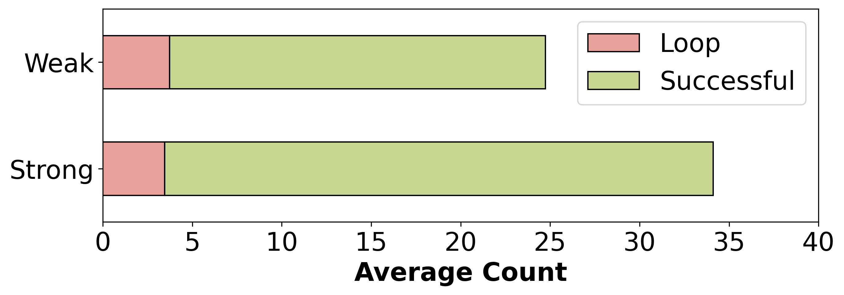
The image is a horizontal bar chart comparing the average count of "Loop" and "Successful" outcomes for "Weak" and "Strong" categories. The chart displays two horizontal bars for each category (Weak and Strong), each bar segmented into two colored sections representing the average count of "Loop" (light red) and "Successful" (light green) outcomes.
### Components/Axes
* **Y-axis:** Categorical, with two categories: "Weak" (top) and "Strong" (bottom).
* **X-axis:** Numerical, labeled "Average Count", ranging from 0 to 40 with increments of 5.
* **Legend:** Located in the top-right corner, indicating "Loop" is represented by a light red bar and "Successful" by a light green bar.
### Detailed Analysis
* **Weak:**
* "Loop" (light red): Approximately 4.
* "Successful" (light green): Approximately 21.
* Total Average Count: Approximately 25.
* **Strong:**
* "Loop" (light red): Approximately 4.
* "Successful" (light green): Approximately 31.
* Total Average Count: Approximately 35.
### Key Observations
* The average count of "Loop" is the same for both "Weak" and "Strong" categories, at approximately 4.
* The average count of "Successful" is significantly higher for the "Strong" category (approximately 31) compared to the "Weak" category (approximately 21).
* The "Strong" category has a higher total average count than the "Weak" category.
### Interpretation
The data suggests that the "Strong" category is more likely to result in "Successful" outcomes compared to the "Weak" category. The "Loop" outcome appears to be independent of the "Weak" or "Strong" category, as its average count remains constant across both. This could indicate that the factor determining "Weak" vs "Strong" has a positive correlation with "Successful" outcomes, but no correlation with "Loop" outcomes.