## Horizontal Bar Chart: Weak vs. Strong Category Performance
### Overview
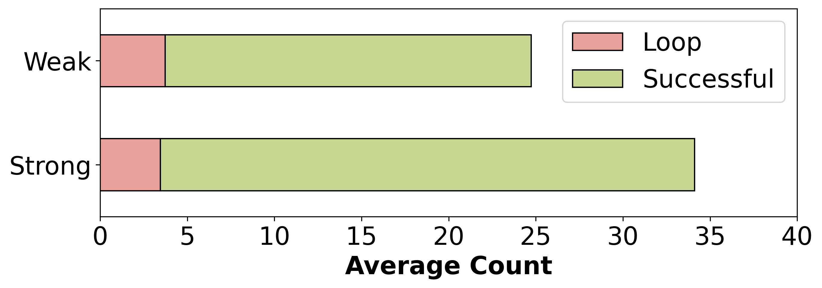
The chart compares two categories ("Weak" and "Strong") across two metrics: "Loop" (pink) and "Successful" (green). The x-axis represents "Average Count" (0–40), while the y-axis lists the categories. The legend is positioned in the top-right corner.
### Components/Axes
- **Y-Axis (Categories)**:
- "Weak" (top)
- "Strong" (bottom)
- **X-Axis (Values)**:
- Labeled "Average Count" with increments of 5 (0, 5, 10, ..., 40).
- **Legend**:
- Pink = "Loop"
- Green = "Successful"
- Positioned in the top-right corner.
### Detailed Analysis
- **Weak Category**:
- **Loop (Pink)**: Bar length ≈ 4 units (x-axis value ~4).
- **Successful (Green)**: Bar length ≈ 25 units (x-axis value ~25).
- **Strong Category**:
- **Loop (Pink)**: Bar length ≈ 4 units (x-axis value ~4).
- **Successful (Green)**: Bar length ≈ 34 units (x-axis value ~34).
### Key Observations
1. **Loop Consistency**: Both "Weak" and "Strong" categories have identical "Loop" values (~4).
2. **Success Disparity**: The "Successful" metric increases from ~25 (Weak) to ~34 (Strong), a ~9-unit difference.
3. **Proportionality**: The "Successful" bar dominates the chart for both categories, occupying ~80–90% of the total bar length.
### Interpretation
The data suggests that the "Strong" category correlates with significantly higher success rates compared to "Weak," while the "Loop" metric remains constant across categories. This implies that the "Strength" of the category is a critical factor in determining success, whereas the "Loop" metric may represent a baseline or control variable. The chart emphasizes the importance of category strength in achieving favorable outcomes, with no notable outliers or anomalies observed.