## Line Chart: Minimum Steps and Examples vs. Parameters (Non-Embedding)
### Overview
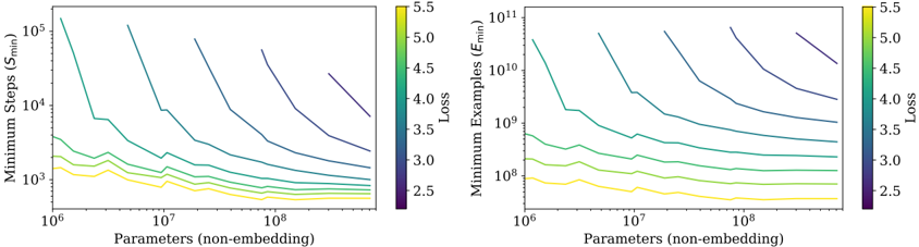
The image contains two side-by-side line charts comparing the relationship between **parameters (non-embedding)** and two metrics: **Minimum Steps (S_min)** (left) and **Minimum Examples (E_min)** (right). Both charts use logarithmic scales for axes and share a color gradient legend indicating **Loss** values (2.5–5.5). Lines represent different loss levels, with colors transitioning from purple (low loss) to yellow (high loss).
---
### Components/Axes
- **X-axis (Both Charts)**:
- Label: "Parameters (non-embedding)"
- Scale: Logarithmic (10⁶ to 10⁸)
- **Left Chart (S_min)**:
- Y-axis Label: "Minimum Steps (S_min)"
- Scale: Logarithmic (10³ to 10⁵)
- **Right Chart (E_min)**:
- Y-axis Label: "Minimum Examples (E_min)"
- Scale: Logarithmic (10⁸ to 10¹¹)
- **Legend**:
- Position: Right of both charts
- Color Gradient: Purple (Loss = 2.5) to Yellow (Loss = 5.5)
- Label: "Loss"
---
### Detailed Analysis
#### Left Chart (Minimum Steps, S_min)
- **Trend**:
- All lines slope downward as parameters increase, indicating fewer steps required for larger models.
- Higher-loss lines (yellow) decline steeply, while lower-loss lines (purple) flatten.
- Example: A loss=5.5 line (yellow) drops from ~10⁵ steps at 10⁶ parameters to ~10³ steps at 10⁸ parameters.
- **Key Data Points**:
- Loss=2.5 (purple): ~10⁴ steps at 10⁸ parameters.
- Loss=5.5 (yellow): ~10⁵ steps at 10⁶ parameters.
#### Right Chart (Minimum Examples, E_min)
- **Trend**:
- Lines slope downward, showing fewer examples needed for larger models.
- Higher-loss lines (yellow) decline sharply, while lower-loss lines (purple) remain relatively flat.
- Example: A loss=5.5 line (yellow) drops from ~10¹¹ examples at 10⁶ parameters to ~10⁹ examples at 10⁸ parameters.
- **Key Data Points**:
- Loss=2.5 (purple): ~10⁸ examples at 10⁸ parameters.
- Loss=5.5 (yellow): ~10¹¹ examples at 10⁶ parameters.
---
### Key Observations
1. **Loss-Parameter Tradeoff**:
- Higher-loss models (yellow) achieve efficiency gains faster with increasing parameters but require fewer steps/examples overall.
- Lower-loss models (purple) show diminishing returns, requiring more resources for marginal improvements.
2. **Divergence in Efficiency**:
- The steepest declines in S_min and E_min occur for loss=4.0–5.5, suggesting these models are more parameter-efficient but less accurate.
3. **Logarithmic Scale Impact**:
- The logarithmic axes emphasize exponential relationships, making small parameter increases appear impactful for high-loss models.
---
### Interpretation
The charts reveal a critical tradeoff between **model efficiency** and **performance**:
- **High-loss models** (yellow lines) are highly parameter-efficient, requiring fewer steps and examples as model size grows. This suggests they are suitable for resource-constrained scenarios but sacrifice accuracy.
- **Low-loss models** (purple lines) demand significantly more resources but achieve better performance, indicating a "quality vs. cost" dilemma.
- The divergence in slopes implies that optimizing for lower loss (higher accuracy) comes at a steep computational cost, while accepting higher loss allows for scalable, lightweight models.
This analysis aligns with Pareto principles in machine learning, where diminishing returns on accuracy justify resource allocation tradeoffs.