## Histograms: Queries - Head 4 and Queries - Head 8
### Overview
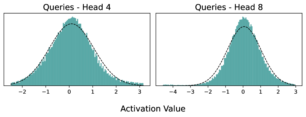
The image contains two side-by-side histograms comparing activation value distributions for "Head 4" and "Head 8" queries. Both plots feature teal bars representing frequency distributions and a dashed black line overlaying the data, likely representing a theoretical normal distribution curve.
### Components/Axes
- **X-axis (Horizontal)**:
- Labeled "Activation Value" for both plots.
- **Head 4**: Ranges from -2 to 3.
- **Head 8**: Ranges from -4 to 3.
- **Y-axis (Vertical)**:
- Unlabeled, but represents frequency/count of activation values (implied by histogram structure).
- **Legend**:
- No explicit legend is visible. The dashed black line is assumed to represent a theoretical normal distribution curve.
### Detailed Analysis
#### Queries - Head 4
- **Data Distribution**:
- Teal bars peak sharply at activation value **0**, with symmetric tapering toward -2 and 3.
- The dashed black line closely follows the bar peaks, indicating alignment with a normal distribution.
- **Key Values**:
- Highest frequency at **0** (exact value unspecified, but visually dominant).
- Frequencies decline gradually toward -2 and 3, with minimal values at the extremes.
#### Queries - Head 8
- **Data Distribution**:
- Teal bars peak at activation value **-1**, with a broader spread compared to Head 4.
- The dashed black line again aligns with the bar peaks, confirming a normal distribution.
- **Key Values**:
- Highest frequency at **-1** (slightly left of center).
- Frequencies decline more gradually toward -4 and 3, with noticeable values at the extremes (e.g., -4 and 3).
### Key Observations
1. **Symmetry**: Both distributions are approximately symmetric around their peaks.
2. **Variance**: Head 8 exhibits a wider spread (higher variance) than Head 4, as evidenced by the broader x-axis range (-4 to 3 vs. -2 to 3) and more gradual frequency decline.
3. **Peak Alignment**: The dashed black line (theoretical curve) fits both histograms well, suggesting the data adheres to a normal distribution.
4. **Positioning**:
- Head 4’s peak is centered at **0**, while Head 8’s peak is shifted slightly left to **-1**.
- Head 8’s x-axis extends further left (-4) and right (3) than Head 4’s (-2 to 3).
### Interpretation
- **Technical Implications**:
- The difference in variance between Head 4 and Head 8 suggests that Head 8 processes queries with greater variability in activation values. This could indicate differences in query complexity, attention mechanism behavior, or data distribution across model heads.
- The alignment of the dashed line with the histograms confirms that both heads’ activation values follow a normal distribution, supporting assumptions about the underlying statistical properties of the data.
- **Outliers/Anomalies**:
- No extreme outliers are visible in either plot. The frequencies at the extremes (-4 and 3 for Head 8) are low but non-zero, consistent with a normal distribution’s tail behavior.
- **Significance**:
- The wider spread in Head 8 may reflect its role in handling more diverse or complex queries, while Head 4’s narrower distribution could indicate specialization in a narrower range of activation values.
## Notes
- No textual content in languages other than English is present.
- The absence of a legend or y-axis label limits precise quantification of frequencies, but relative trends are clear.
- Spatial grounding: Head 4 is on the left, Head 8 on the right. Both share the same y-axis structure (unlabeled frequency).