## Scatter Plot: Original vs. Corrected Wind Speed
### Overview
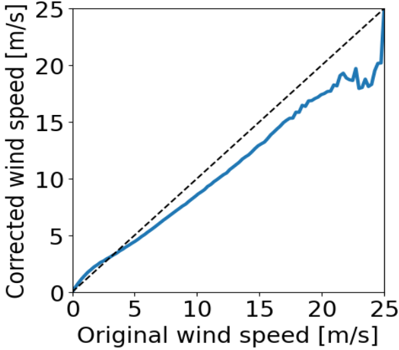
The image is a 2D scatter plot or line graph comparing "Original wind speed" on the horizontal axis to "Corrected wind speed" on the vertical axis. Both variables are measured in meters per second (m/s). The plot contains a dashed diagonal reference line and a solid blue data line, illustrating the relationship between the two measurements.
### Components/Axes
* **X-Axis (Horizontal):**
* **Label:** "Original wind speed [m/s]"
* **Scale:** Linear, ranging from 0 to 25.
* **Major Tick Marks:** At intervals of 5 (0, 5, 10, 15, 20, 25).
* **Y-Axis (Vertical):**
* **Label:** "Corrected wind speed [m/s]"
* **Scale:** Linear, ranging from 0 to 25.
* **Major Tick Marks:** At intervals of 5 (0, 5, 10, 15, 20, 25).
* **Legend / Reference Elements:**
* A **dashed black line** runs diagonally from the origin (0,0) to the top-right corner (25,25). This represents the 1:1 line where corrected speed equals original speed.
* A **solid blue line** represents the actual data series, plotting the corrected wind speed as a function of the original wind speed.
### Detailed Analysis
* **Trend of the Blue Data Line:** The blue line originates near (0,0). For low wind speeds (approximately 0 to 10 m/s), it follows the dashed 1:1 reference line very closely, indicating minimal correction. As the original wind speed increases beyond ~10 m/s, the blue line begins to deviate consistently **below** the dashed line. This downward deviation grows more pronounced, suggesting the correction method systematically reduces the reported wind speed at higher values.
* **Data Point Extraction (Approximate):**
* At Original = 5 m/s, Corrected ≈ 5 m/s (on the 1:1 line).
* At Original = 10 m/s, Corrected ≈ 9.5 m/s (slightly below).
* At Original = 15 m/s, Corrected ≈ 13.5 m/s.
* At Original = 20 m/s, Corrected ≈ 17.5 m/s.
* At Original = 25 m/s, the data shows high variability. The line fluctuates between approximately 18 m/s and 24 m/s, with a sharp spike that nearly reaches or briefly exceeds the 1:1 line at the very end of the plotted range.
### Key Observations
1. **Systematic Bias:** There is a clear, increasing negative bias in the corrected wind speed relative to the original for speeds above ~10 m/s. The correction appears to be a dampening or reduction function.
2. **Non-Linearity:** The relationship is not perfectly linear. The deviation from the 1:1 line increases with wind speed.
3. **High-End Anomaly:** The most significant feature is the erratic behavior and sharp upward spike in the corrected speed at the highest original wind speed measured (~25 m/s). This breaks the previously established trend of consistent reduction.
4. **Spatial Grounding:** The dashed reference line is positioned perfectly diagonally. The blue data line is positioned below it for the majority of the plot's right half (high original wind speed region).
### Interpretation
The graph demonstrates the output of a wind speed correction algorithm or sensor calibration. The data suggests the algorithm is designed to, or has the effect of, **reducing measured wind speed values, particularly as they increase**. This could be intended to account for sensor over-speeding, turbulence effects, or other systematic measurement errors.
The consistent downward trend implies a predictable correction model (e.g., a linear or polynomial scaling factor less than 1). However, the **anomaly at 25 m/s is critical**. It indicates a potential failure mode, edge-case behavior, or instability in the correction method at the upper limit of its operational range. This could be due to sensor saturation, a change in atmospheric conditions, or a flaw in the algorithm's logic for extreme values.
In a technical context, this plot would raise important questions: Is the reduction at high speeds intentional and validated? What causes the instability at 25 m/s? The graph provides strong visual evidence that the correction is not a simple, uniform offset but a complex, non-linear function with a concerning outlier at the extreme.