\n
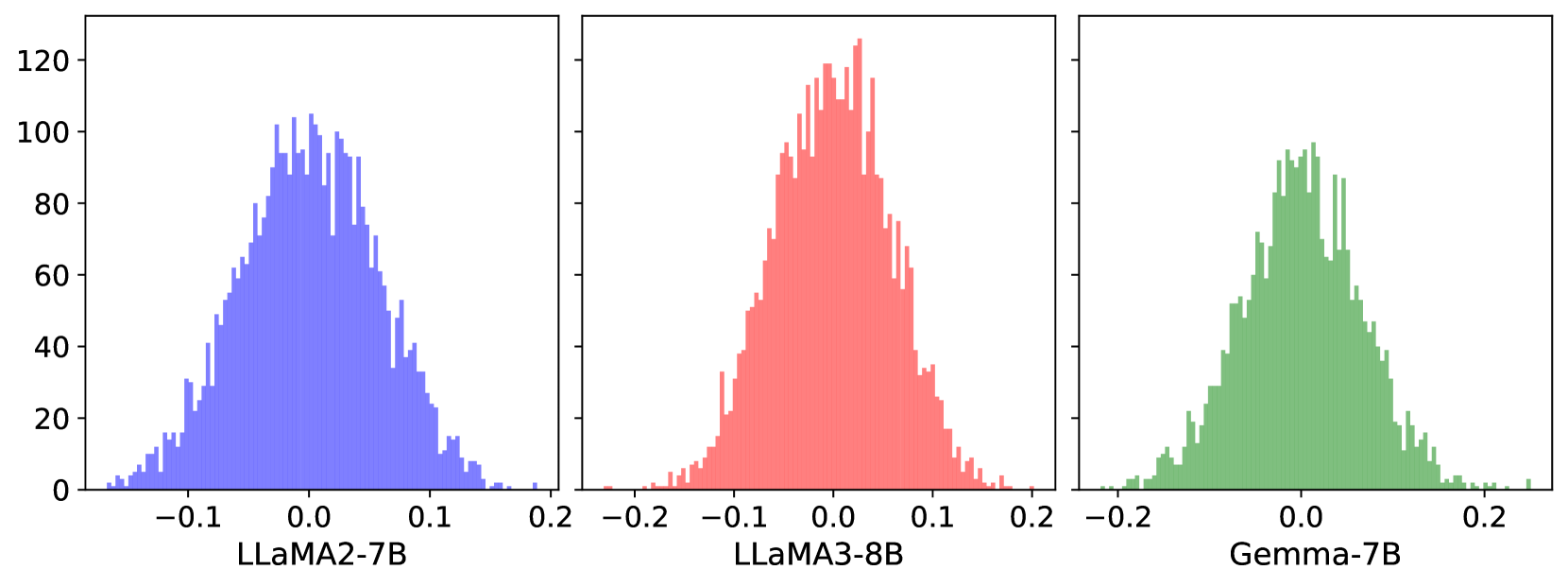
## Histograms: Model Performance Comparison
### Overview
The image presents three histograms, visually comparing the distributions of some metric (likely a performance score or error rate) for three different language models: LLaMA2-7B, LLaMA3-8B, and Gemma-7B. Each histogram is displayed in a separate panel, arranged horizontally. The y-axis represents frequency (count), while the x-axis ranges from approximately -0.2 to 0.2.
### Components/Axes
* **X-axis Label (all panels):** Ranges from -0.2 to 0.2, with a central mark at 0.0. The specific metric is not labeled.
* **Y-axis Label (all panels):** Frequency, ranging from 0 to approximately 120.
* **Panel 1:** LLaMA2-7B (Blue Histogram)
* **Panel 2:** LLaMA3-8B (Red Histogram)
* **Panel 3:** Gemma-7B (Green Histogram)
### Detailed Analysis
**Panel 1: LLaMA2-7B (Blue)**
The histogram for LLaMA2-7B is centered slightly to the left of 0.0. The distribution is roughly symmetrical, with a peak frequency of approximately 80 at an x-value of around -0.05. The frequency decreases as the x-value moves towards -0.2 and 0.2.
* Approximate peak: x = -0.05, y = 80
* Approximate x-value at y=0: x = -0.2 and x = 0.15
**Panel 2: LLaMA3-8B (Red)**
The histogram for LLaMA3-8B is centered very close to 0.0. It exhibits a sharper peak than LLaMA2-7B, with a maximum frequency of approximately 110 at an x-value of around 0.0. The distribution appears more concentrated around 0.0.
* Approximate peak: x = 0.0, y = 110
* Approximate x-value at y=0: x = -0.18 and x = 0.18
**Panel 3: Gemma-7B (Green)**
The histogram for Gemma-7B is centered slightly to the right of 0.0. It has a broad peak, with a maximum frequency of approximately 90 at an x-value of around 0.05. The distribution is less symmetrical than the other two, with a longer tail extending towards positive x-values.
* Approximate peak: x = 0.05, y = 90
* Approximate x-value at y=0: x = -0.15 and x = 0.2
### Key Observations
* LLaMA3-8B has the highest peak frequency, suggesting a greater concentration of data points around 0.0.
* LLaMA2-7B is shifted slightly to the left, indicating a tendency towards negative values.
* Gemma-7B is shifted slightly to the right and has a broader distribution, suggesting more variability.
* All three distributions are roughly bell-shaped, indicating a normal or near-normal distribution.
### Interpretation
The histograms likely represent the distribution of a performance metric, such as the difference between predicted and actual values, or a similarity score. A value of 0.0 would likely indicate perfect performance.
* **LLaMA3-8B** appears to perform best, as its distribution is most concentrated around 0.0. This suggests that its predictions are, on average, closer to the actual values.
* **LLaMA2-7B** shows a slight bias towards underperformance (negative values).
* **Gemma-7B** exhibits more variability in its performance, with a broader distribution and a slight bias towards overperformance (positive values).
The differences in the distributions suggest that the three models have different strengths and weaknesses. LLaMA3-8B appears to be the most consistent performer, while LLaMA2-7B and Gemma-7B may be more prone to errors in specific directions. The specific meaning of the x-axis values would require additional context about the metric being measured.